
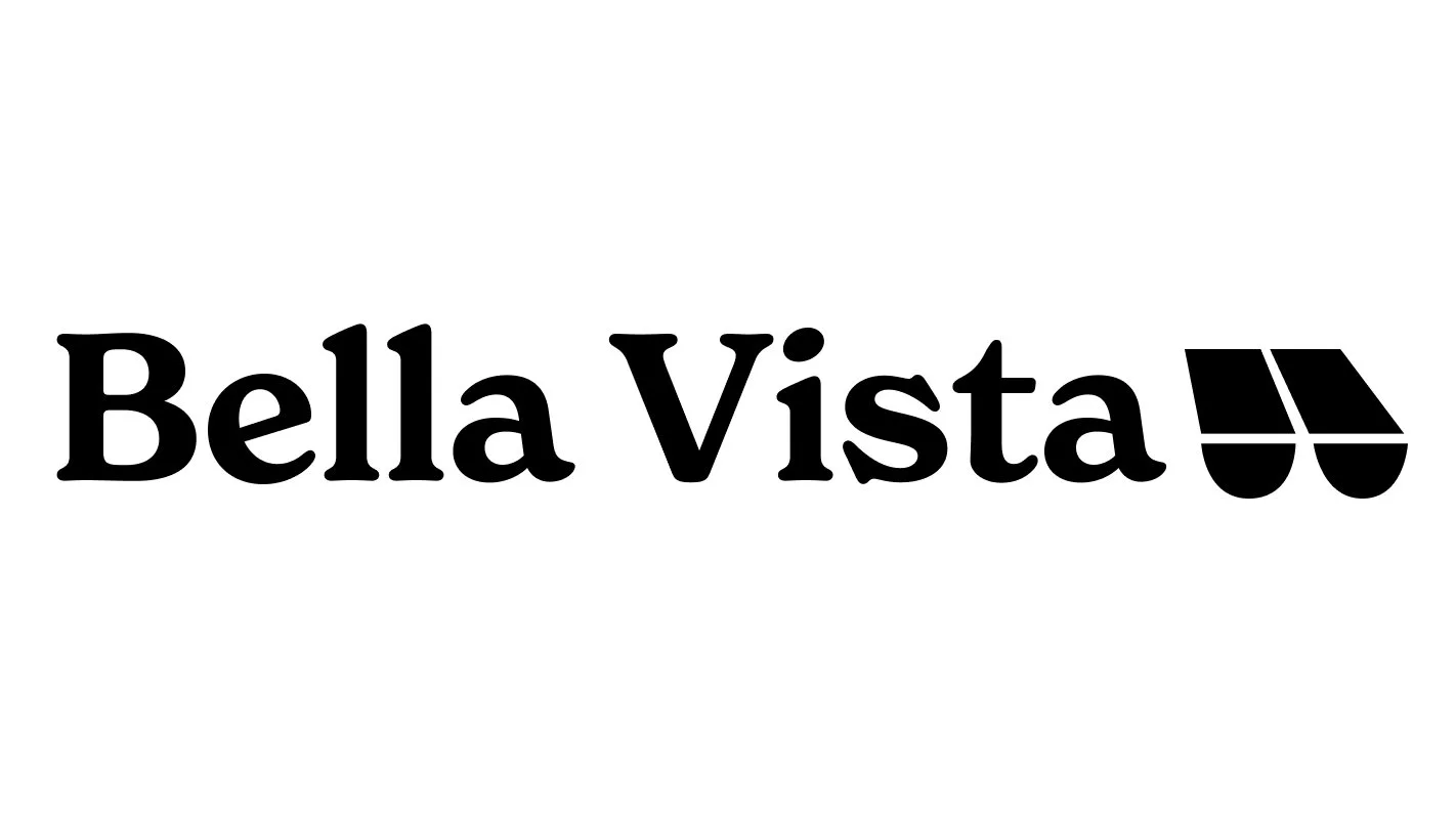
Bella Vista Website
In this group case study, we took on the challenge of building a government website for a local community in Philadelphia. Our aim? To create a design system that's more than just inclusive, but also truly speaks to the needs of the residents of Bella Vista.
Instructor: Sara Hall
Project Year: 2023
Primary Research
Philadelphia Neighborhoods
We researched various neighborhoods in Philadelphia before selecting one that we thought would be exciting to explore. Once we chose Bella Vista, we delved into its current state, history, and the people who live there.
Here’s what we discovered:
Bella Vista, meaning ‘Beautiful Sights,’ is one of Philadelphia’s oldest neighborhoods, renowned for its Italian Market and the enchanting Magic Gardens. Originally a haven for Irish settlers in the 1850s, it later became home to Italian, Jewish, Vietnamese, and Mexican communities. In the 1970s, in response to the threat of a new highway, the neighborhood rebranded from Moyamensing to Bella Vista. Today, it boasts a vibrant array of dining options that reflect its rich, multicultural history.
First Iteration Brand Identity
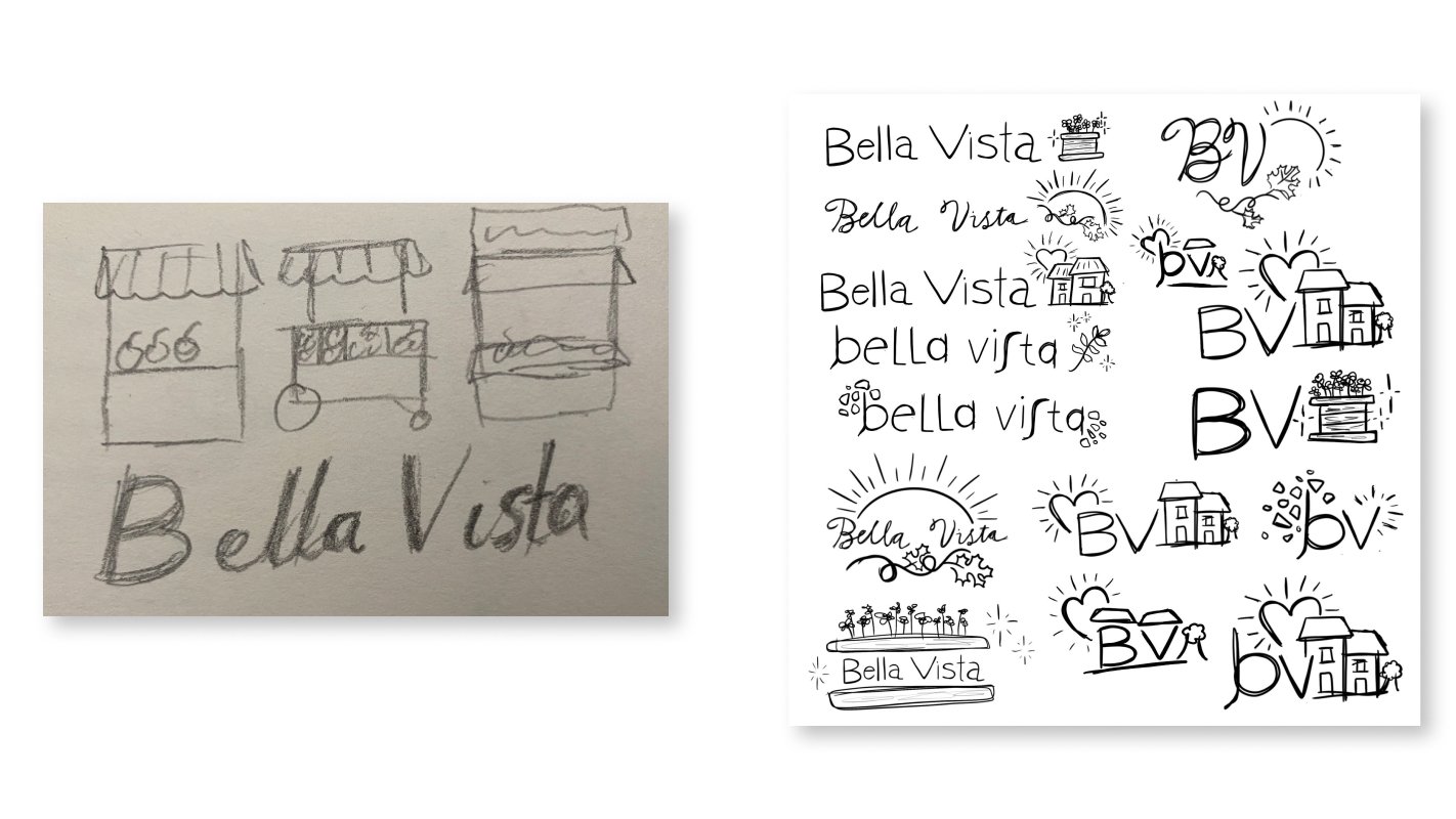
Logo Sketches
We began by sketching logo ideas, experimenting with fonts, and testing various color schemes. Our focus was on capturing the unique qualities of Bella Vista and reflecting them in our iconography and font choices. We also considered the neighborhood's residents, aiming to represent them authentically in our branding.
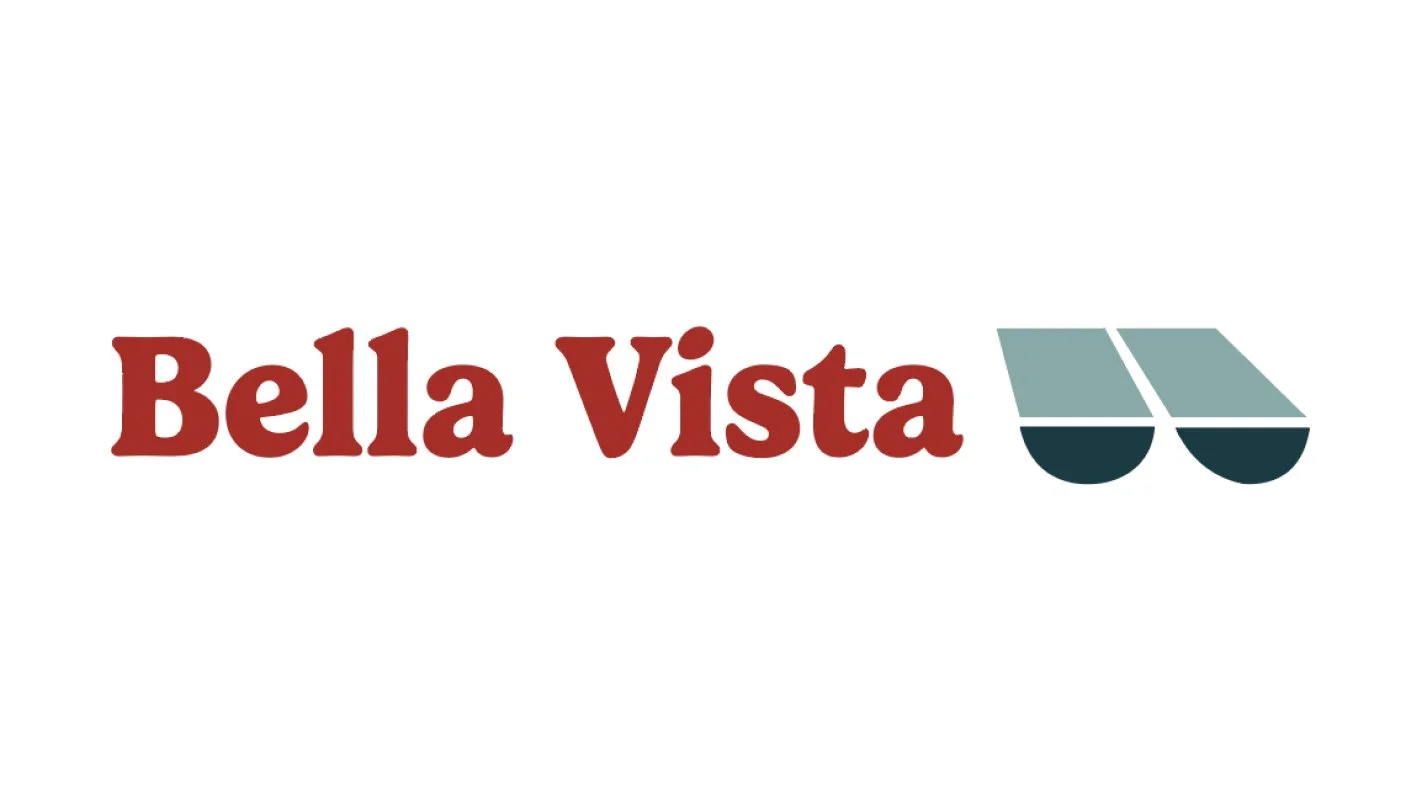
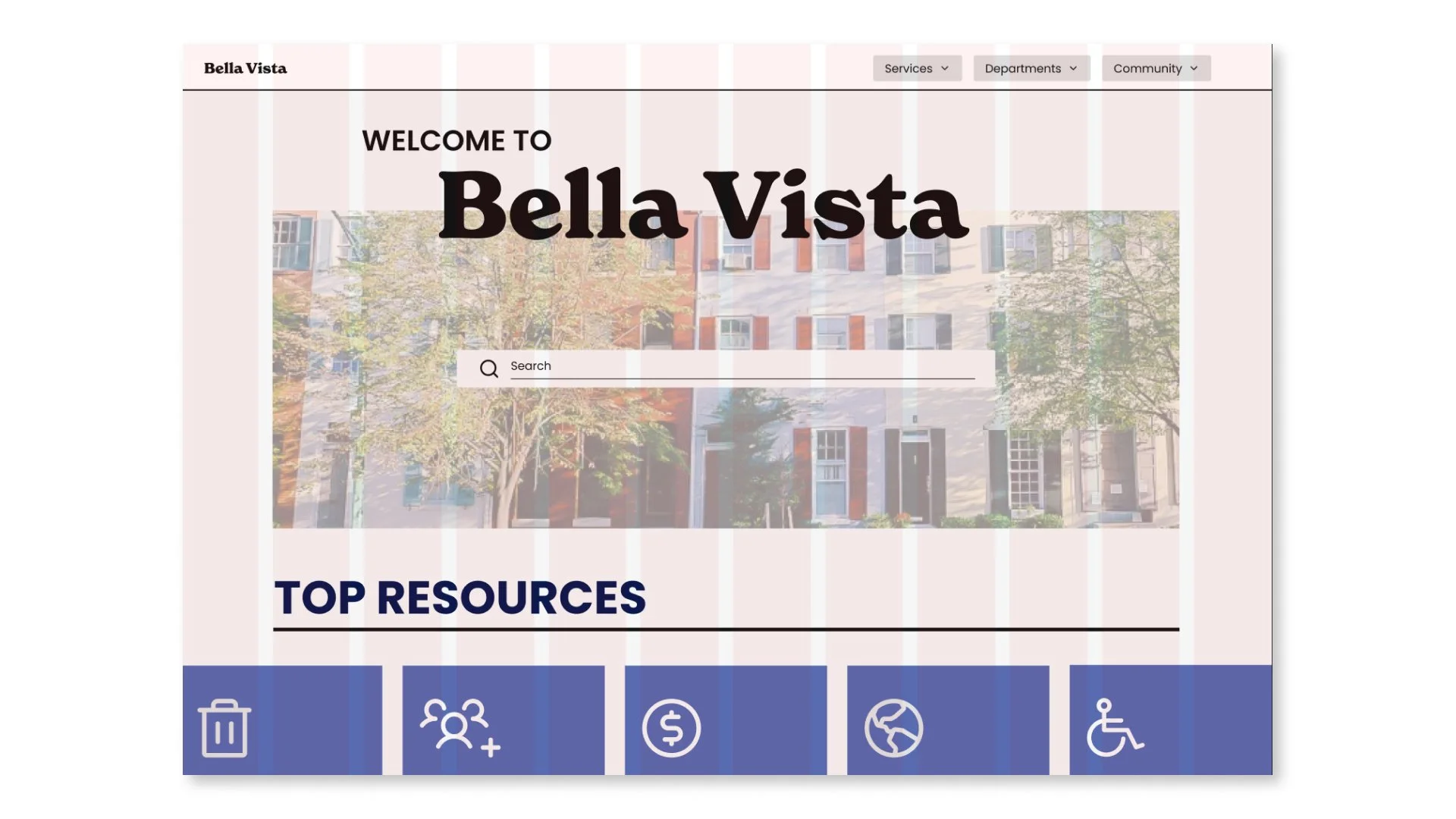
Initial Brand Identity
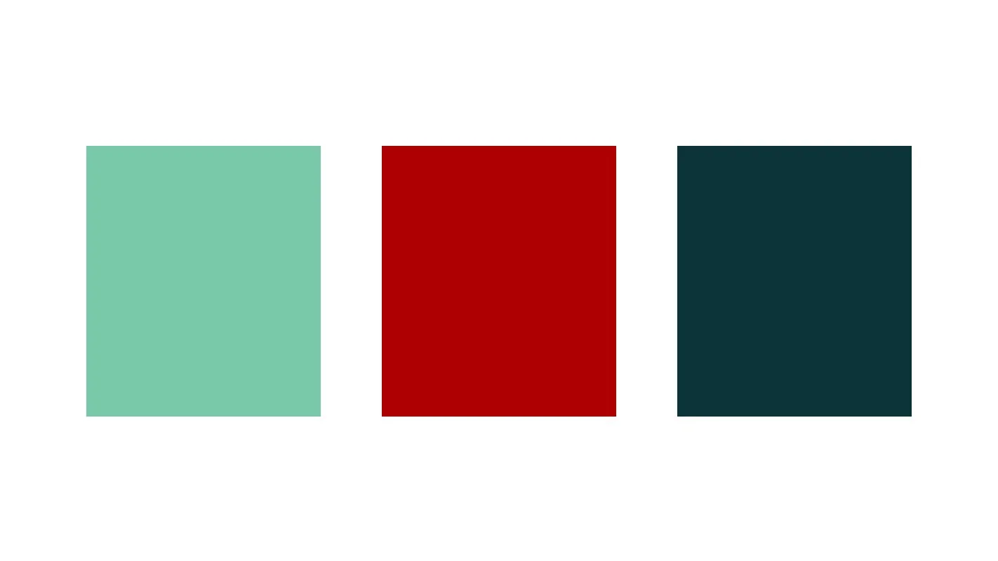
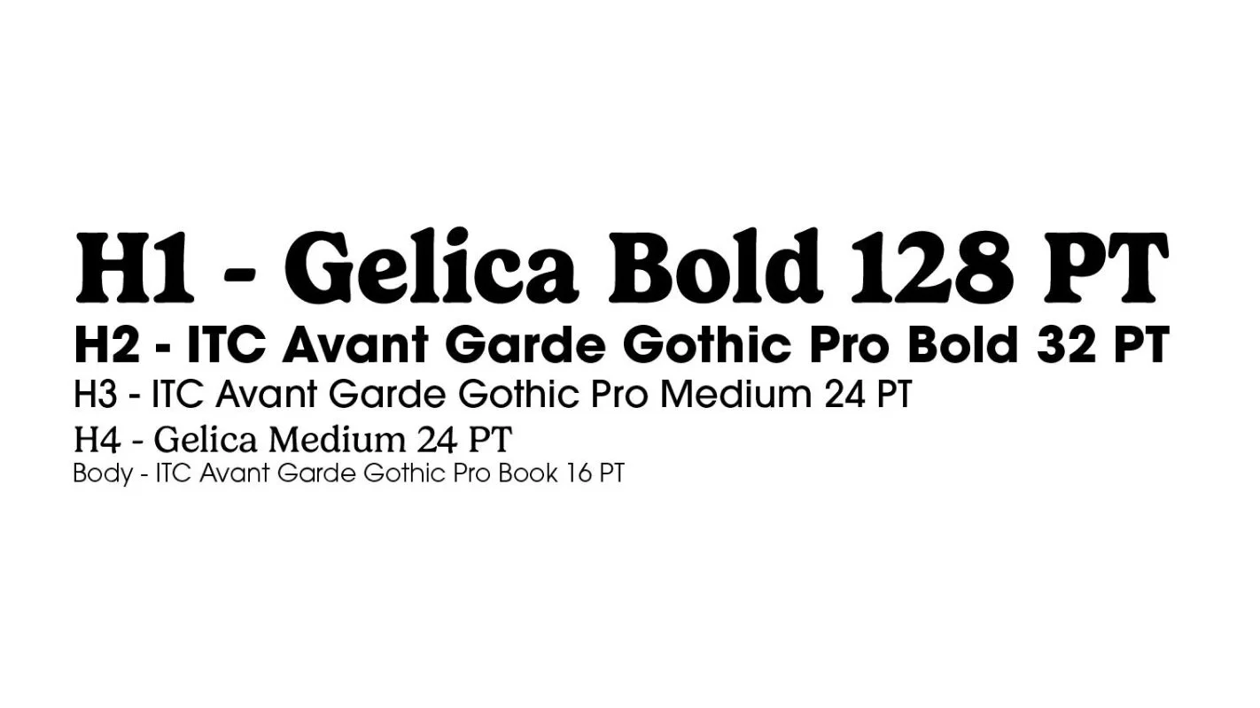
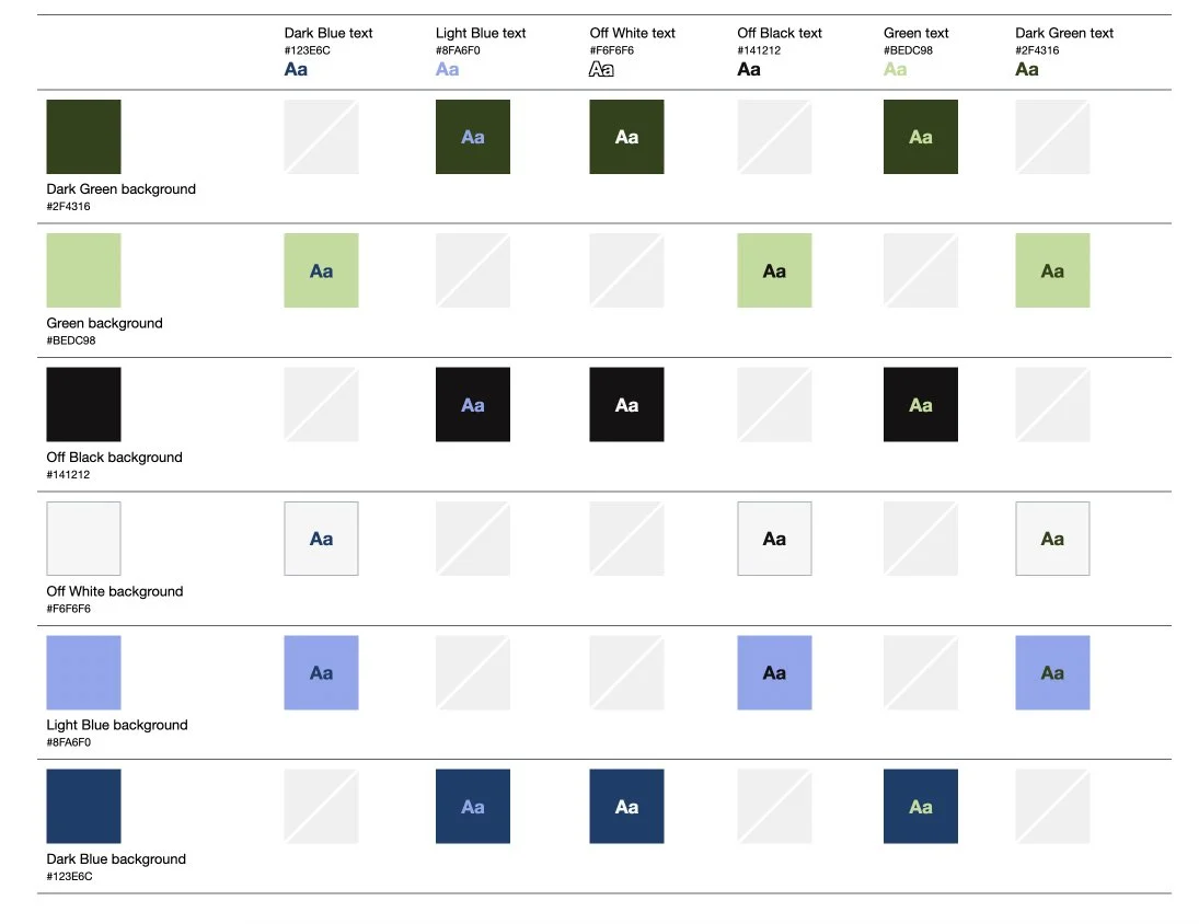
We selected a color palette inspired by the flags representing the main demographics of the neighborhood. For the font, we chose Gelica due to its friendly and playful personality, which complements the vibrant character of Bella Vista. We paired Gelica with ITC Avant Garde for body text and smaller headers to enhance readability and ensure accessibility standards were met.
Finalize Branding
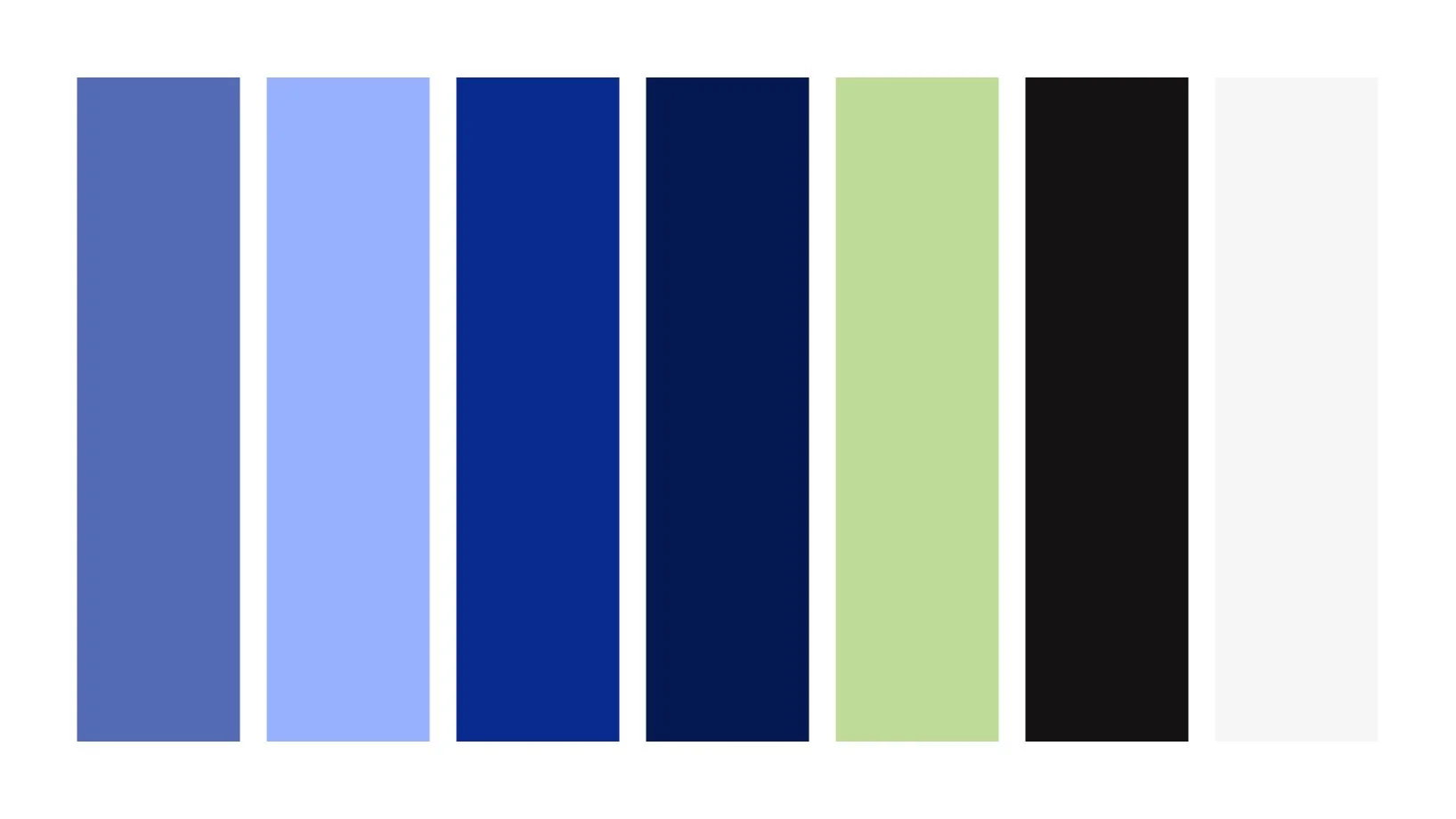
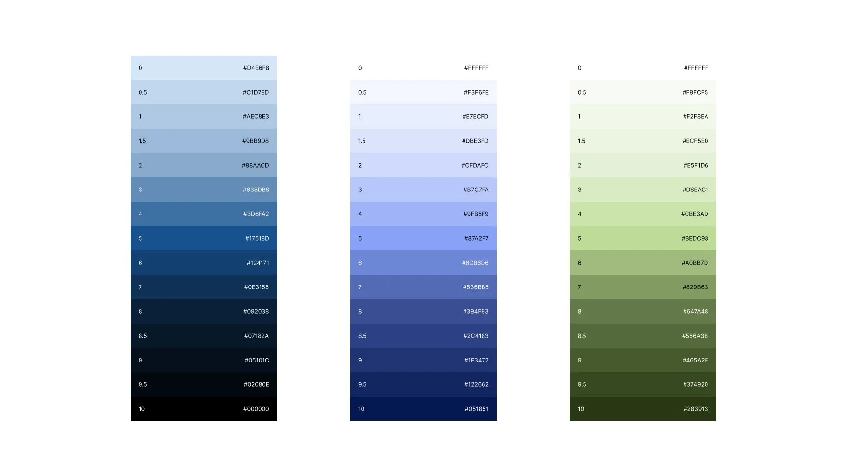
Although we liked the reasoning behind our initial choices, the colors felt stale and outdated, and the font combinations didn’t pair as well as hoped. Given that many of Bella Vista’s residents are younger professionals, we recognized we hadn’t fully captured the neighborhood's lively spirit and decided to pivot.
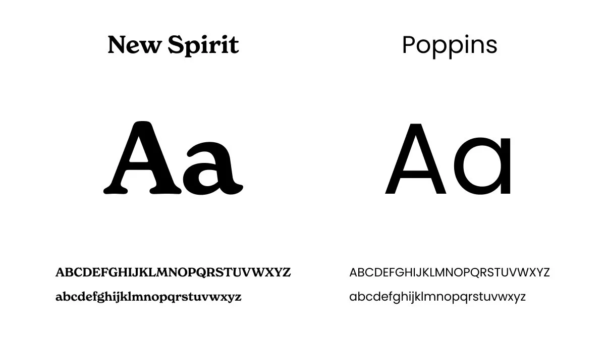
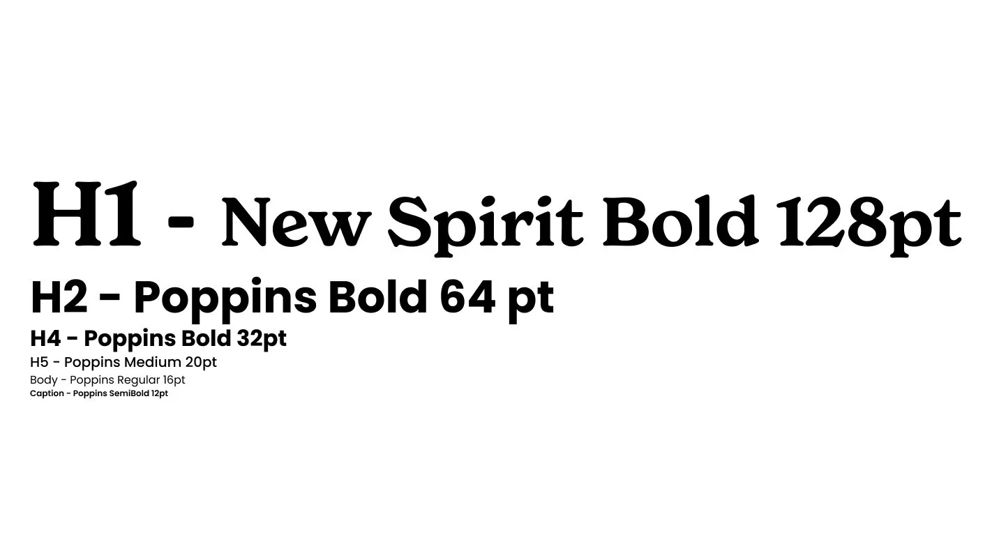
We updated our fonts from Gelica to New Spirit and adjusted our color palette to align with current design trends while maintaining WCAG AA accessibility standards. These changes revitalized the group’s atmosphere, reigniting our inspiration and excitement to move forward.
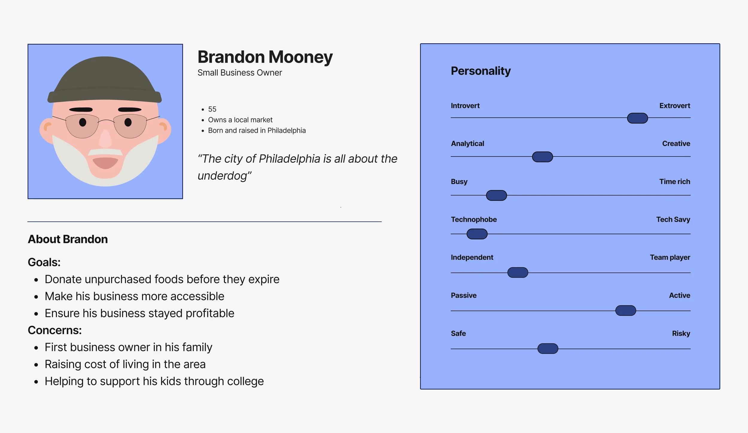
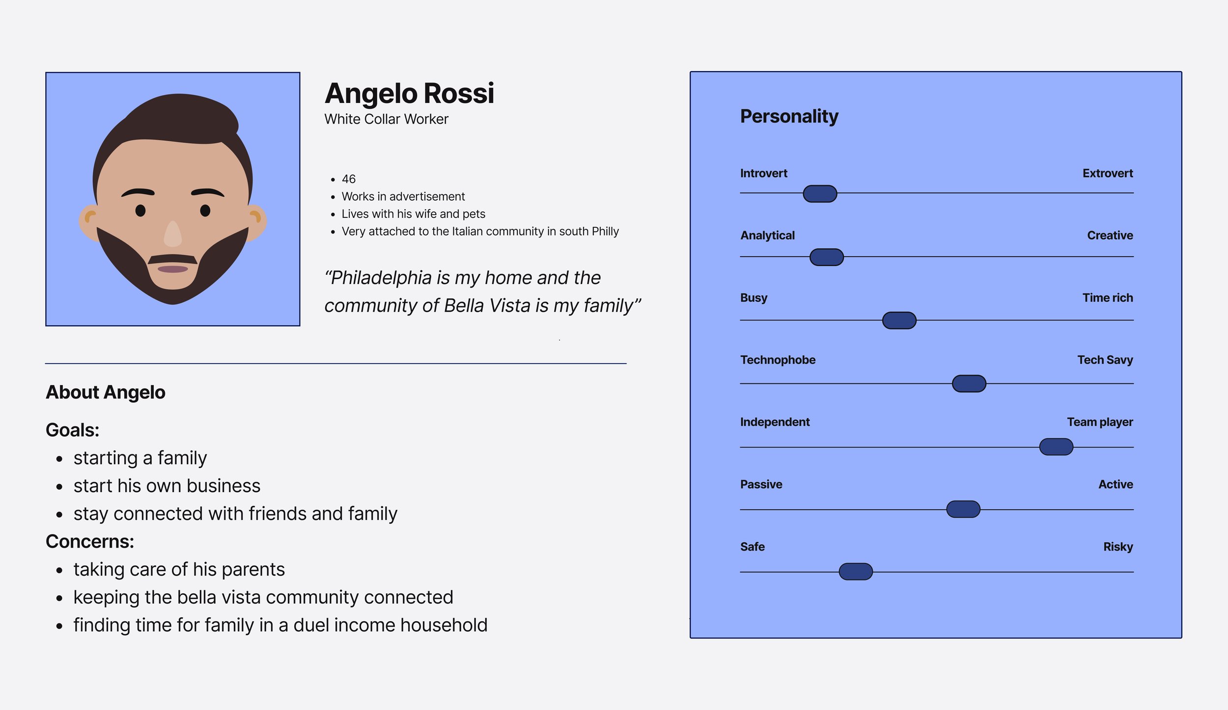
Personas
We developed three personas representing the diverse types of residents we anticipated would use our website. Each persona was crafted to address their unique needs and preferences, ensuring our design catered to a broad range of users.

Design Elements
Design Assets
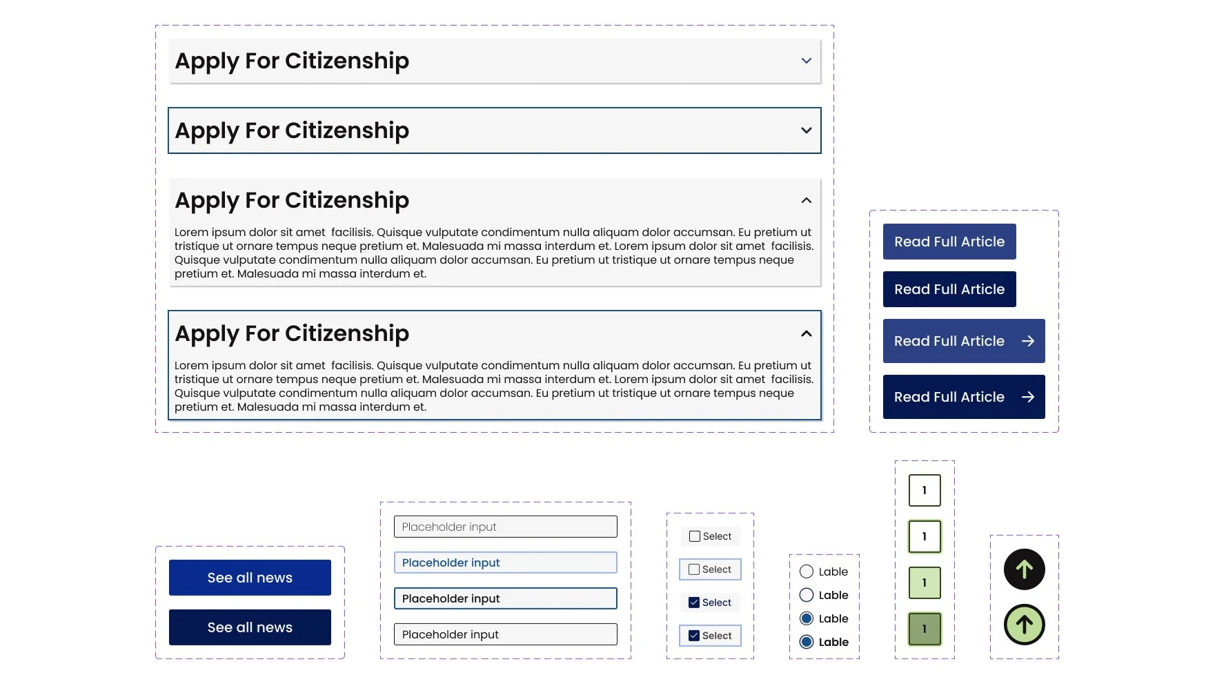
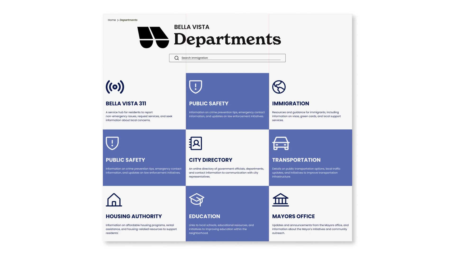
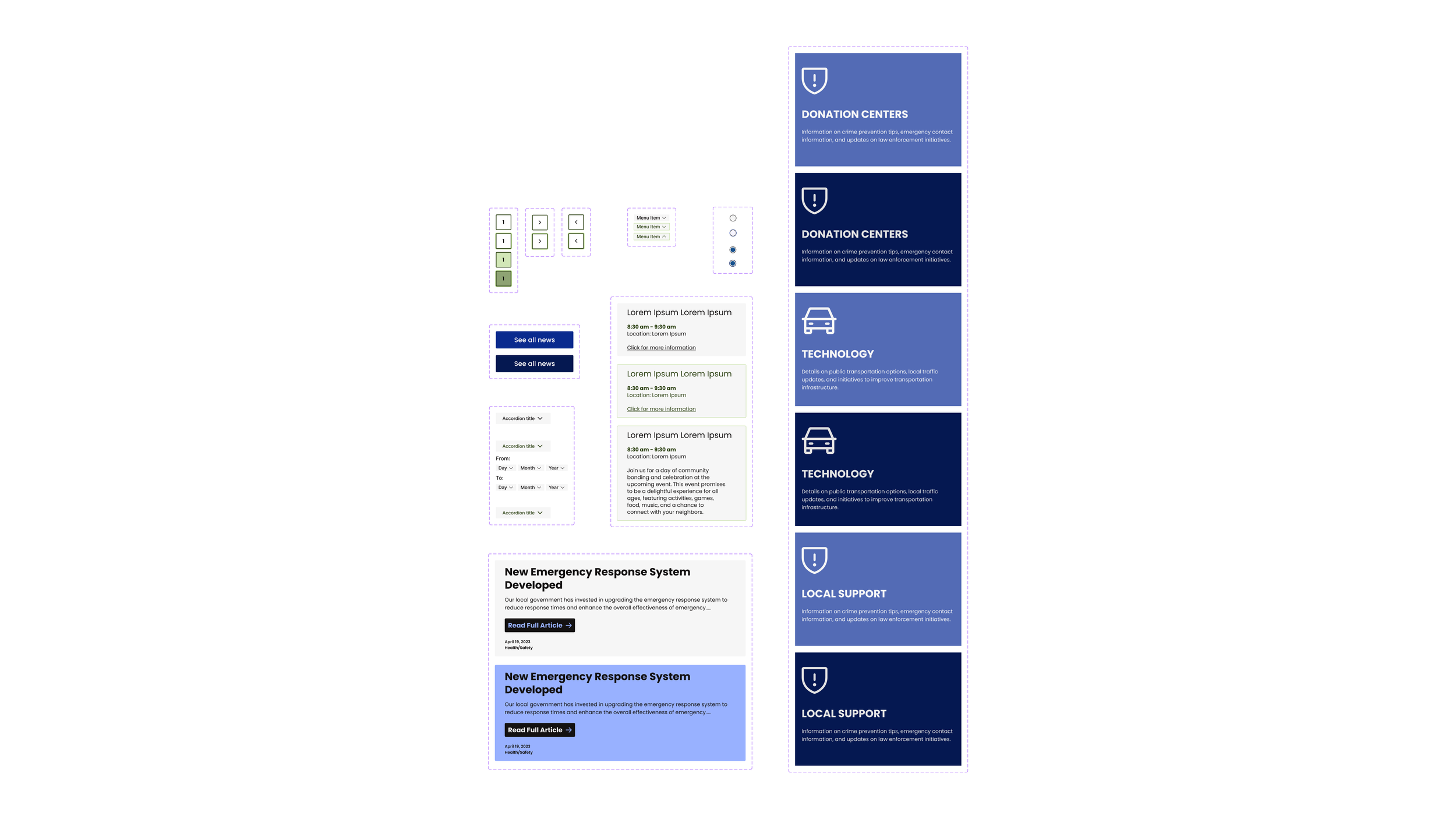
We compiled a list of essential design elements and started developing a comprehensive collection of assets, including navigation menus, breadcrumbs, search bars, headers, filters, and other components of our design system.
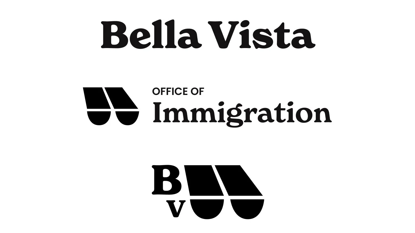
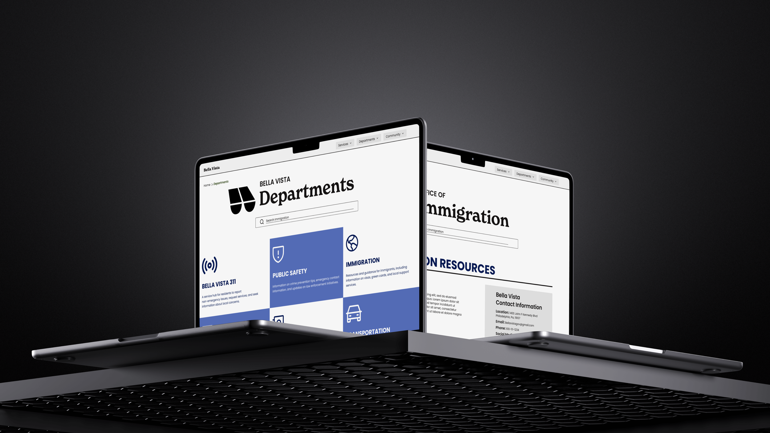
Iconography and Logo Variations
We designed multiple logo variations to capture the essence of Bella Vista's vibrant spirit and to represent various neighborhood departments effectively. By creating distinct versions of the main logo, we ensured that each department had a unique yet cohesive visual identity.
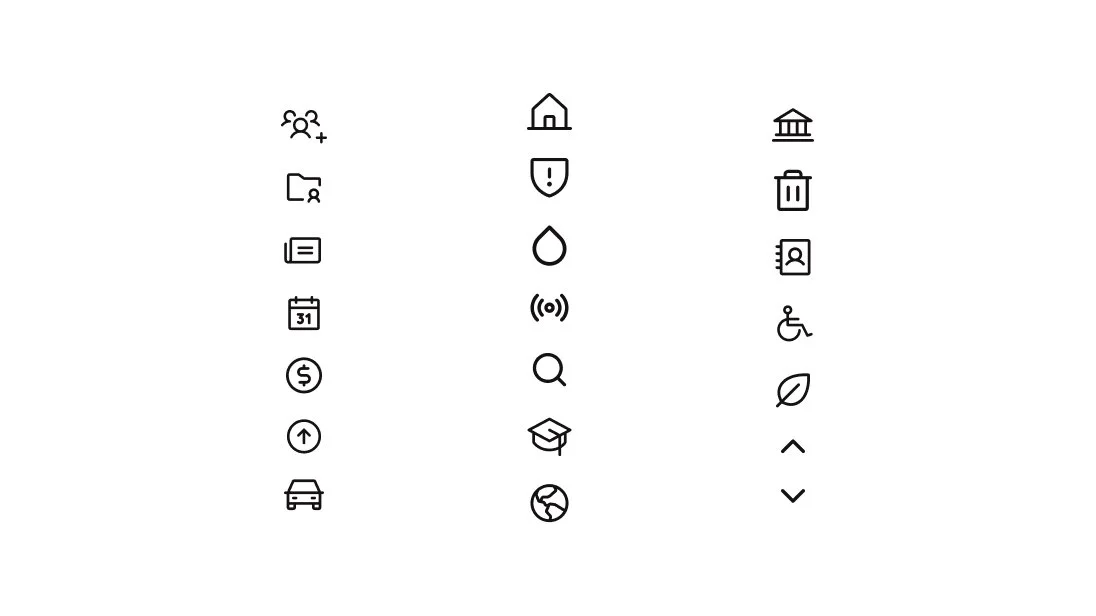
Additionally, we curated a set of icons to assign to different departments and buttons throughout the site, creating a consistent and intuitive user experience. This approach helped maintain a unified look while making navigation and functionality clear for users.
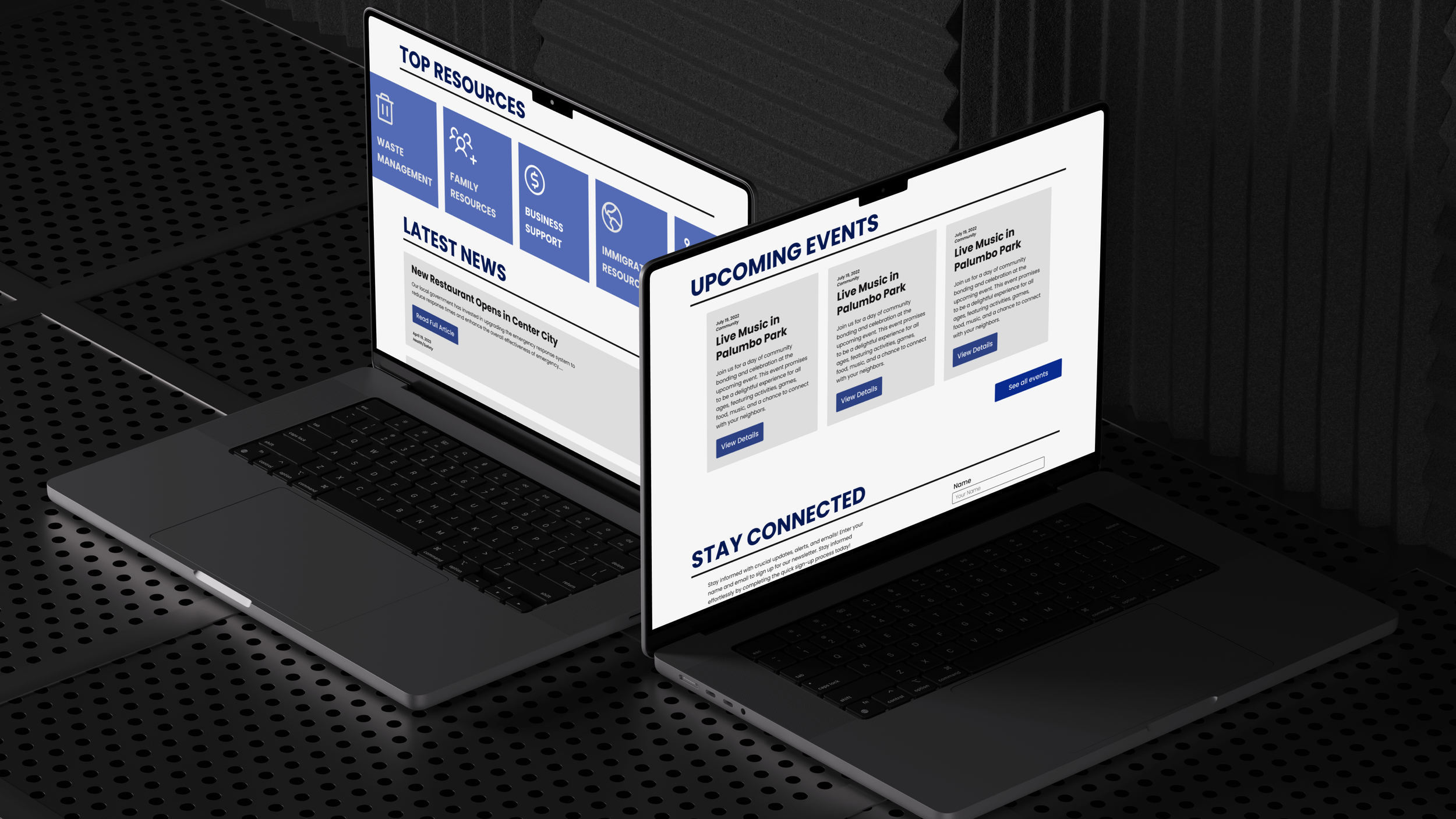
Interactive Elements
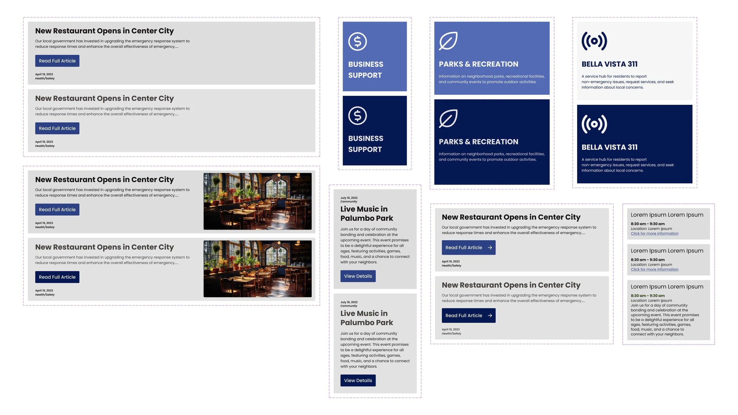
We extended our design system by creating various button styles and states, along with other interactive elements such as cards, accordions, and filters.
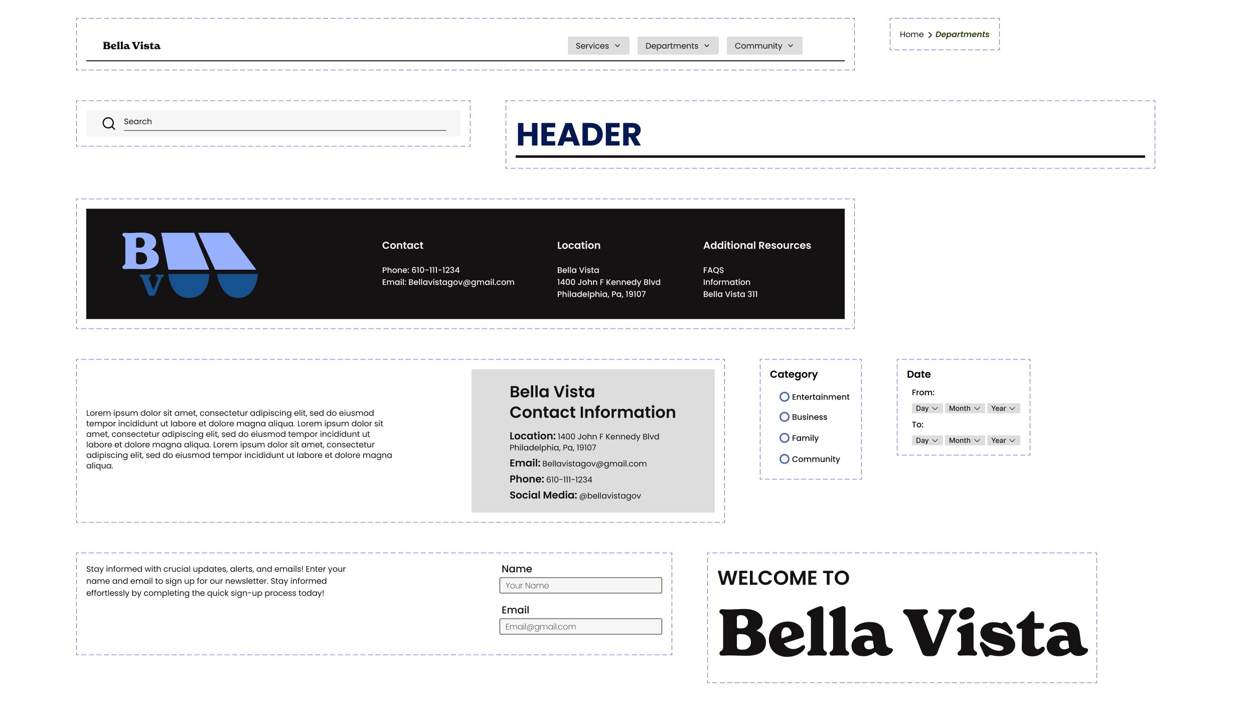
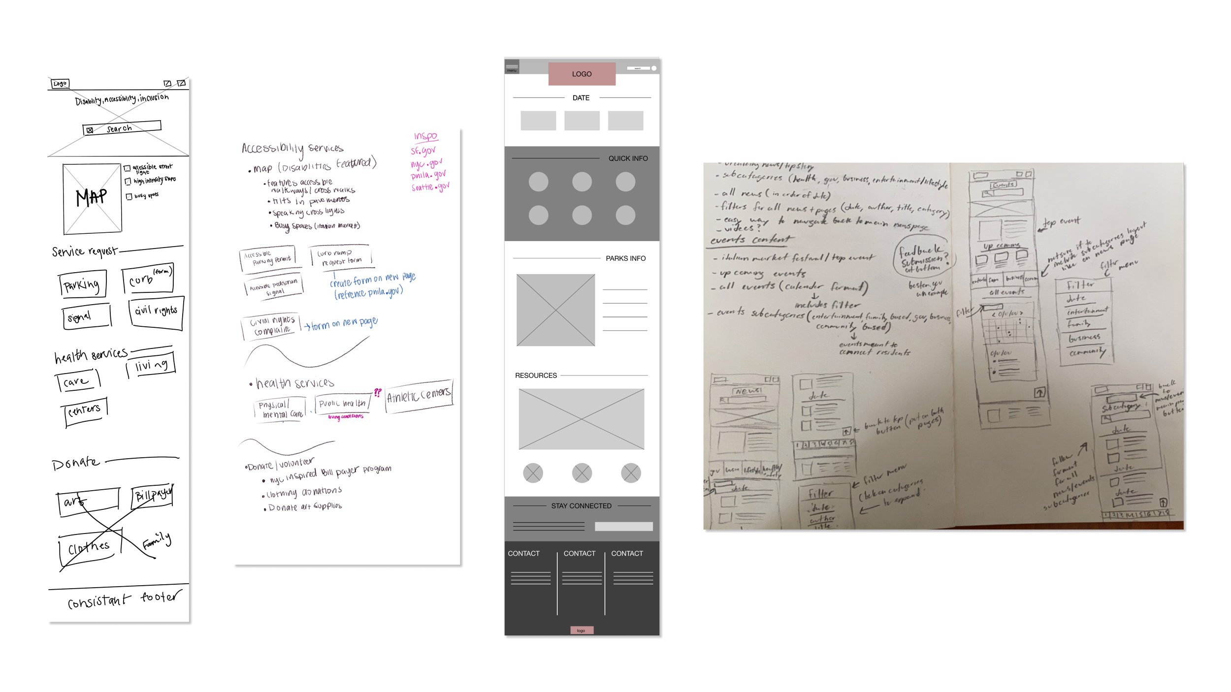
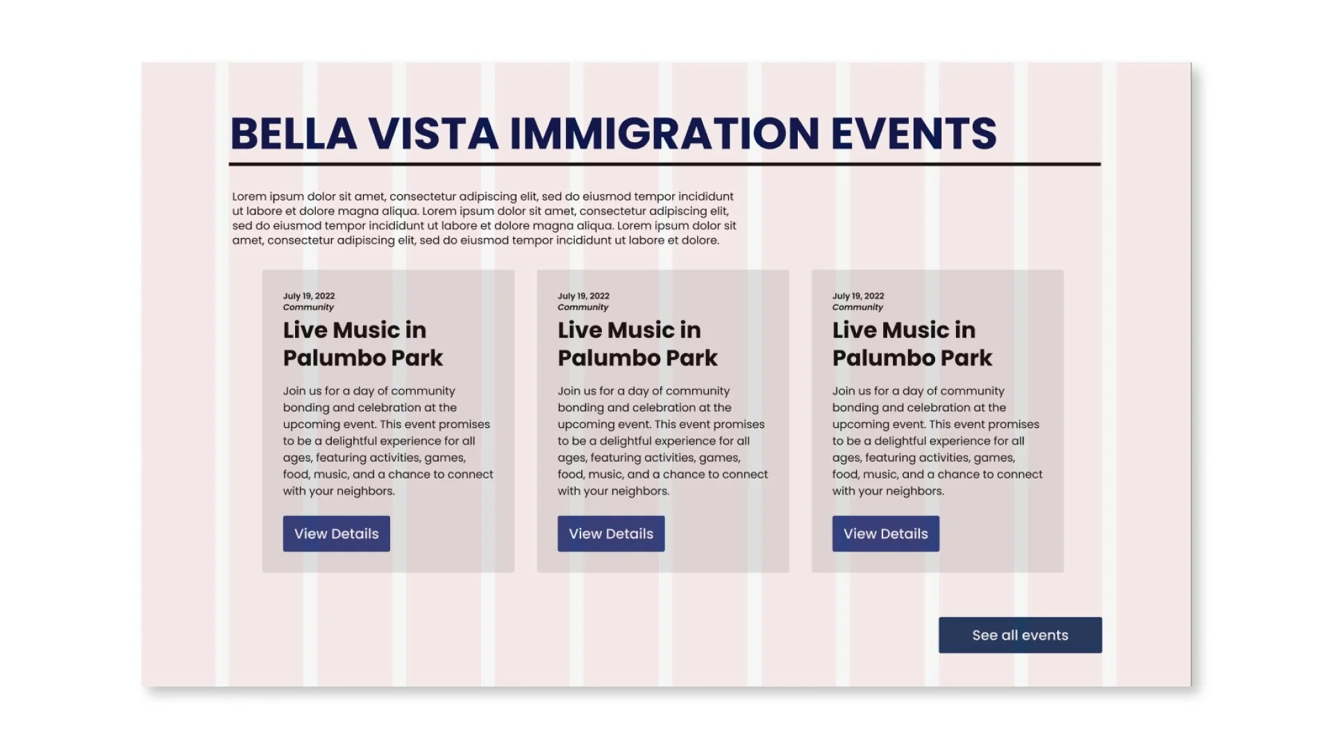
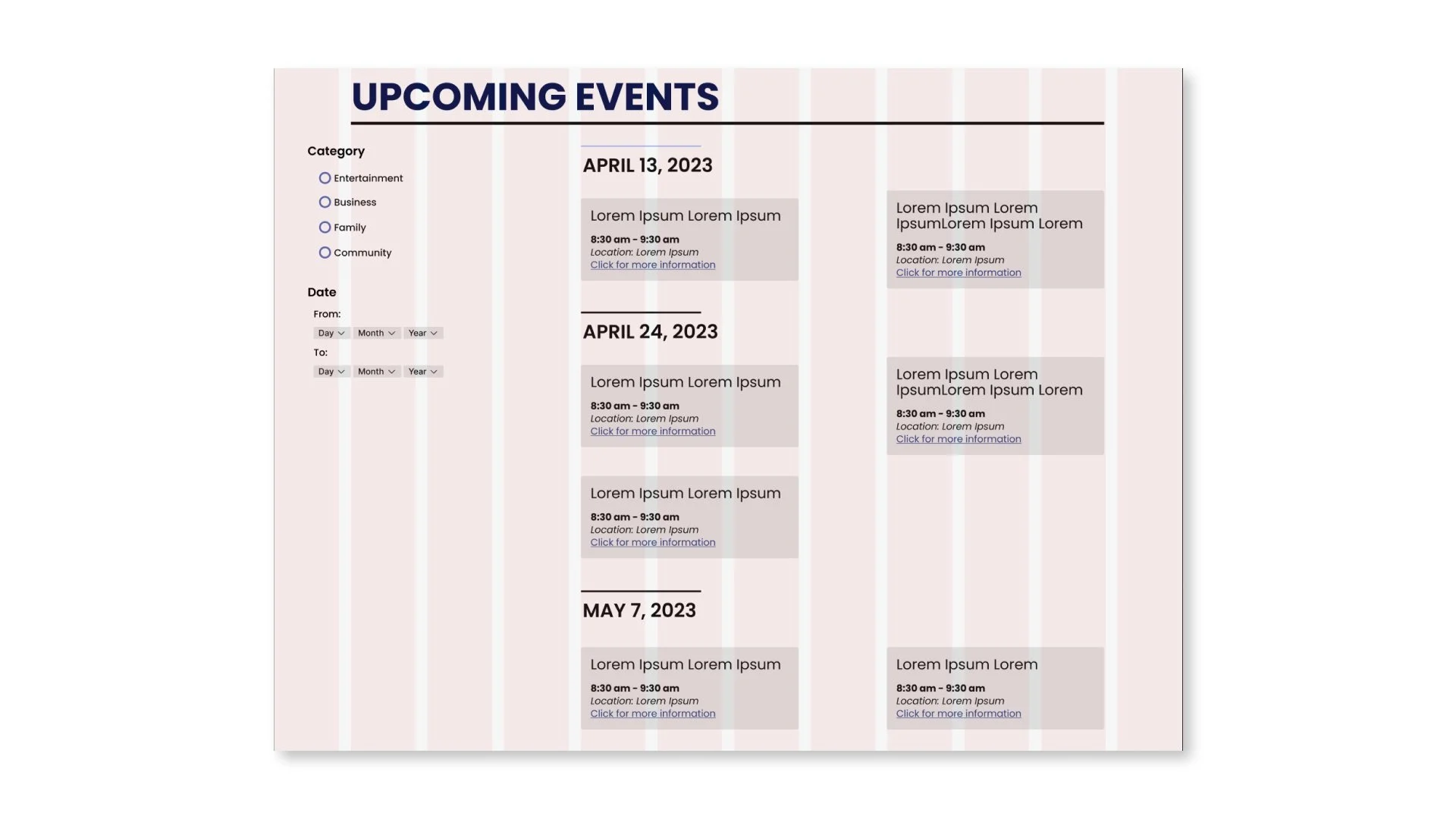
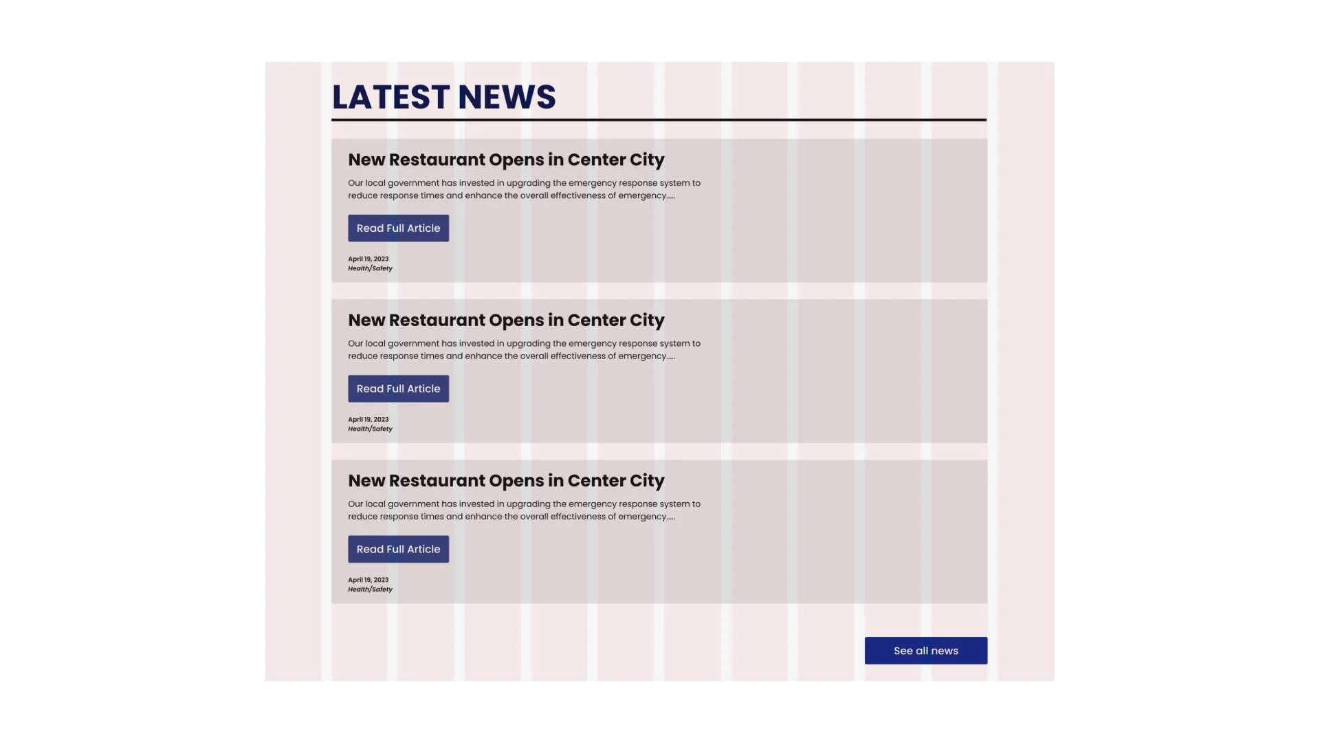
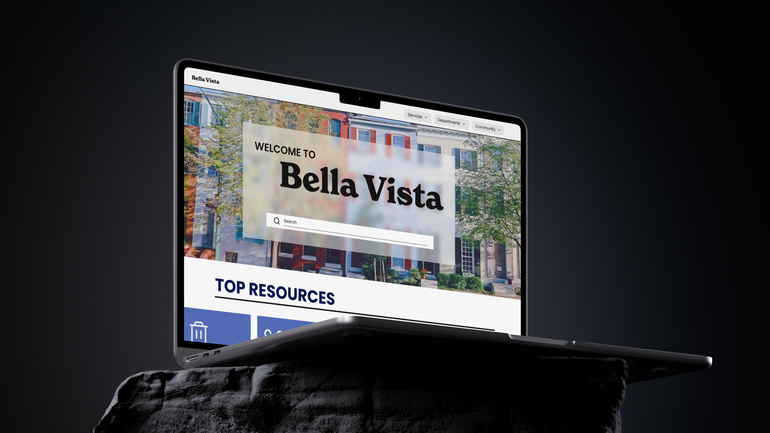
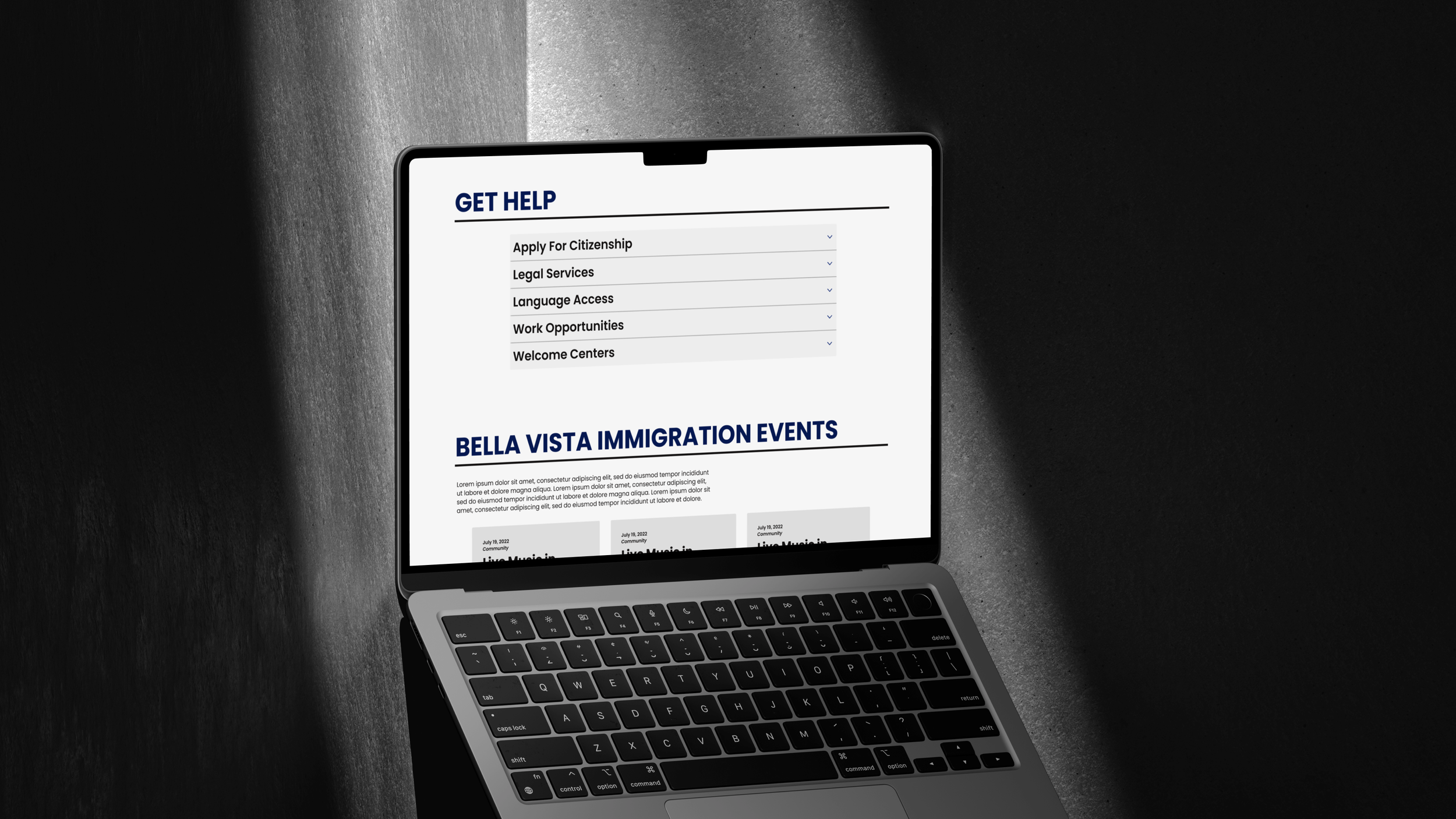
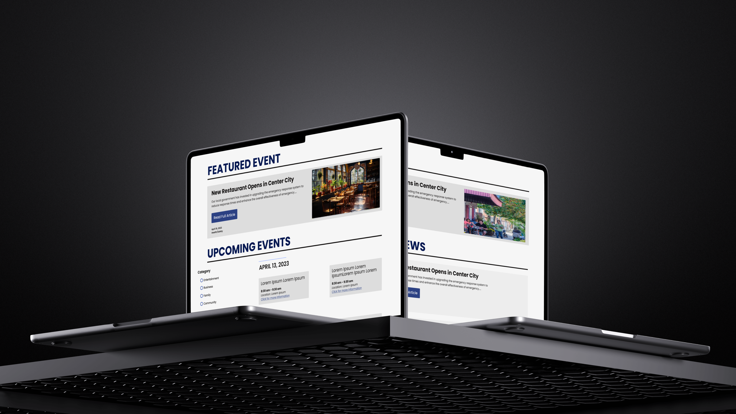
Page Wireframes
While building our design system and developing common web elements, we began designing wireframes for the neighborhood homepage, department homepage, and other planned pages. This approach allowed us to incorporate important yet often overlooked elements into the wireframes, resulting in designs that felt familiar and intuitive. This was crucial, given the project's context as a government website where user familiarity is key.
Grid Layout
After finalizing our designs, we meticulously refined them using a grid system to address any spacing issues and ensure visual consistency. Employing a grid system is essential for maintaining alignment and proportion across different elements, which helps create a polished and professional appearance.
Prototyping
We began by focusing on the core navigation elements, such as the nav bar, home page buttons, and breadcrumbs. Then, we prototyped interactive components, defining their various states—default, hover, selected, and selected hover. This hands-on approach allowed us to interact with the site as if it were live, helping us identify and refine any areas needing improvement.

Conclusion
Starting this project, my UX design experience was minimal. It was my first immersion in user-centric design and working in a team, which ultimately had a significant impact on my development as a designer.
Throughout the process, I honestly struggled a lot to stay motivated because the style of the project didn't align with my personal preferences, which left me feeling disconnected from the work.
I felt more restricted because of the need to meet accessibility standards and work with other designers instead of individually.
Looking back, I'm grateful for this learning experience.
I learned to work more collaboratively and balance team dynamics, grasp the distinct goals and purpose of UX design, navigate its constraints, and maintain creativity without compromising accessibility.
Most importantly, I realized that I'm not designing for myself but for the people who will use what I create.