Lyft Case Study
Why do many individuals seem to favor Uber over Lyft? This single question was the inspiration behind this collaborative project centered around Lyft. To address this question, we conducted research by engaging with users to understand their behavior and needs to understand what "better" really meant when redesigning the app.
Instructor: Sara Hall
Project Year: 2023
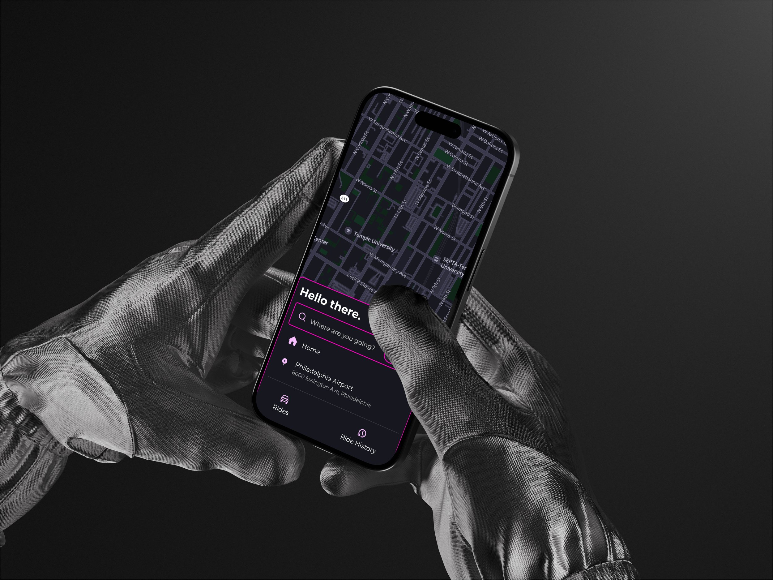
App Overview
Lyft is a ride-share app that provides users with an alternative to taxis and public transportation. Offering ride reservations, payment, and communication with drivers, all within one convenient platform.
Early Research
Our early research focused on understanding Lyft's competitors, our target audience, and the user experience flow within the Lyft app.
We chose Uber for its popularity as a ride-share app, Septa due to our target users being primarily Philly residents with easy access to public transportation, and DoorDash for its convenience in food delivery, potentially eliminating the need for a ride-share app.


Competitor Key Takeaways
Uber
Positives - Offers delivery services & reliable drivers
Negatives - More expensive and longer wait times
Septa
Positives - More cost-effective and environmentally friendly
Negatives - Safety/cleanliness
DoorDash
Positives - Offers food delivery
Negatives - Not a ride-share app & lacks secure safety for orders
User Research
Survey
We created a survey using Google Forms and distributed it across social media platforms, targeting users within our desired audience. In total, we had 33 people complete the survey. Our primary objectives were to understand why individuals use ride-share apps, the circumstances surrounding their usage, their overall sentiment towards ride-share services, and any preferences they may have between different platforms such as Lyft and Uber.

Almost half of the participants had access to a car
This was very important to us because one of our initial theories was that individuals were more likely to use a ride-share app if they did not have access to a personal vehicle.
Nearly 25% of participants used public transportation regularly
While we didn't anticipate this to be the primary mode of transportation, it wasn't a surprise, considering that many participants lived in an urban environment.
Nearly all participants had used a ride-share app in the past
This disproved our initial car theory and prompted us to question why there seemed to be no correlation between using ride-share apps and individuals' primary modes of transportation.
60% of participants said they mainly use rideshare apps between 10 pm - 4 am
This data, when paired with the observation that people predominantly used ride-share apps when going out at night, made it very clear why even those with a car would still use an app like Lyft.
Cost was the main issue participants had with
ride-share apps
We honestly expected people to complain about more. However, aside from cost, we found no consistent complaints or clear reasons why individuals might prefer one ride-share app over another aside from pricing concerns.
Key Survey Insights
People overall had a good experience
Safety and saving time were people’s biggest priority
People switched from Uber to Lyft for shorter wait times and cheaper fares
People mainly use ride-share apps when going out at night
Most people only use Uber over Lyft because of habit
Interviews
After analyzing our survey results, we transitioned to conducting interviews to dive deeper into our insights and some emerging patterns. We went through three iterations of our interview questions before reaching our final draft that effectively addressed our main objectives while keeping things clear, concise, and convenient for the participants.
Our Objectives
Learn specific information about what people like/dislike about Lyft
What changes would motivate people to use Lyft more
Learn more about user experiences
Learn more about user needs
Interview Summaries
-
![]()
Interview 1
Liked the bright colors
Disliked being rated
Wanted app to show when no rides available, instead of just waiting
Easier to share a ride with friends on Lyft
-
![]()
Interview 2
Wonders if rating system is accurate
Would like to see food delivery in Lyft
Map could be improved
Switched to Lyft when rides were cheaper
-
![]()
Interview 3
Lyft was more visually appealing
Wanted more communication within rating system
App was easy to navigate but too cluttered
-
![]()
Interview 4
Map can be confusing
Waited a long time to get a driver
Liked the cheaper pricing
Liked the safety features in the app
Enjoyed that Lyft connects with venmo
-
![]()
Interview 5
Communication can be difficult
Color pink stood out
Drivers would cancel suddenly
Saving time was top priority
Wanted comments with ratings
-
![]()
Interview 6
Lyft colors were the most memorable part of the app
Safety was a priority
Used rid-share app when in a rush
Didn’t care about rider preferences


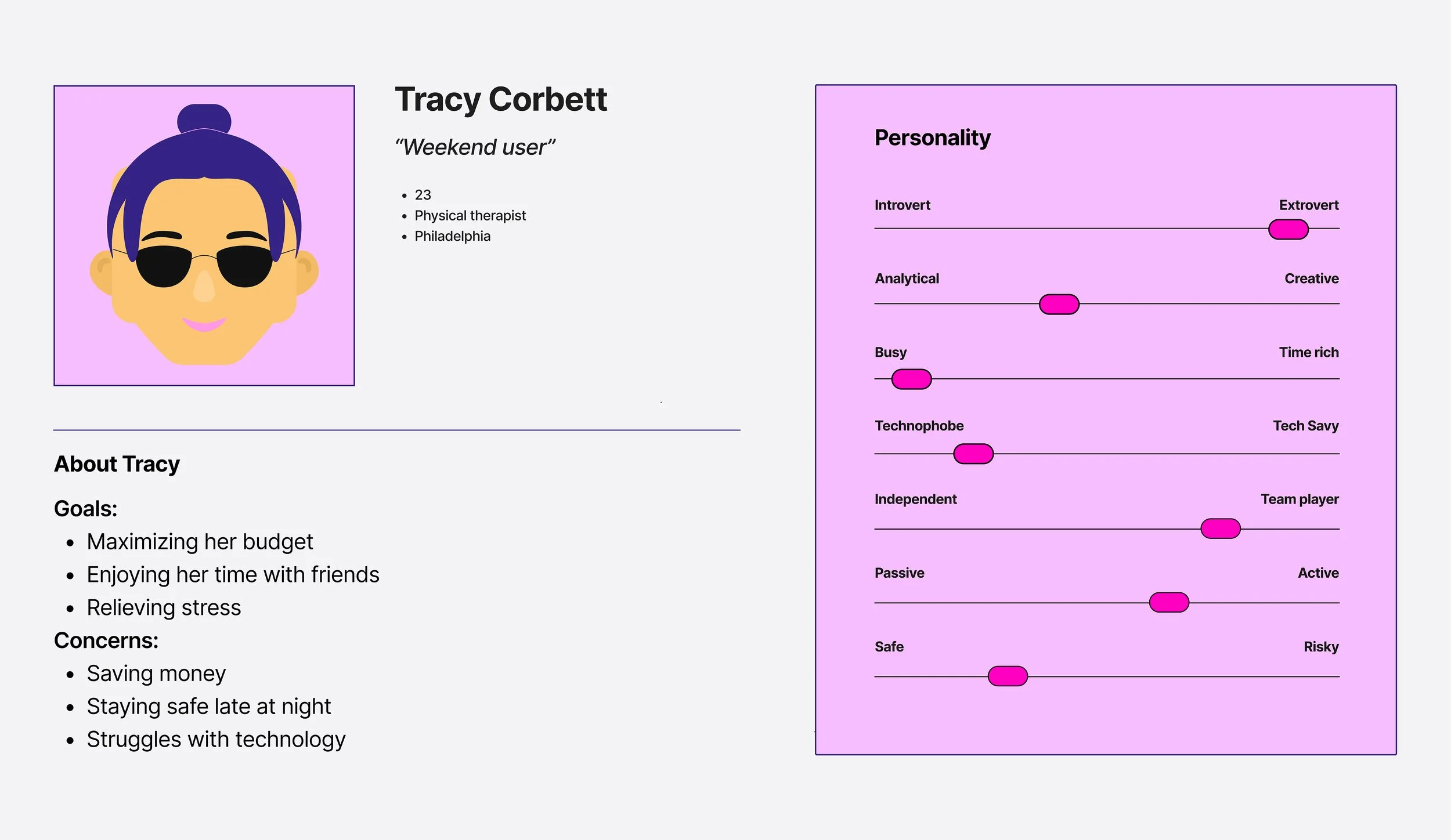
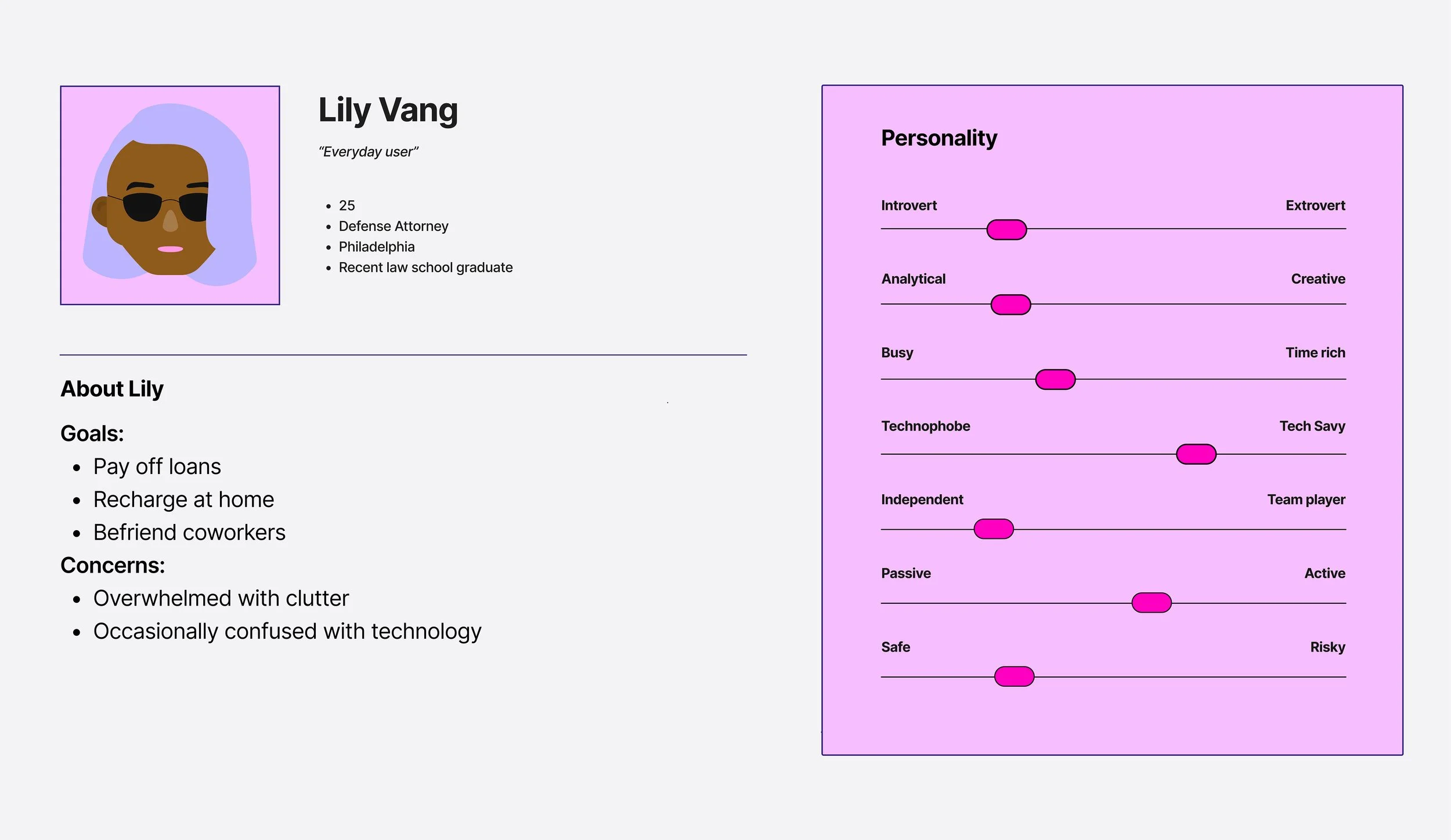
Personas
Based on our research, we developed three personas centered around their motivations for using Lyft, their frequency of usage, comfort level with technology, and budget constraints. By focusing on these factors, we felt we could represent the full range of individuals that would fall within our target audience.

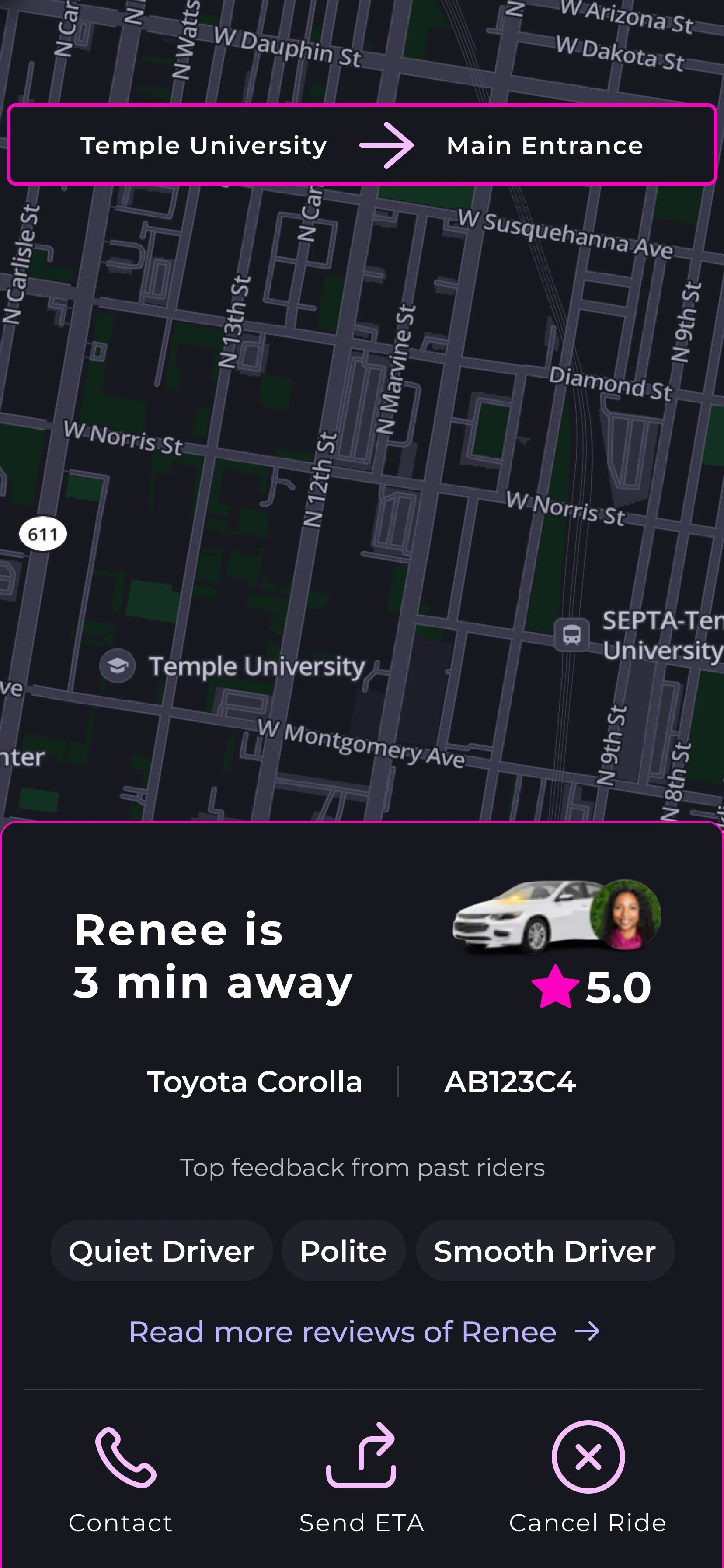
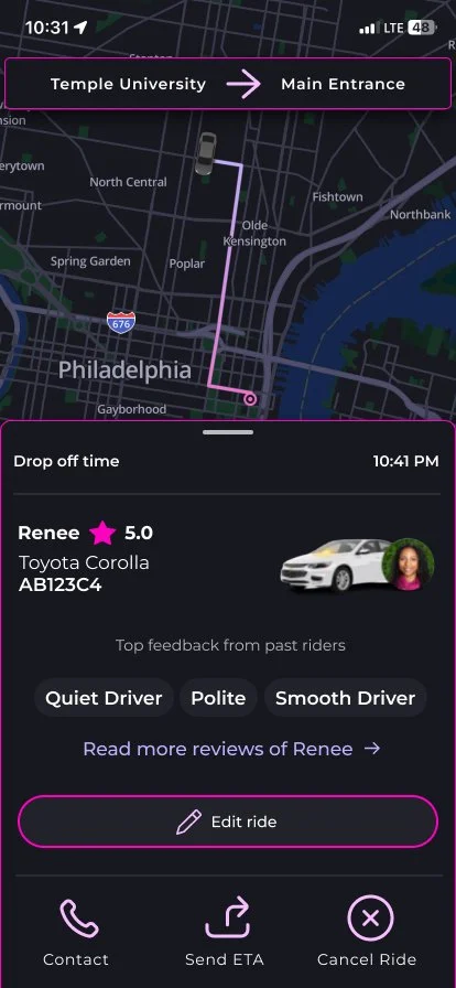
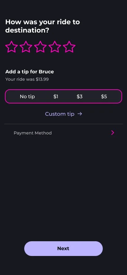
Concept 1
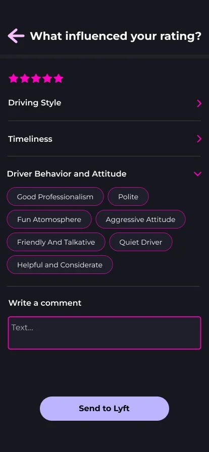
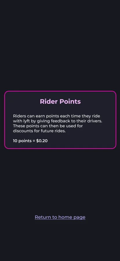
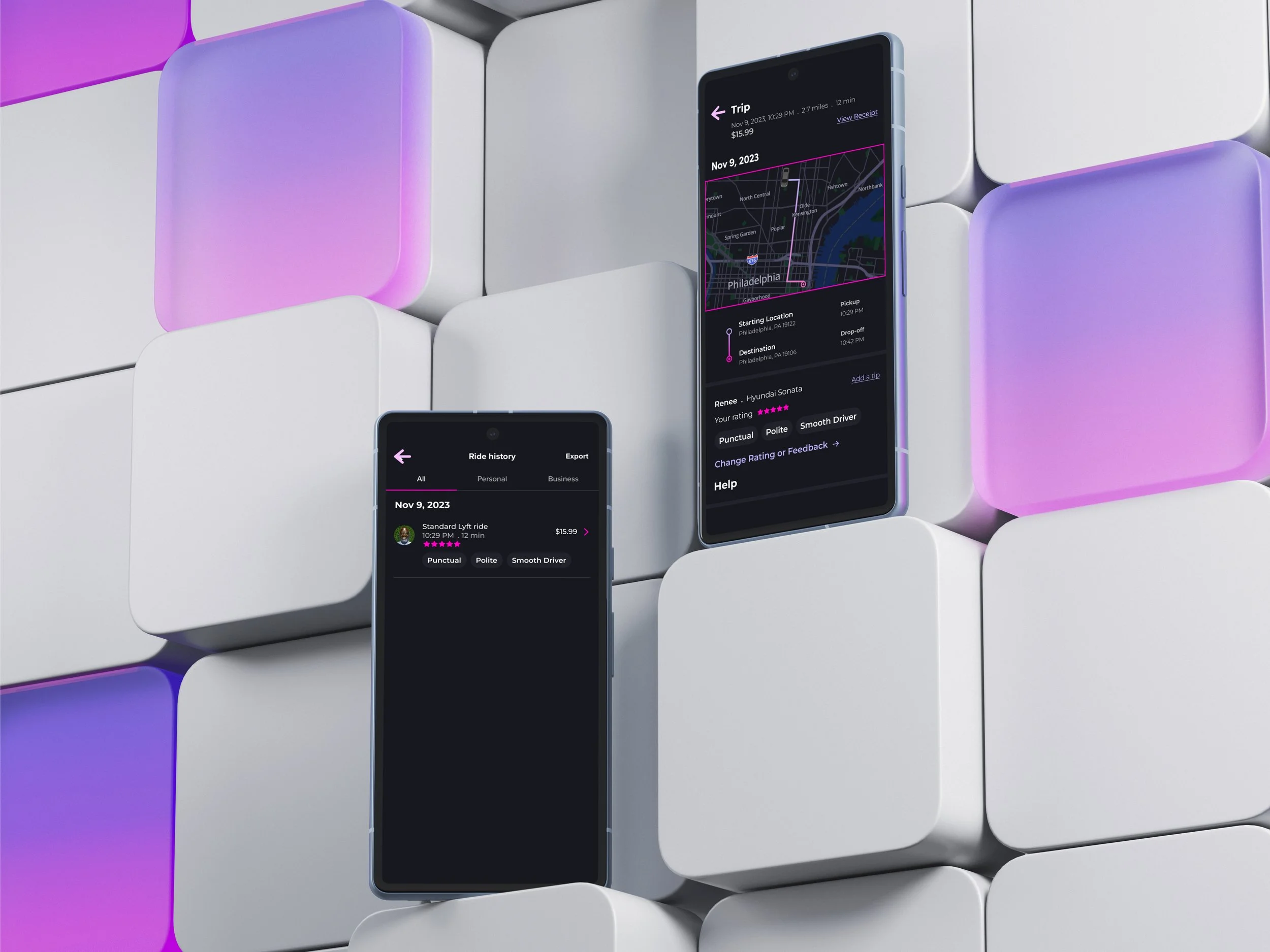
Improved Rating System
One area of Lyft we recognized could use improvement was its rating system. While our survey indicated that many users were indifferent toward the rating system, our interviews revealed a common sentiment that the current system felt useless and redundant since most scores were consistently similar.
Concept 1
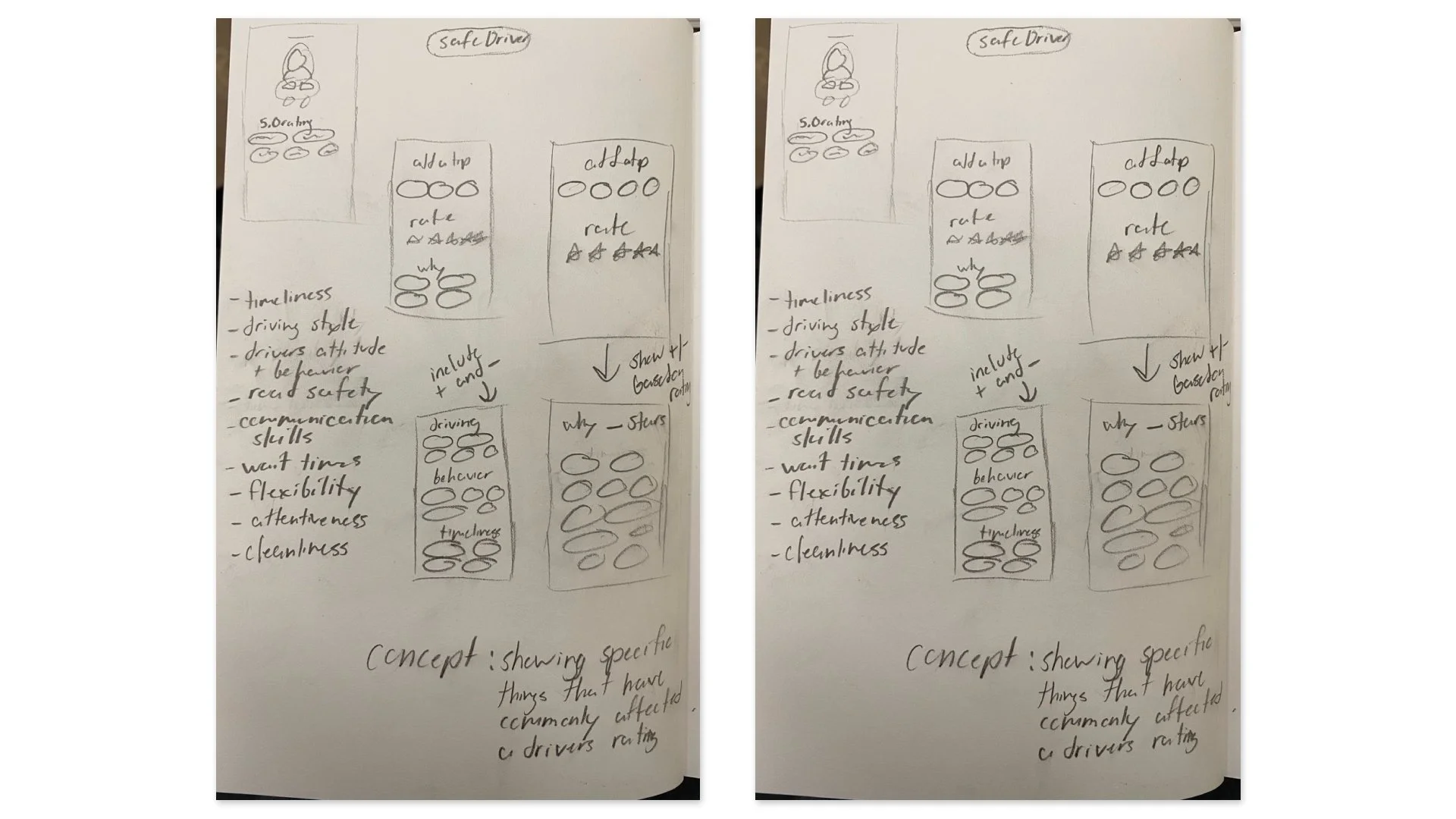
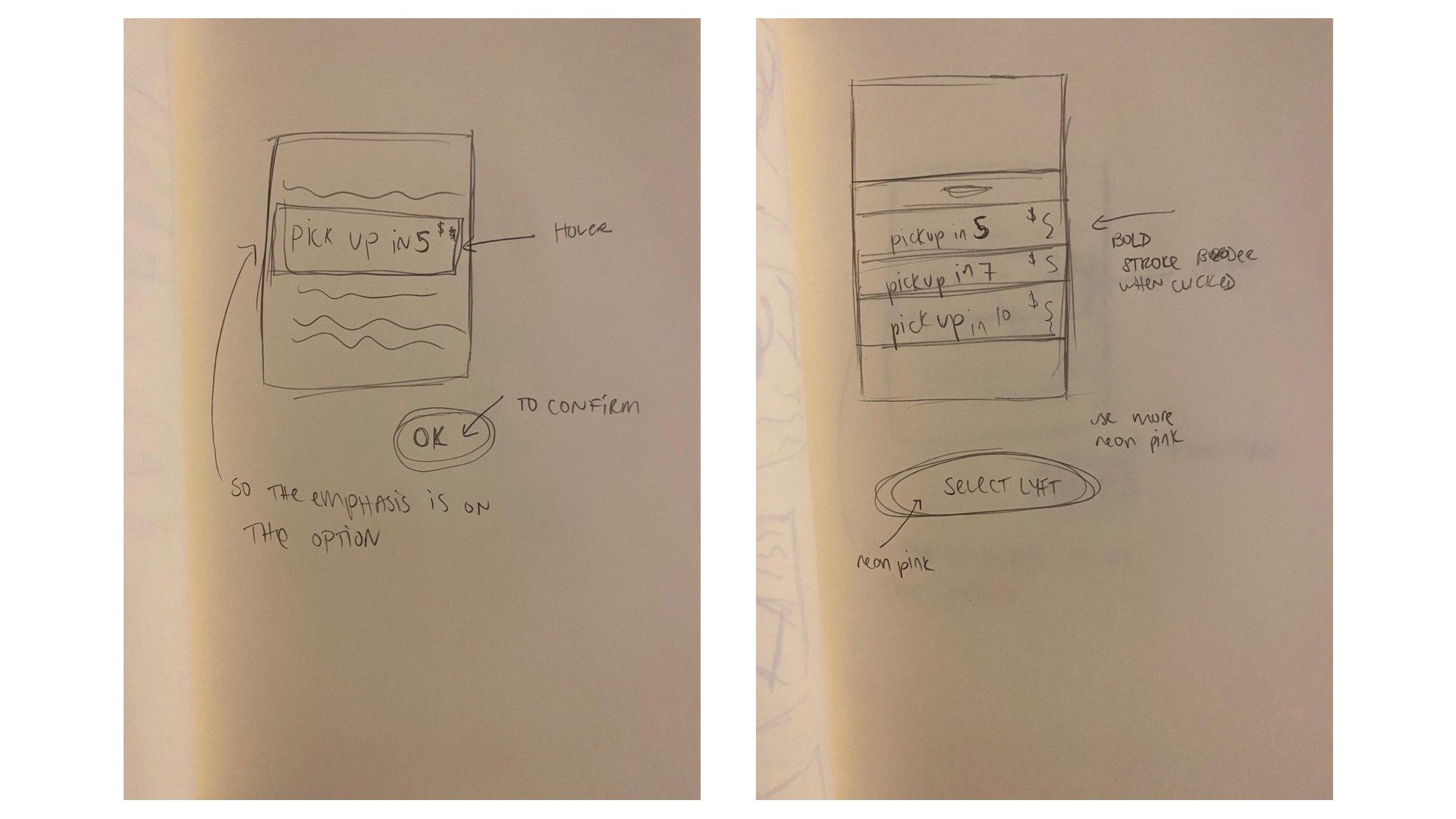
Sketches
We initially considered two ideas for improving the rating system: implementing a more detailed system for drivers and introducing gamification elements for riders. While both ideas held value, we ultimately moved forward with the first concept. We believed it would have a more significant impact on both riders and drivers.
Concept 1
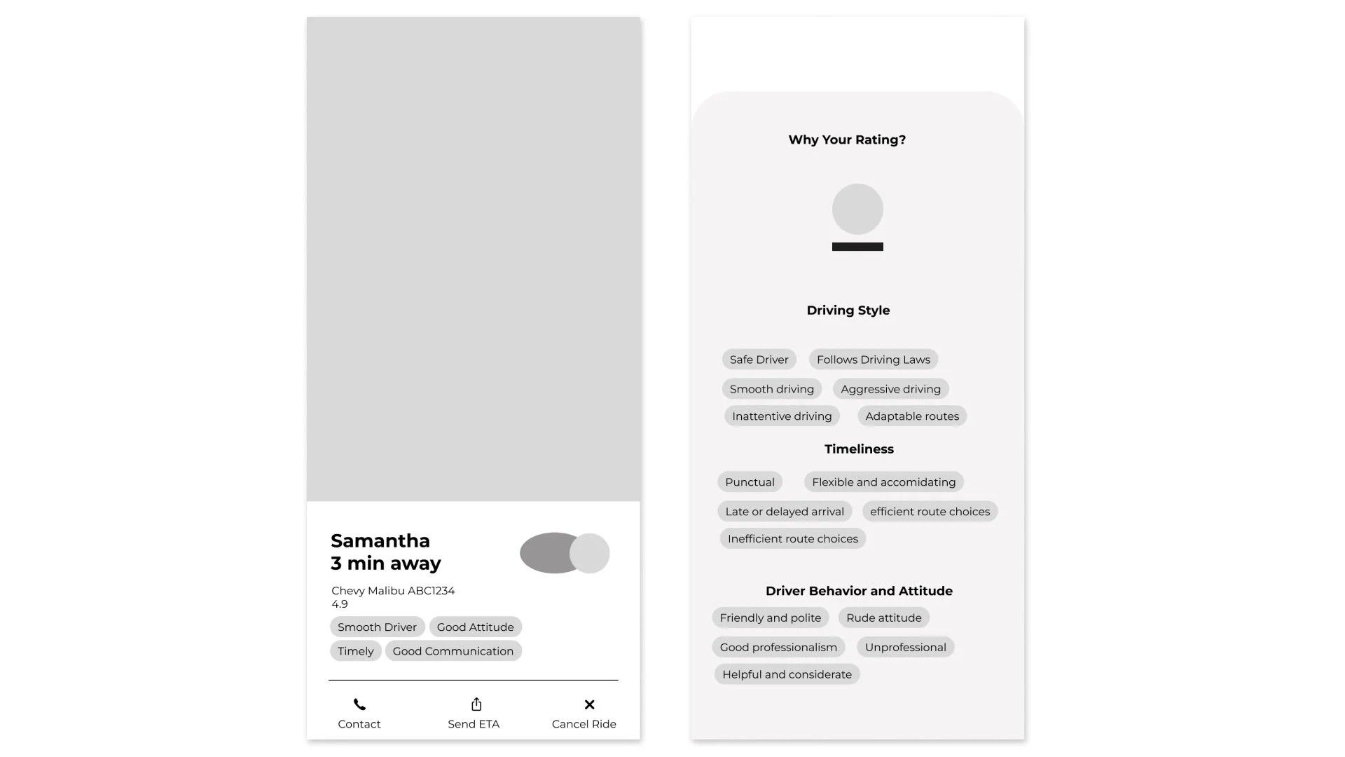
First Iteration Wireframes
In our first round of wire-framing, we included the basic screen that involved the rating system in some way such as the drivers’ profile, the actual rating screens, and past rides.
Concept 1
User Testing
Once we had working prototypes of all three ideas explored, we conducted user testing to hear their thoughts and figure out what could be improved. Before testing, we created a basic script to follow when conducting these tests to ensure everything flowed smoothly.
Concept 1
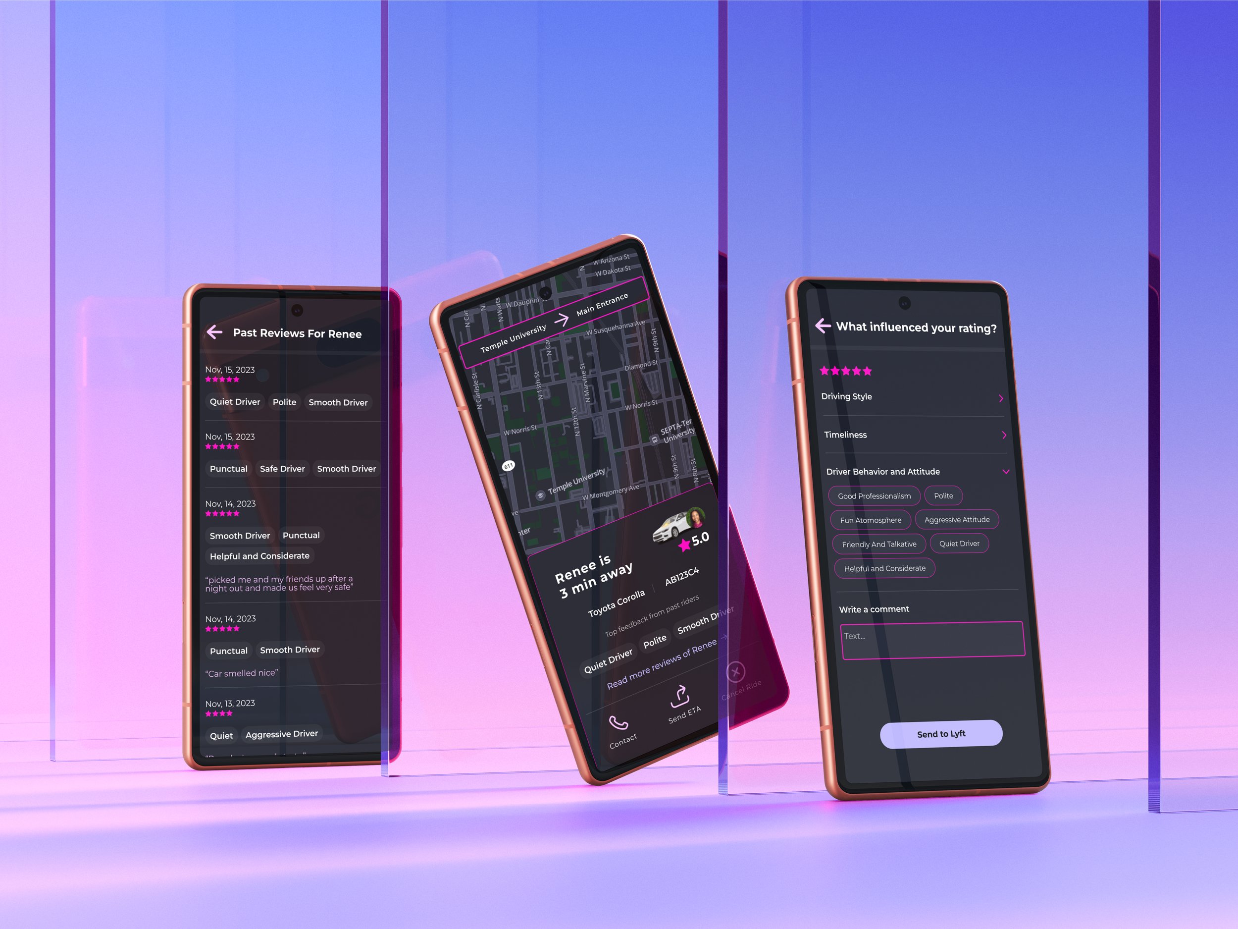
Second Iteration Wireframes & What Changed
-
Improved type hierarchy for readability, updated feedback design to match button style, added 'Read More Reviews' option, improved access to detailed driver information, adjusted license plate format for authenticity, optimized hierarchy and spacing for key information.
-
Enlarged touch space for buttons, integrated dropdown menu for easier navigation, added dedicated comment section, streamlined prototyping for Lyft submission, refined button wording and organization.
-
Positioned price and receipt option at the top, implemented dark mode with larger map and accent, updated feedback design for consistency, increased font size and used lighter color, amplified star size for prominence.

Concept 2
Improved Design
Another aspect of Lyft that we examined closely was its design. Initially, we assumed that Uber's popularity stemmed from its clean design. However, our research revealed a different story. We found that Lyft's use of color was perhaps the most memorable aspect of the app experience

Concept 2
Sketches
During our interviews, we noticed that despite the app's simple flow, users still felt it was cluttered. This feedback sparked two potential design directions: streamline the interface for a cleaner, more open feel, or go bold with a vibrant, eye-catching layout.
Concept 2
First Iteration Wireframes
We decided to blend both design concepts by introducing neon pink as a standout color to highlight selected states, helping them pop amidst clutter. This vibrant shade was a hit with users, so we extended its use across the app for a memorable touch. Along with the color update, we refined icons and text for clarity and increased the size of key icons and headings to improve overall usability.

Concept 2
User Testing
For this round of user testing, we selected participants with different levels of design knowledge to get a range of perspectives. While insights from designers were valuable, we prioritized hearing from the average user to better understand their experience and usability concerns.
Concept 2
Second Iteration Wireframes & What Changed
-
Despite our efforts, clutter remained an issue. To tackle this, we improved the visual hierarchy by using more color shades, ensuring consistent font sizes, and reducing stroke weight. We introduced more pink shades and increased purple usage.
-
We changed the secondary body text to light gray, creating the illusion of more space while maintaining the current font size.

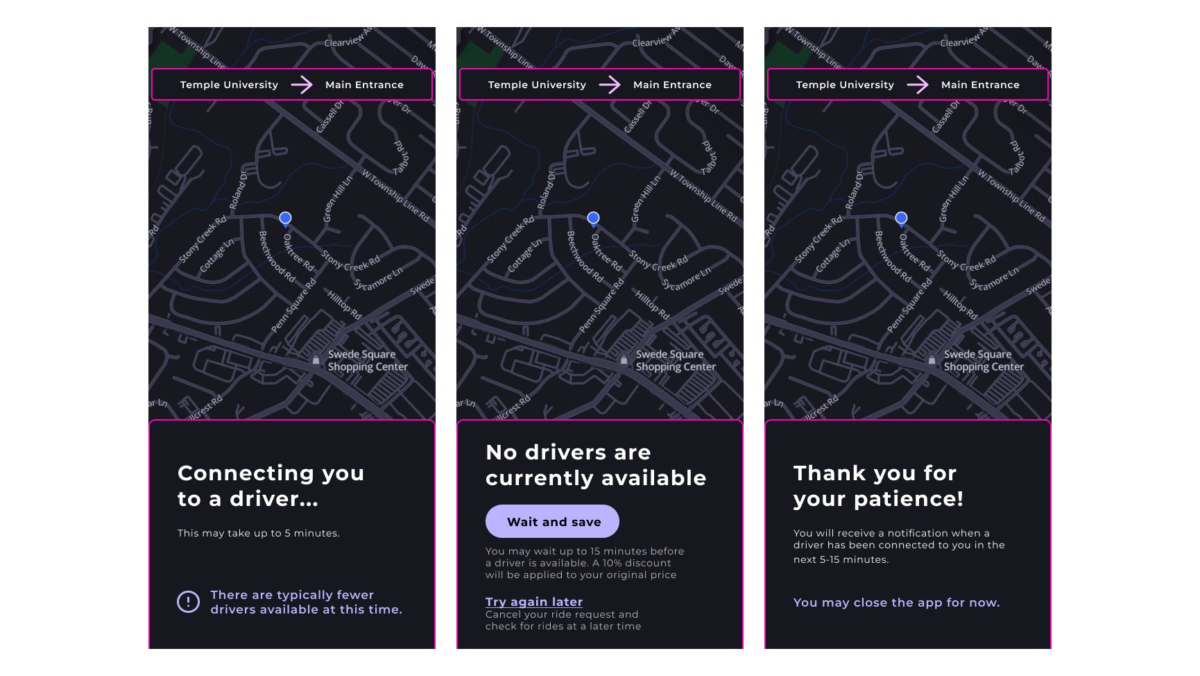
Concept 3
Improved Transparency
During our research, we consistently found that lack of transparency was a significant concern for users. People expressed frustration with issues such as long wait times, price fluctuations, and traffic delays, highlighting a clear desire for greater transparency.
Concept 3
Sketches
Transparency emerged as a key issue, especially when users faced long wait times or sudden price increases. While both were worth addressing, we found that wait times were a more consistent pain point based on our interviews and survey results.
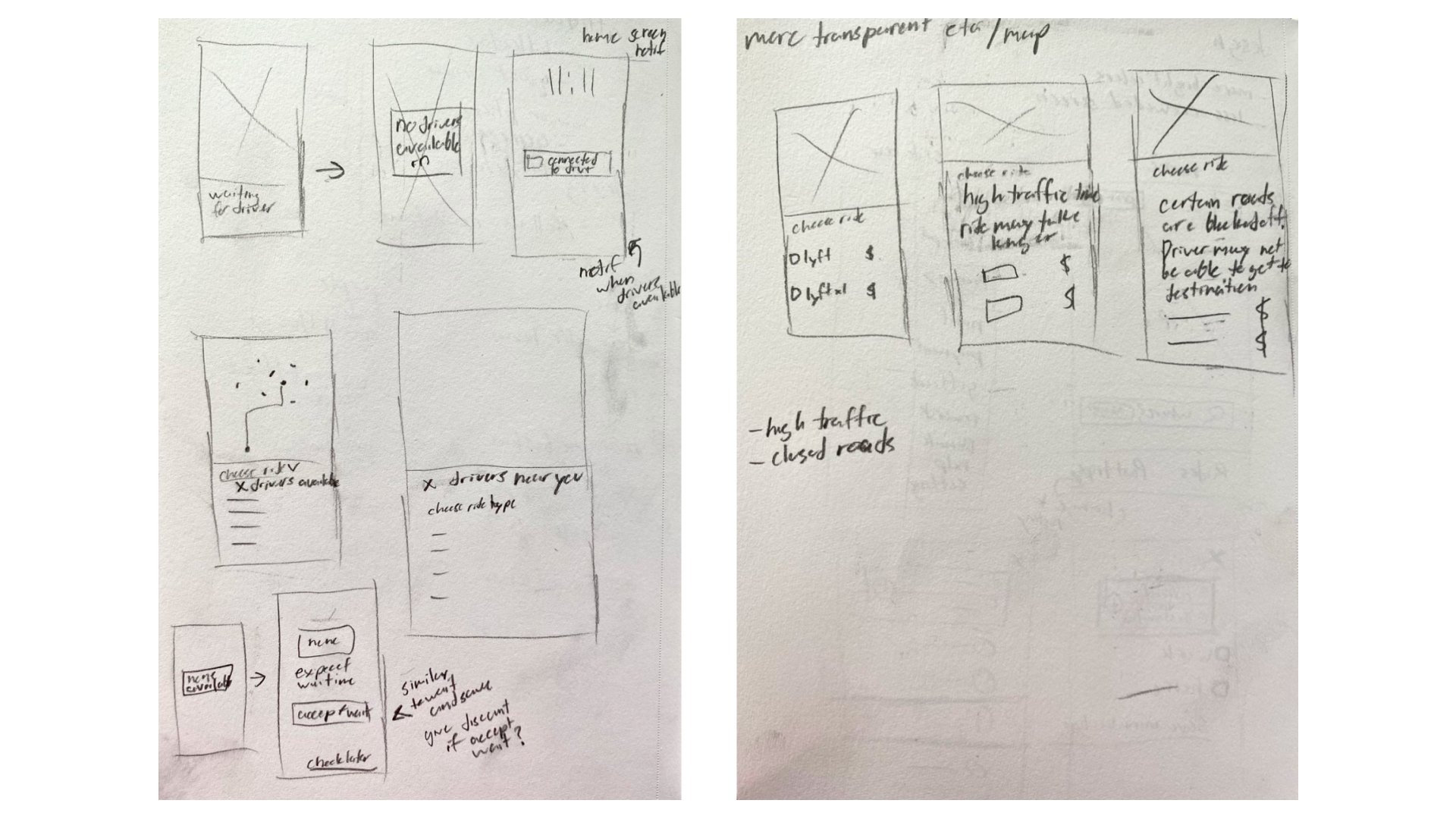
Concept 3
First Iteration Wireframes
For this section, we kept our prototypes simple compared to other concepts. We realized that improving transparency didn’t require additional screens or significant content—adding too much could actually make it harder for users to find the information they needed.
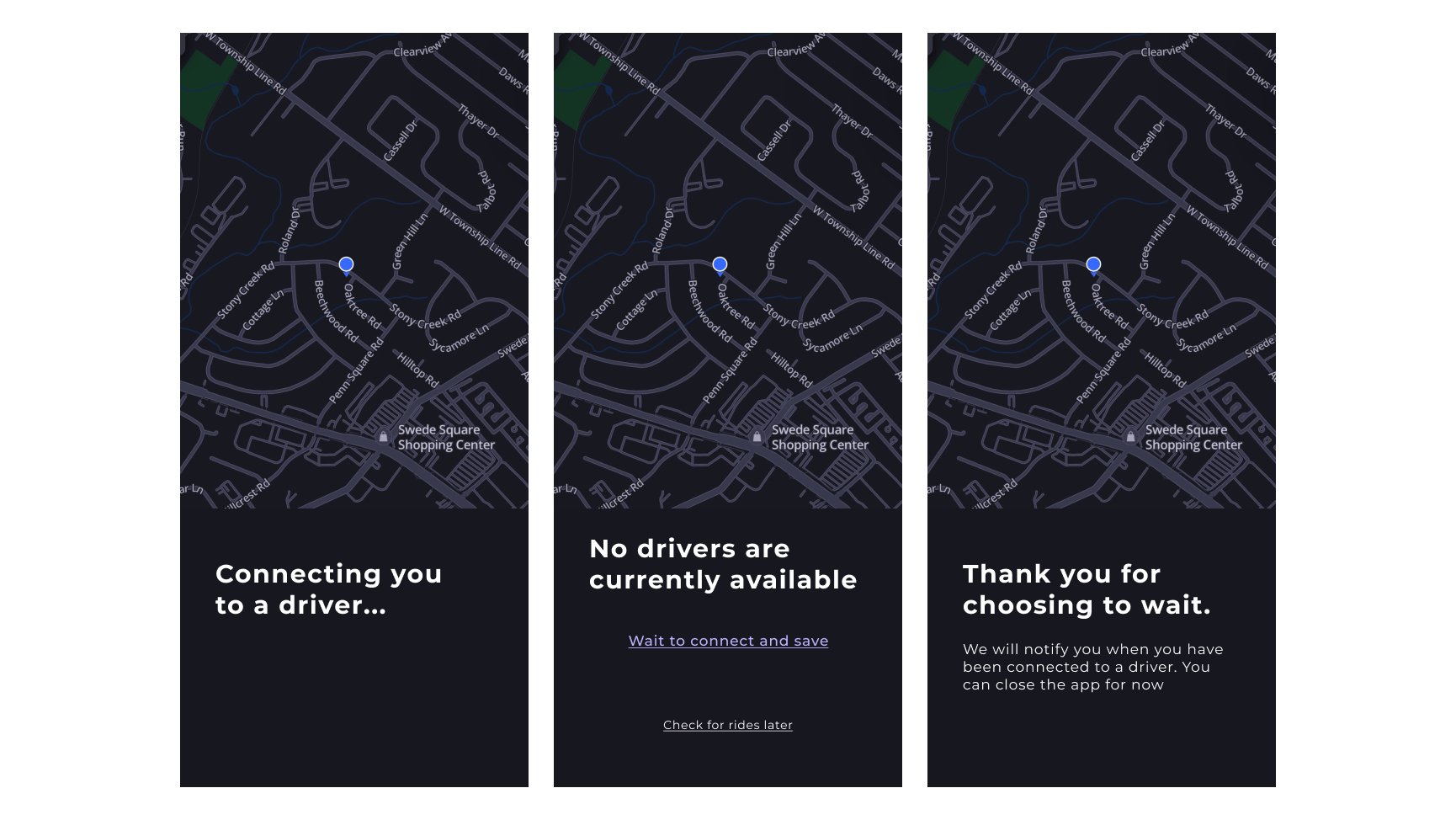
Concept 3
User Testing
For this section, user testing had a unique focus. We recognized that our designs fell short compared to other sections but weren’t sure how to improve them. Therefore, we planned two rounds of testing: first to gather feedback and identify missing elements, and then to refine the design based on those insights.
Concept 3
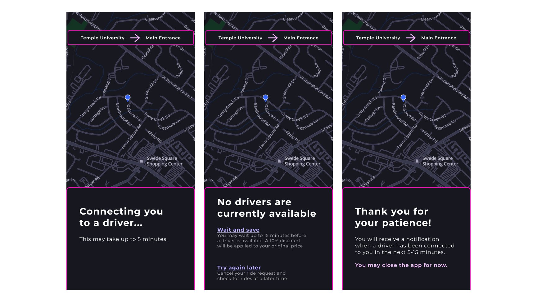
Second Iteration Wireframes & What Changed
-
Our testing confirmed that participants wanted more content on the page and highlighted several areas of confusion. In response, we updated the screens by refining the style and adding more text to address the questions raised.
-
We also added more buttons to guide users and encourage interaction with the updated pages.
Concept 3
Follow-up User Testing
Due to the section's initial underdevelopment, we conducted a second round of user testing to assess progress. As anticipated, there were areas needing improvement. Participants still lacked trust in the first screen and expected to experience prolonged wait times. Additionally, the second screen lacked the desired hierarchy between the different interactive elements.
Concept 3
Final Wireframes & What Changed
-
Now, regarding wait times, we've added clearer information to help users understand what to expect and why delays might occur. Additionally, we've included more details on other screens to address points of confusion identified during testing.
-
We incorporated the primary button design on the middle screen to enhance usability by establishing a clearer hierarchy.
-
Lastly, adding more content allowed us to integrate more design updates from Concept 2, enhancing visual excitement and creating a more complete feel for the pages. This helped users feel like there was content they were missing
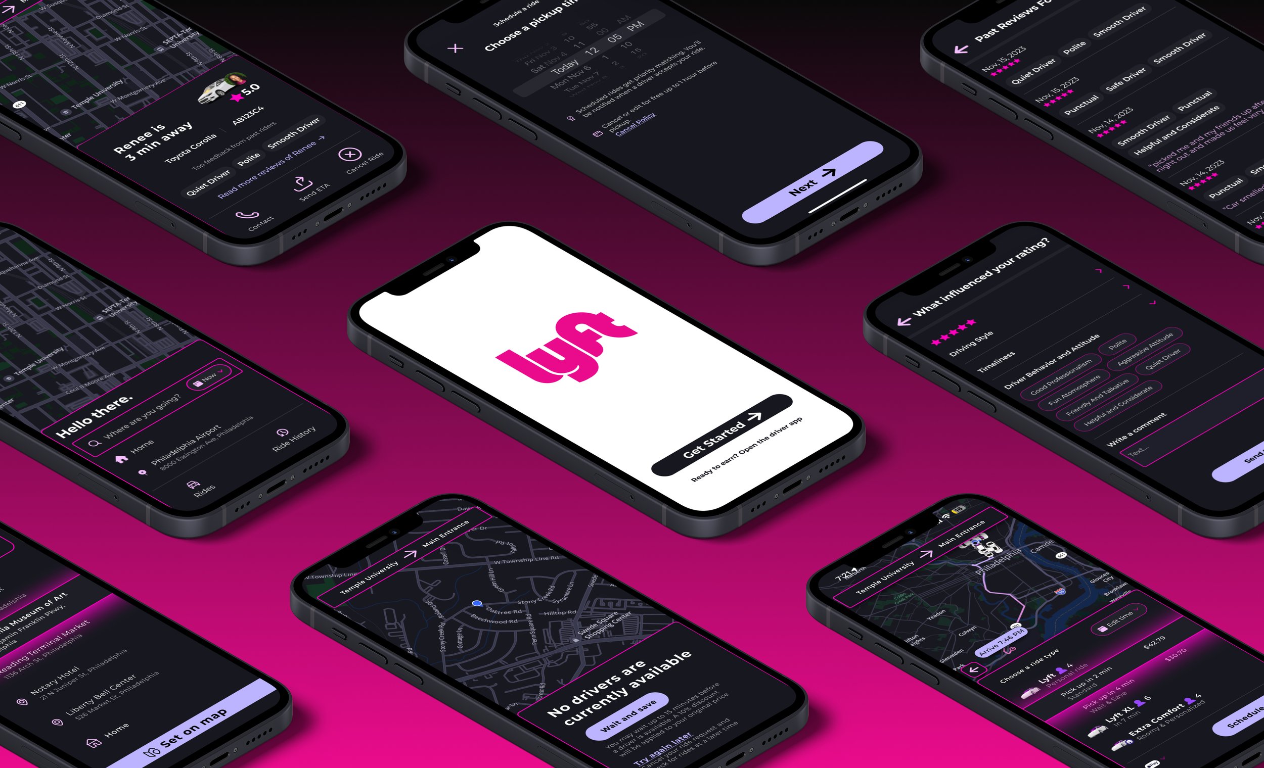
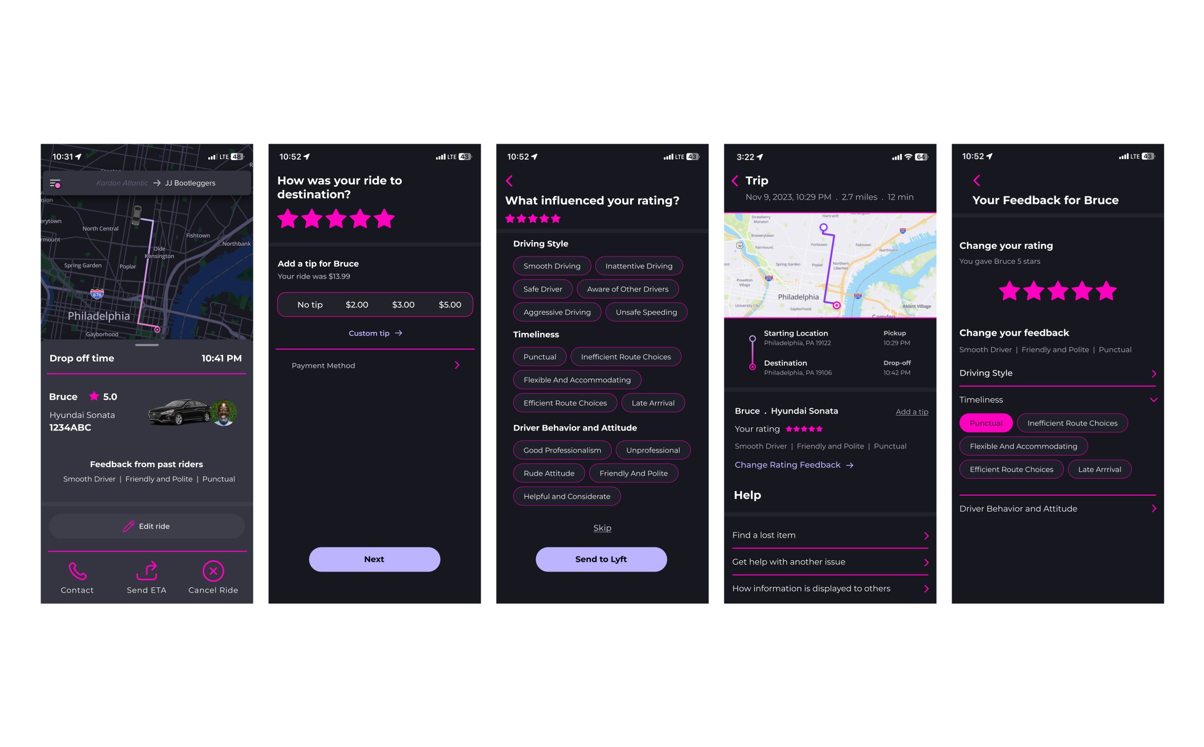
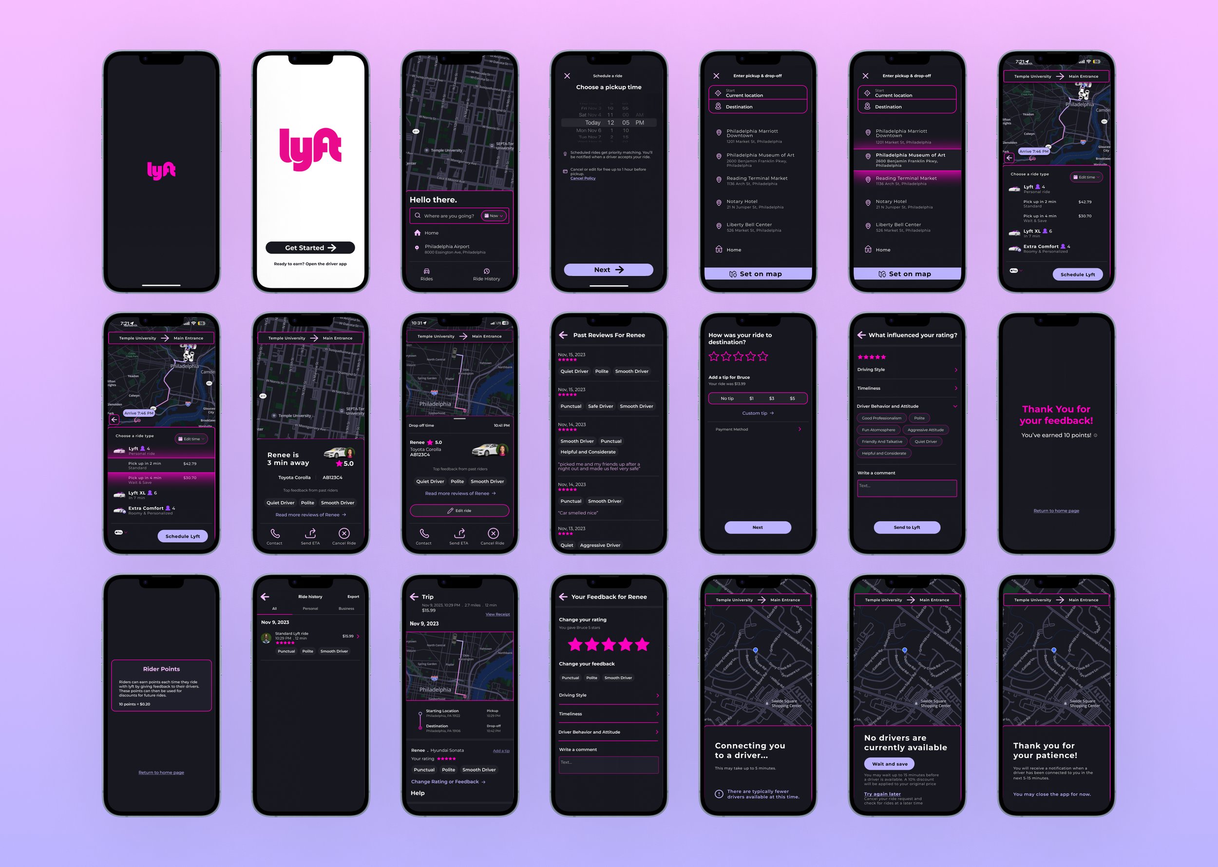
Final Screens
Conclusion
In this project, we prioritized research, a shift from my usual approach to design. I developed valuable skills in user research, including effective survey and interview techniques to obtain unbiased results. I also improved my ability to manage schedules, balancing interviews with project timelines.
This experience enhanced my data analysis skills, enabling me to identify patterns and extract meaningful insights.