Horatio B. Hackett Website
Project Overview:
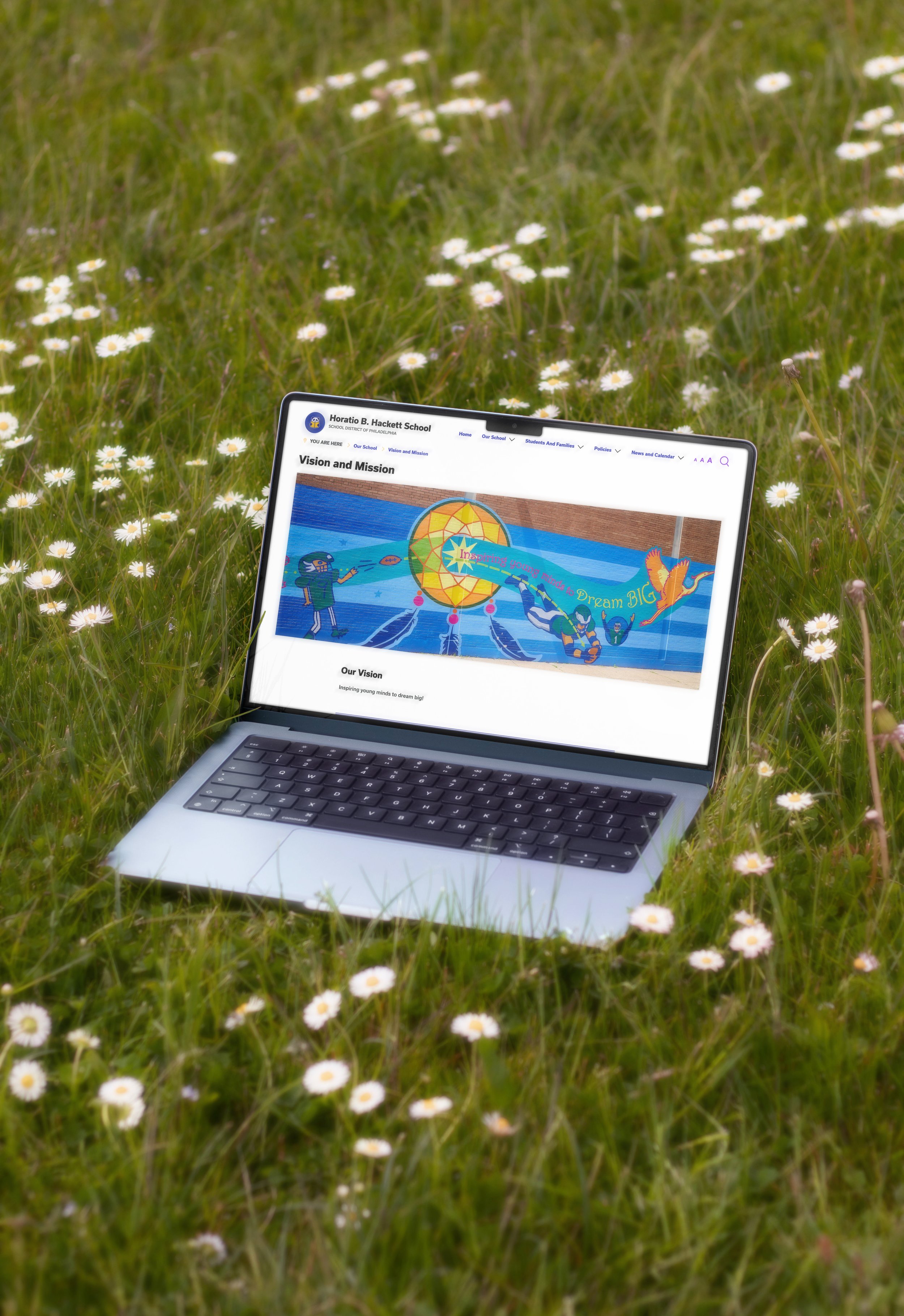
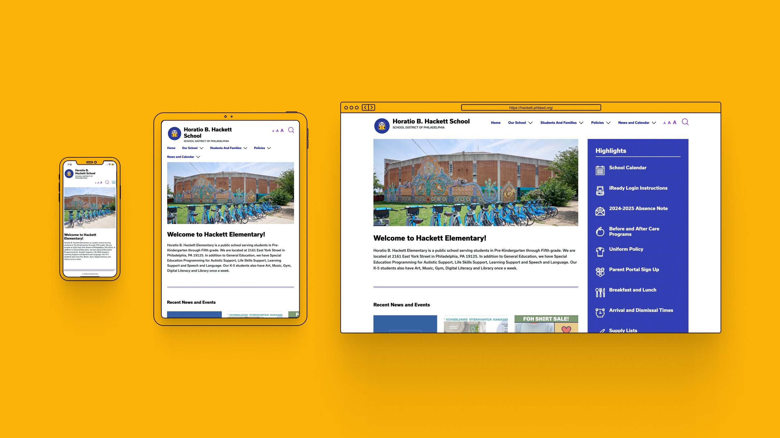
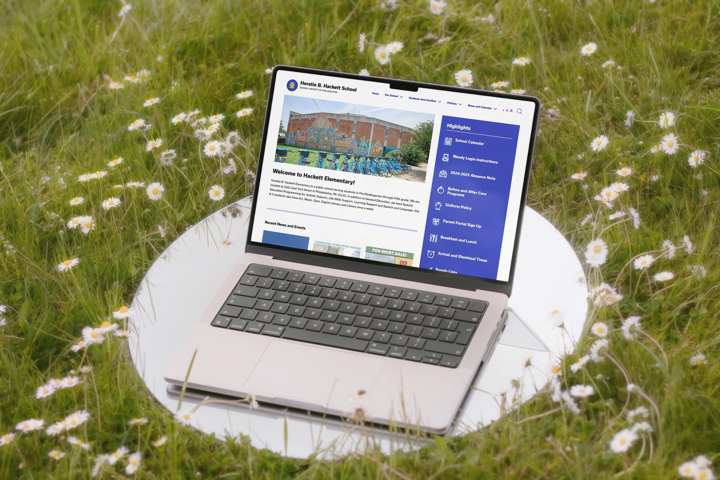
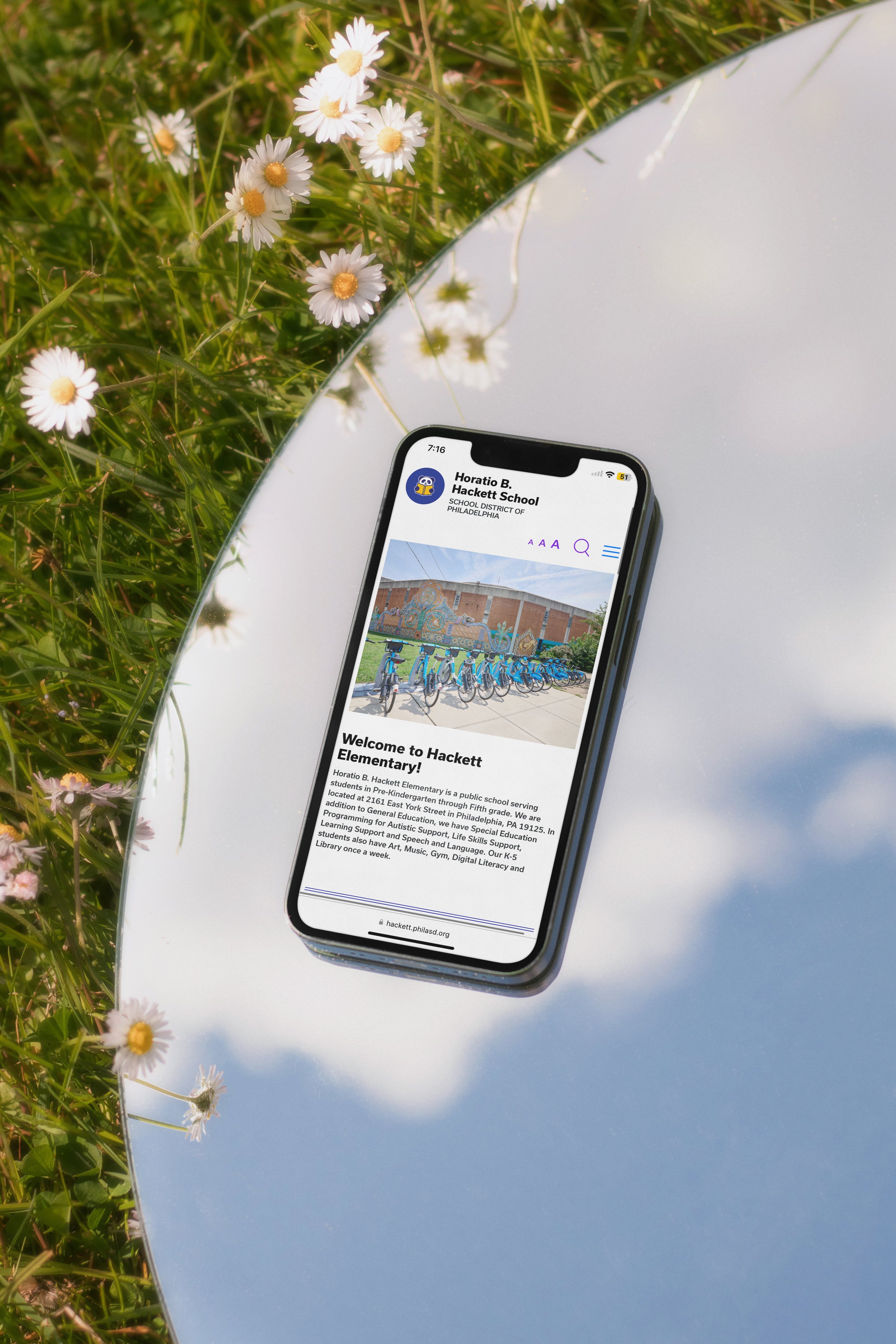
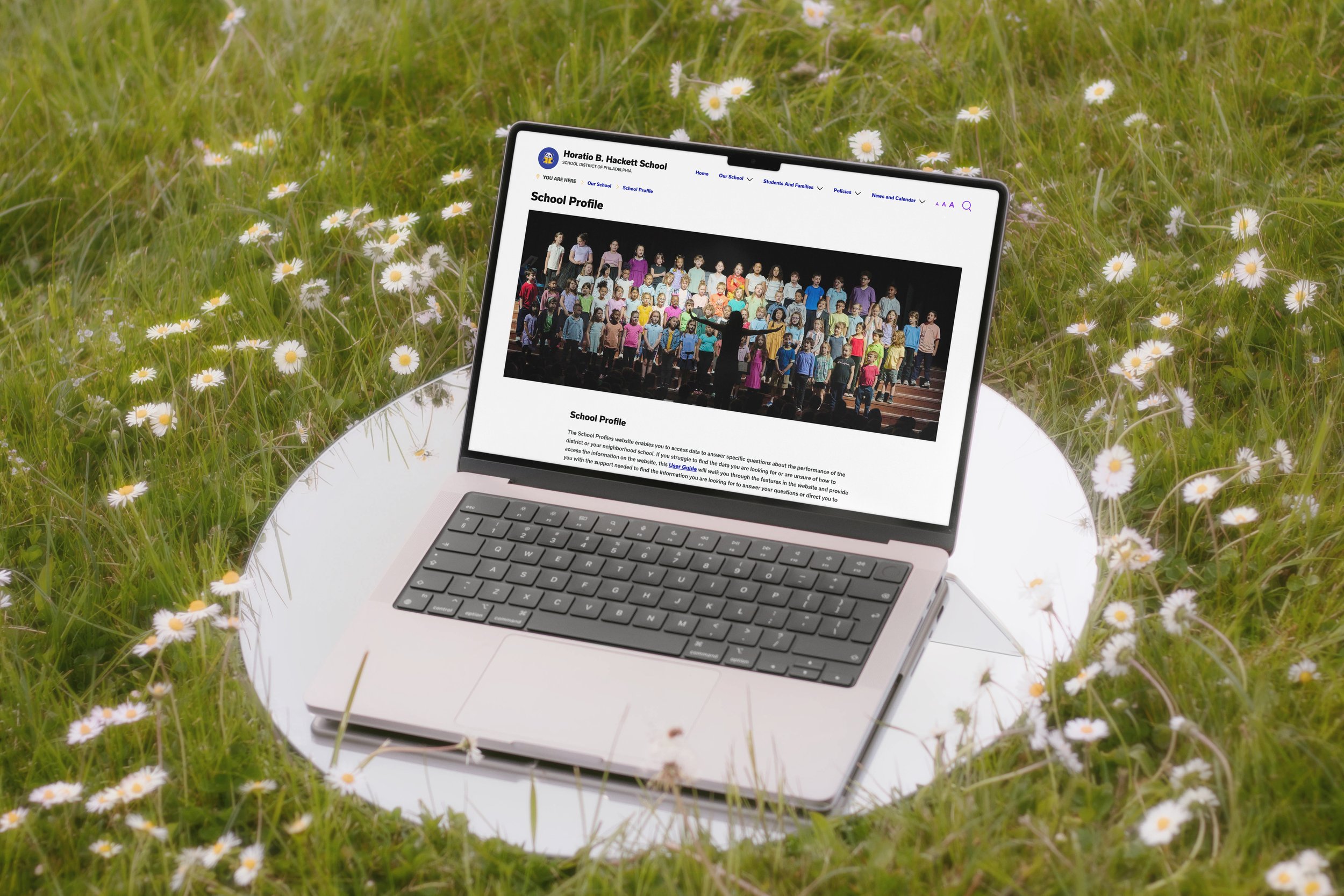
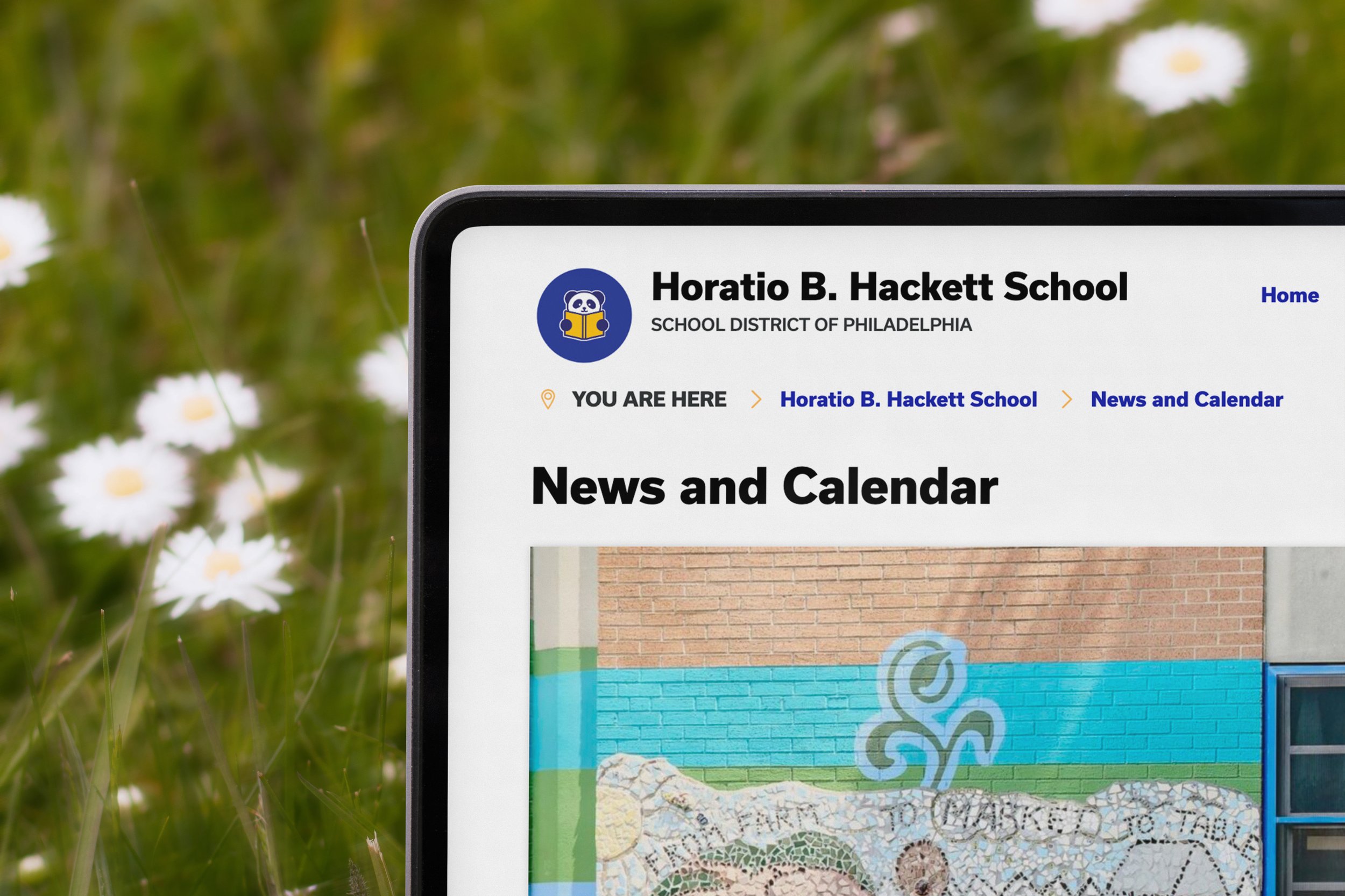
In the summer of 2024 I had the opportunity to work as a Contract Web Designer for Abby Ryan Design, where I created and led the design of Horatio B. Hackett Elementary School’s new website. This project focused on creating a cohesive design system that followed accessibility guidelines to improve user experience. Additionally, I designed a set of new logos to match the new design system while maintaining the schools core identity.
The final deliverables included a responsive and visually engaging website, a comprehensive design system, and an updated primary logo with accompanying logo variations that reflects Horatio B. Hackett’s mission and values. This case study highlights the creative process, challenges, and solutions that led to a successful outcome
Client Overview:
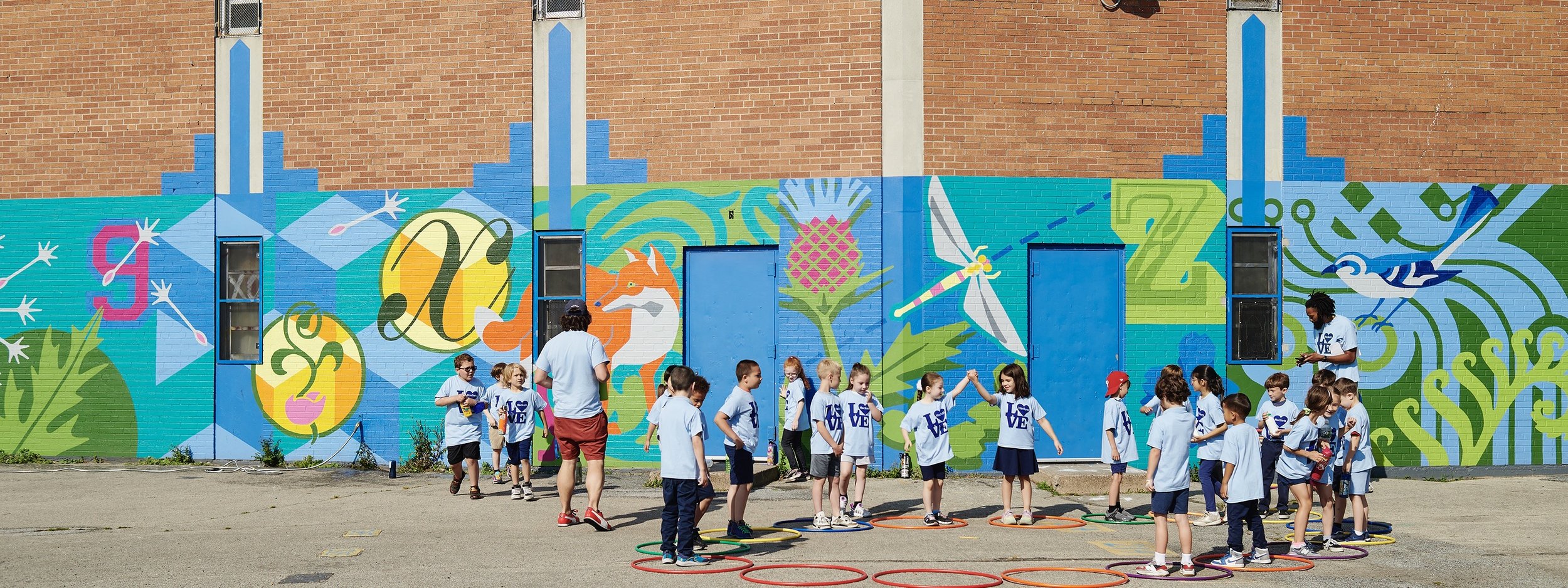
The client for this project was Horatio B. Hackett Elementary School. Hackett Elementary is a Philadelphia public school located in Fishtown. The school's mission is: "We are committed to providing our culturally diverse population a positive, safe, respectful, and supportive environment where all children will gain the knowledge to become lifelong learners and model citizens."
Project Goals:
The primary objective was to deliver a fully functional, dynamic website that met the standards of the Philadelphia school district while elevating the school’s online presence.
Initially, the school relied on a minimal, single-page website with a few essential links as a temporary solution. This project aimed to transform that into a comprehensive, multipage platform that would become an indispensable resource for students, families, and staff.
My Roles and Responsibilities
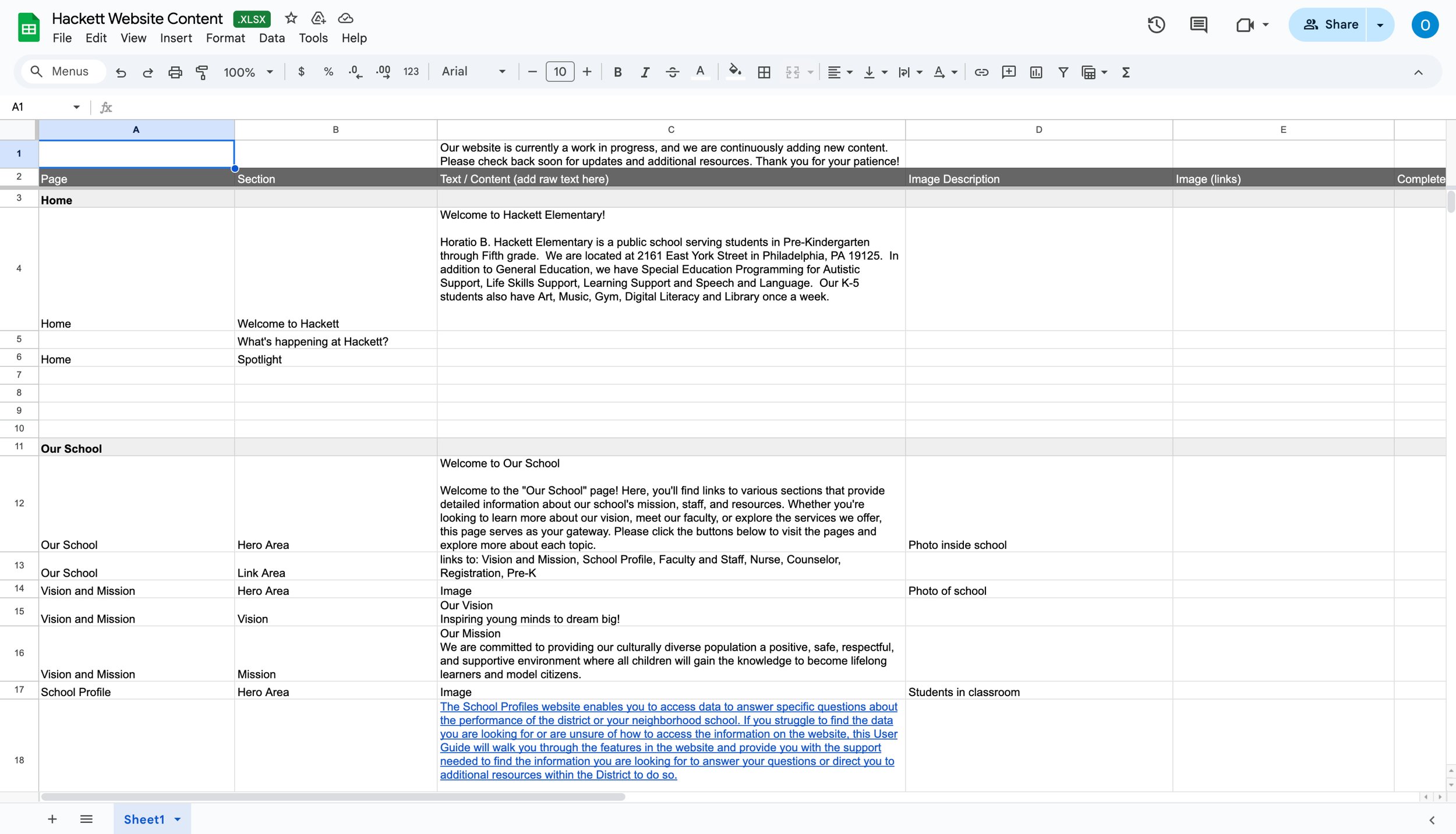
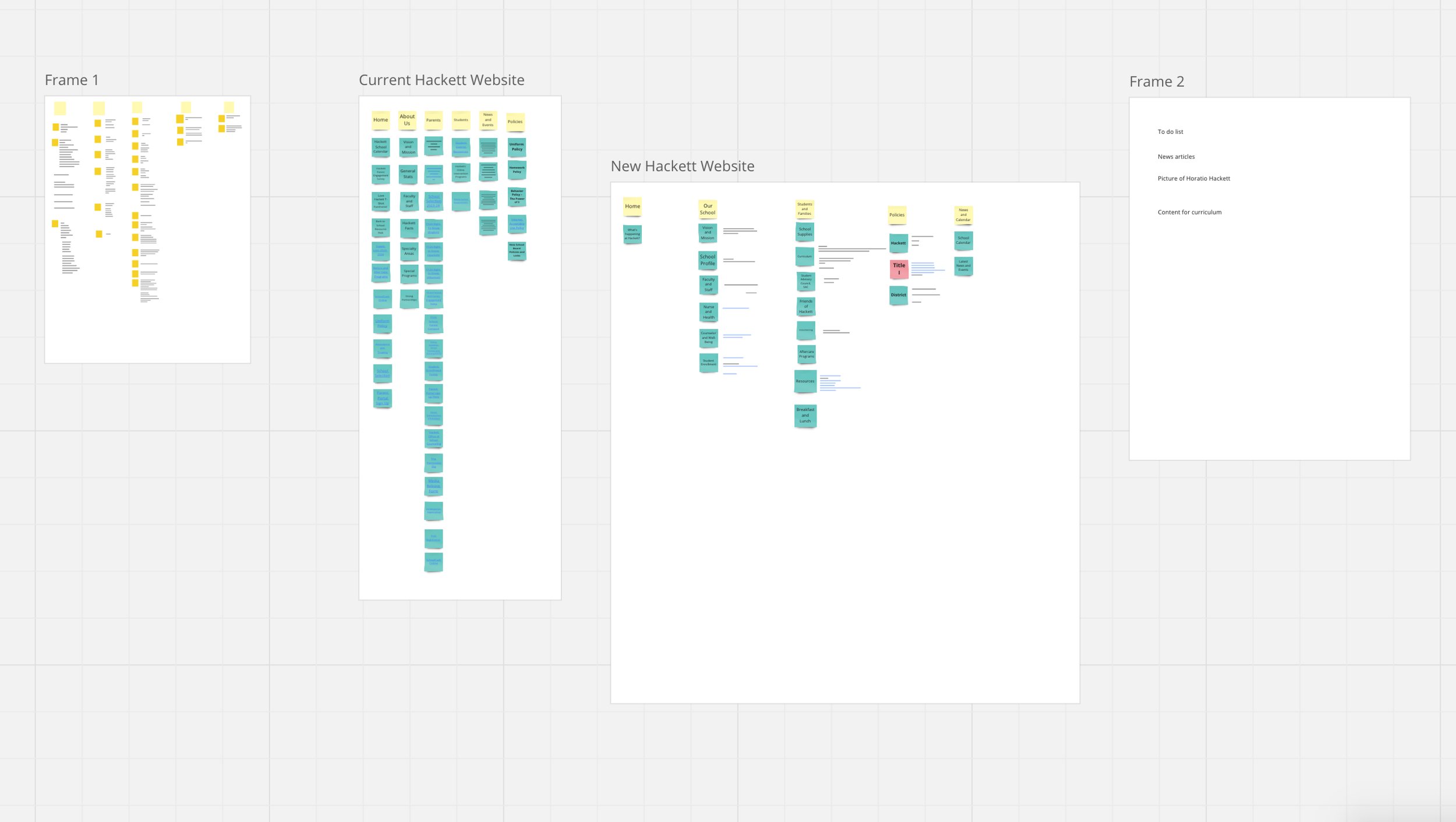
In this 40-hour contract, I designed the website’s overall look and feel, working within the school’s existing WordPress platform. My responsibilities included creating a cohesive design system, redesigning the logo to align with the brand, and building the site on WordPress. I used Miro for the sitemap and Excel to organize the site’s written content, ensuring a streamlined and efficient process.
The Design System
Typography and Colors
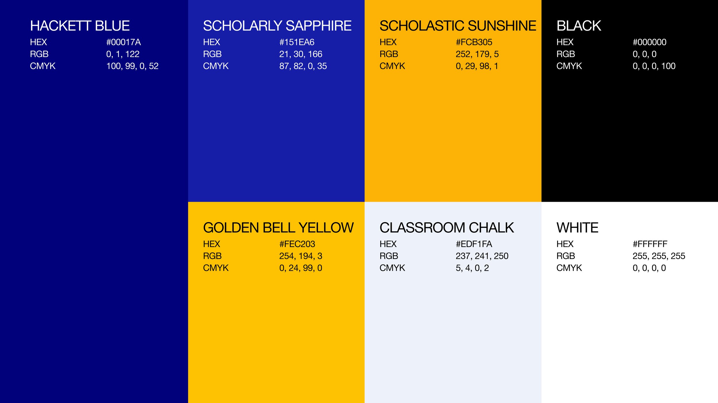
The website design uses a blue and orange color palette inspired by the school’s official colors, navy and gold. For typography, Bio Sans semibold, was carefully selected to complement the typeface used in the "Friends of Hackett" logo, ensuring cohesive branding across all Hackett-related materials.

UI Components
Primary buttons feature a yellow/orange color gradient, adding a youthful touch to the site. Secondary buttons and other interactive elements use the same orange as an outline around the element. This approach ensures a consistent experience through color while providing good contrast when primary and secondary buttons appear together.
Additionally, buttons include icons that reflect users' actions after clicking them.
Internal Links: Arrow Circle Right Icon for navigation within the site.
External Links: Alternate External Arrow Icon for navigation outside the site.
Downloads: A Download Icon for opening downloadable documents.
Logo Development
Research and Ideation:
I began my research by discussing the project with Abby and examining the Friends of Hackett logo. I aimed to create a logo that aligned with the existing design without being identical. I analyzed the font used, the round elements in the logo, and how the panda was incorporated.

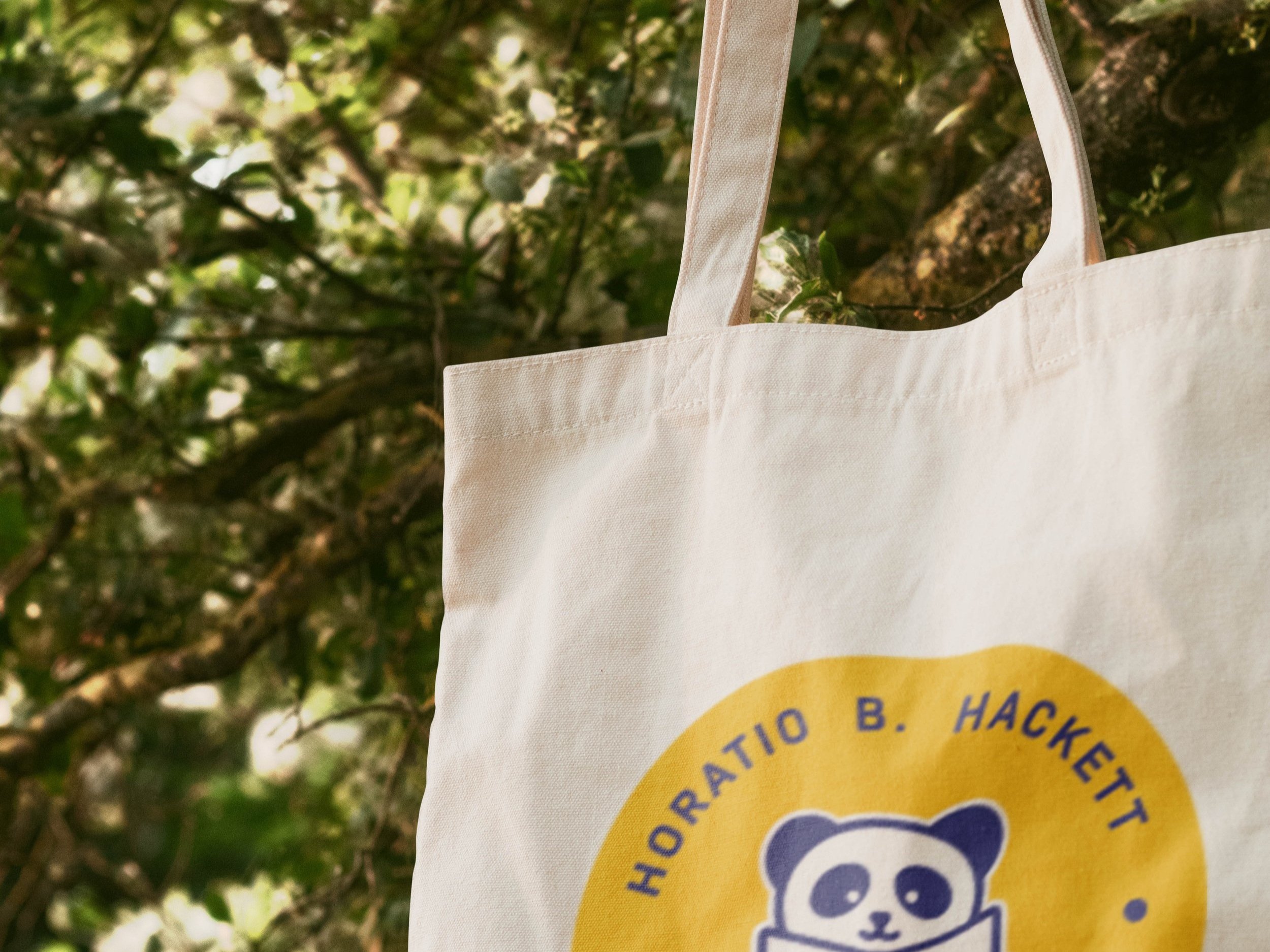
To maintain cohesion, I decided to use the same font but styled the panda differently. While the Friends of Hackett logo featured an adult and baby panda, I thought it would be engaging to play with that idea by using a young-looking panda to represent the young students at the school. This approach aimed to create a logo that not only reflected the brand identity I was developing but also resonated with the student body.
Additionally, I ensured the logo incorporated the school colors. For versatility, some logo variations included a white outline. This design choice was made to ensure readability in instances where the logo needed to be displayed over a background color that did not pair well with the primary design.

Finished Design


Reflection
What I Learned
This was my first project after graduating, and it challenged me to adapt to real-world constraints. Unlike previous work in Figma, this project required translating designs into functional implementations within WordPress, balancing creative goals with platform limitations. I learned to adjust my approach when creative freedom was restricted and am proud of the solutions I developed.
Future Improvements
If I could revisit this project, I would refine the design system to better align with the pre-built WordPress posts page, which I discovered too late to adjust. Initially, I created a custom posts page but decided to keep the built-in version to avoid potential SEO or functionality issues. In future projects, I will thoroughly explore platform constraints early on to prevent similar challenges.
