Adaptive Interfaces:
A Study in Responsive Design for Optimal User Experience
This senior thesis project delves into the principles of responsive design, focusing on how to create a website that seamlessly adapts to different screen sizes, delivering an optimal experience across all devices.
Instructor: Jason Kernevich
Project Year: 2024
Content

Why a travel booking platform? To build this project, I needed to choose a topic for content. Based on my personal experiences and observing how others approach travel, I knew that multiple devices are often used throughout the process, making it ideal for exploring responsive design.
Participants involved in the research, along with myself, could explain why they use specific devices, leading to valuable insights into when and where responsive issues arise.
Research
I followed a research approach similar to what I had used in previous UX projects. The main objective for this part of the project was to understand how people book travel and the technological issues they encounter. At this stage, I was less focused on responsive design and more on user behavior. I conducted basic research into popular travel platforms and apps to better understand the options available to users.
Survey
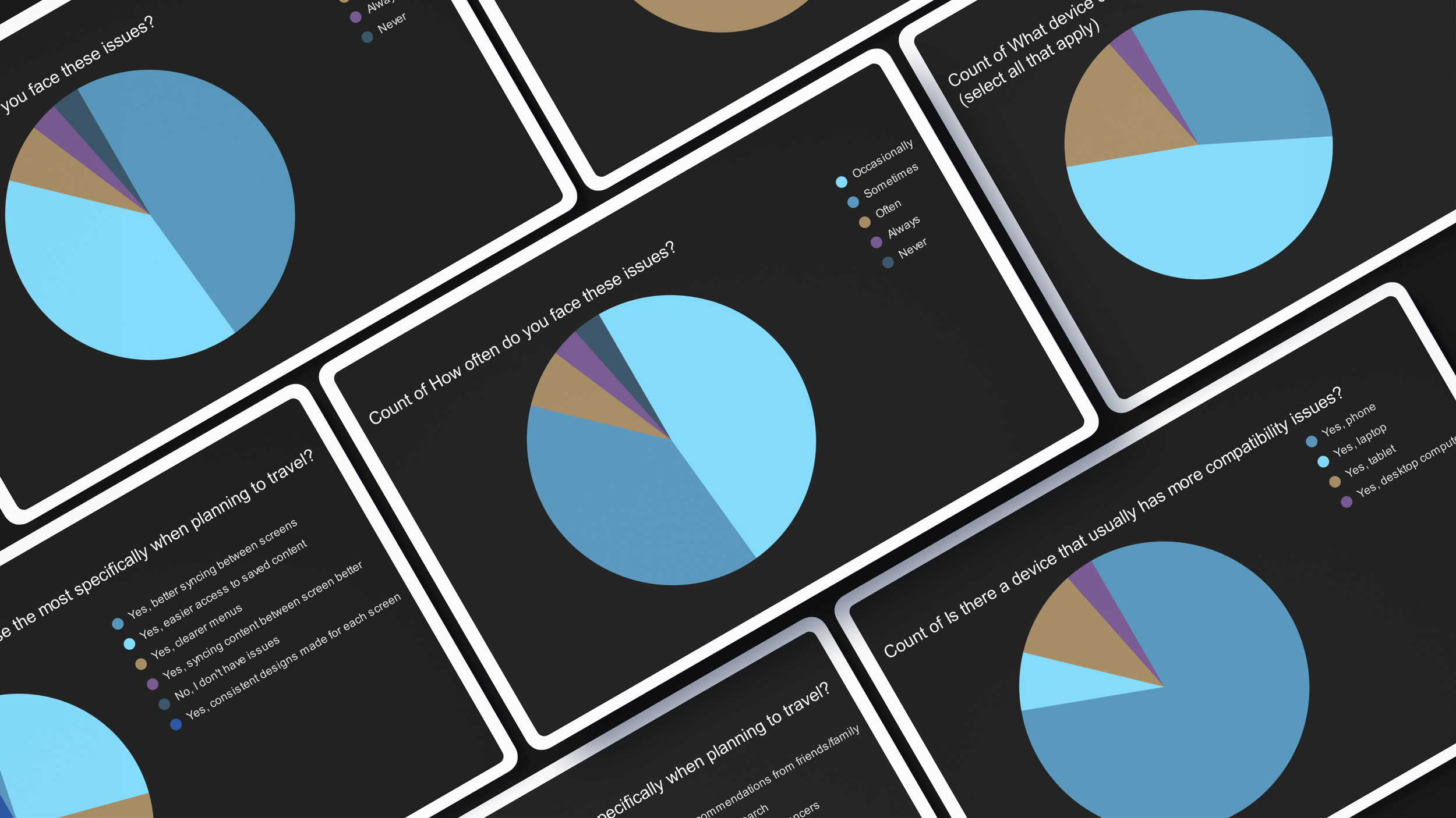
I released a survey on social media to collect data on how people travel. Since I wanted quantitative data at this stage, I only included multiple-choice and scaled questions to make the survey easier for participants to complete. The survey was available for 24 hours, during which 33 people completed it.
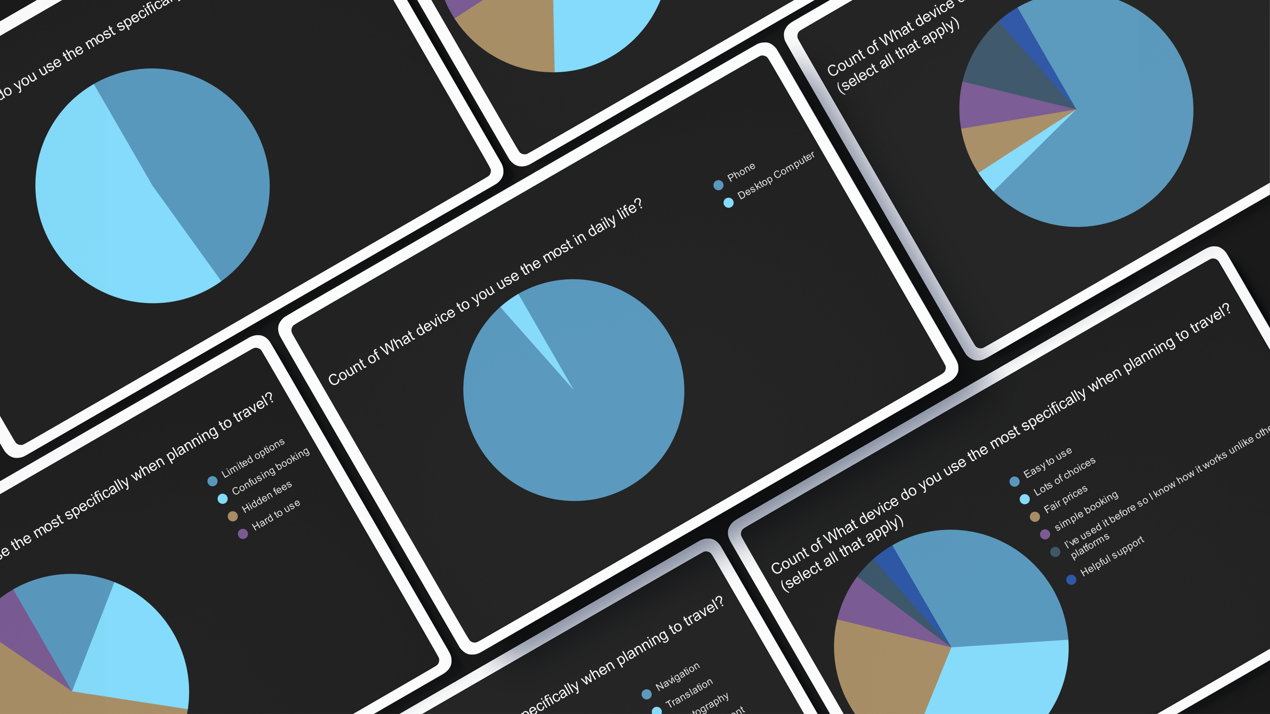
This survey allowed me to better understand the motivations, pain points, and behavioral patterns of the target audience. It also confirmed a key assumption I had going into this project: people use multiple devices when booking travel.
Interviews
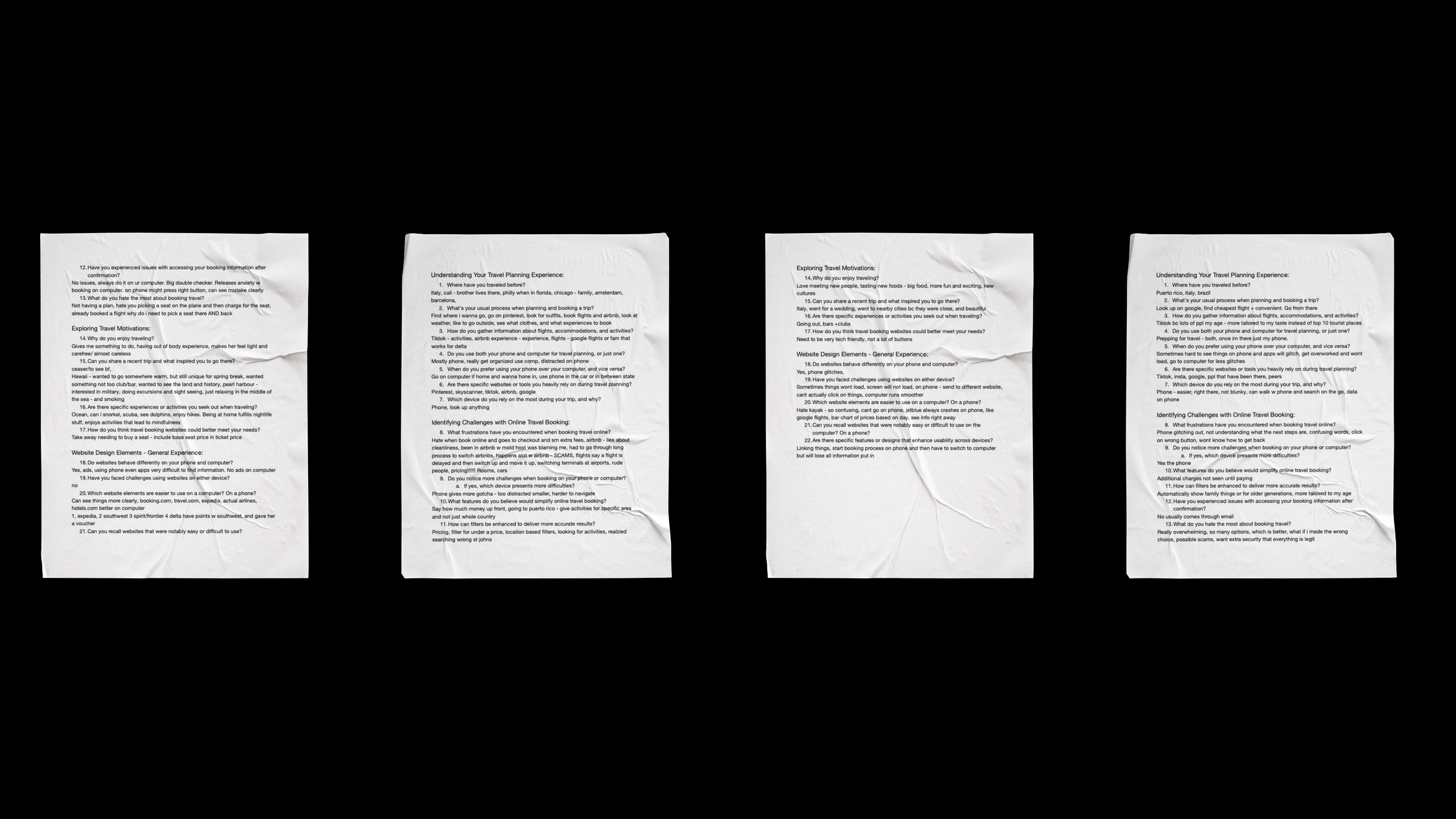
I chose to conduct interviews because I wanted more qualitative, detailed information to follow up on the survey takeaways. Interviews allowed participants to lead the conversation, especially if they had a major pain point they disliked or a platform they particularly loved. At this stage, I was primarily focused on understanding how responsive design, good and bad, affected their process.
Another key reason for conducting interviews was that none of the participants had a design background. The interviews gave me the opportunity to reword questions and explain what responsive design really entails.
Design Process
Typography
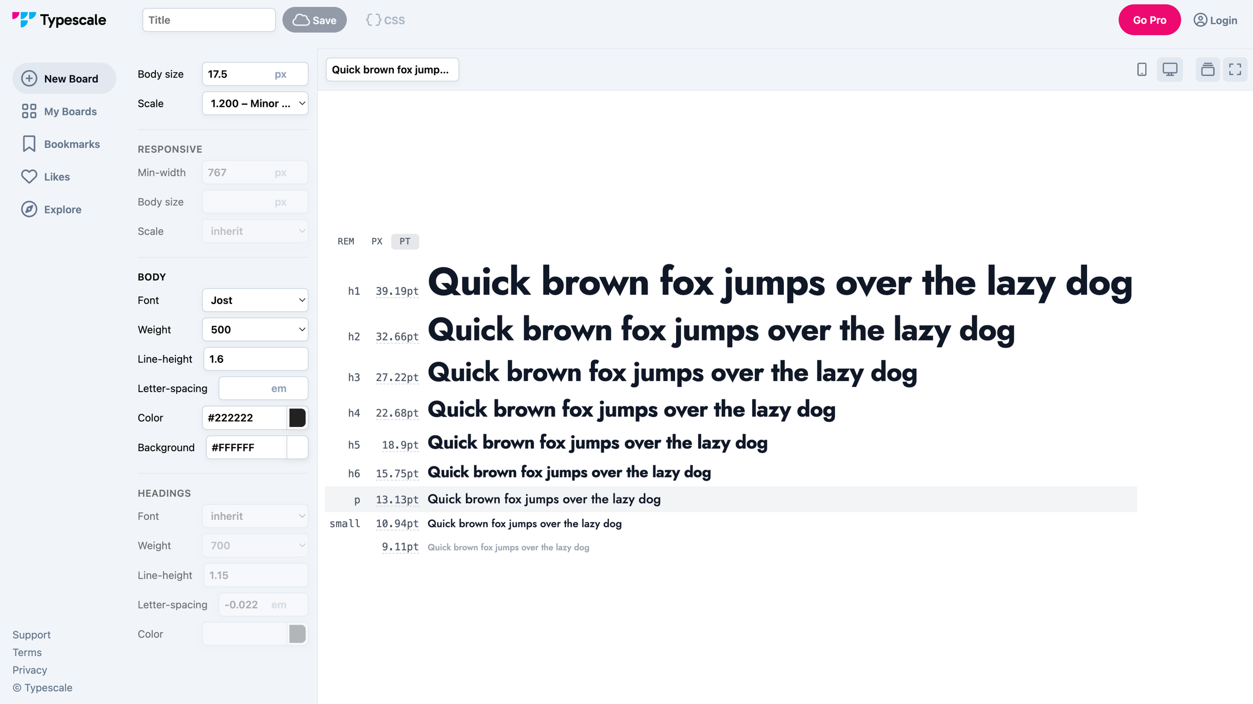
Using Typescale, I created two text styles—one small and one large—based on the major third scale. I selected the font Jost for its readability, cheerful aesthetic, and refreshing, contemporary feel.
Color Palette
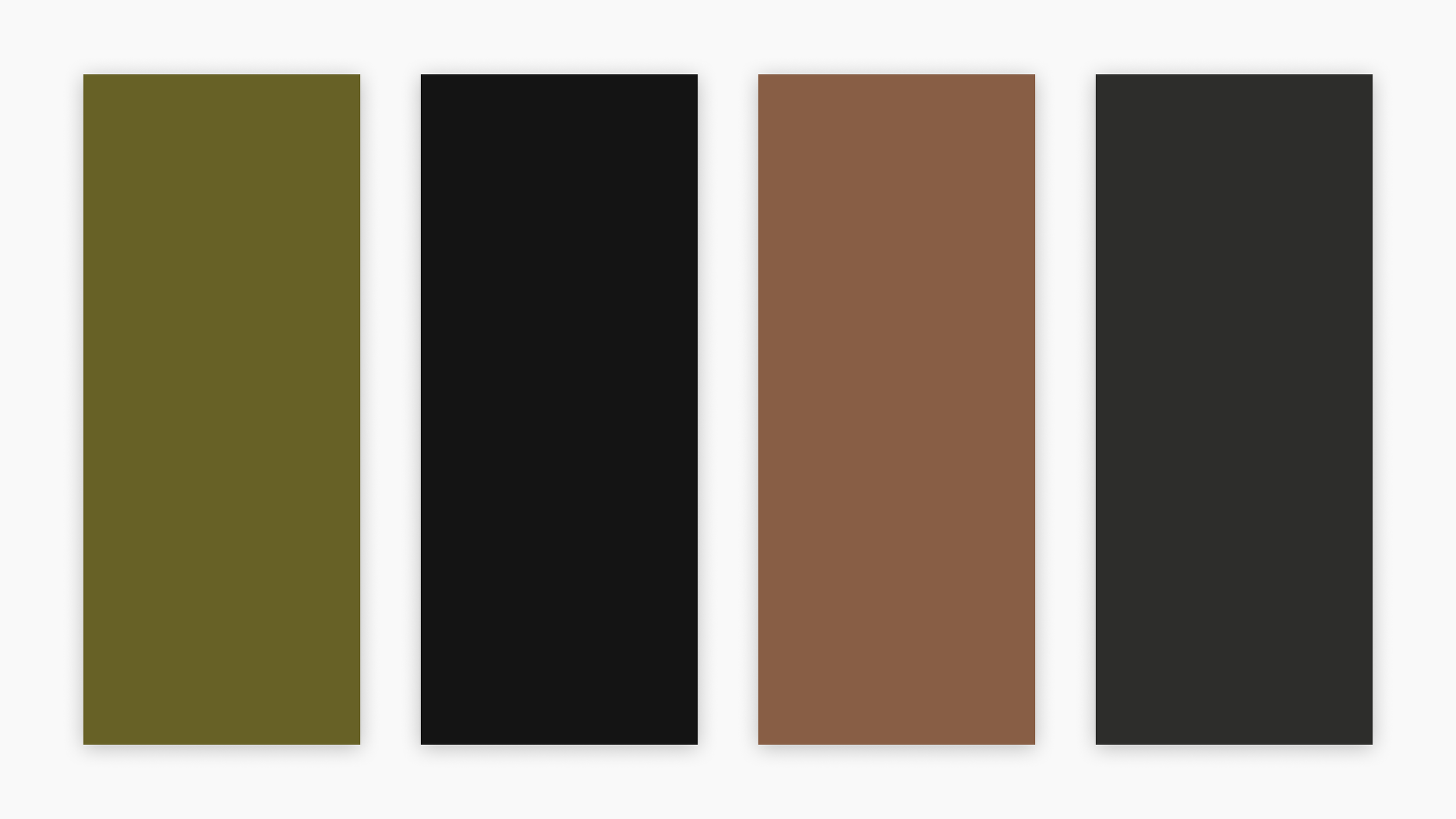
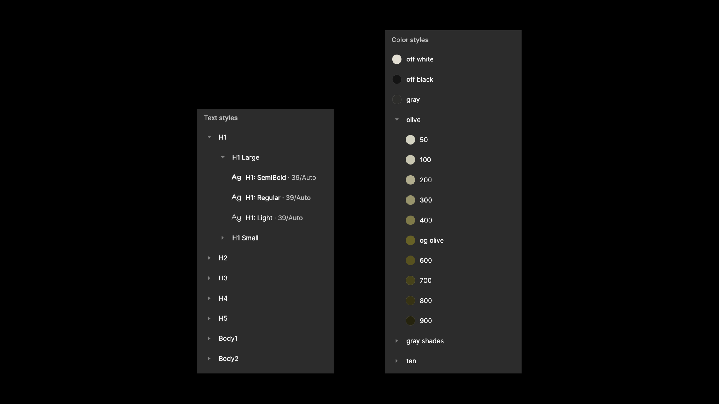
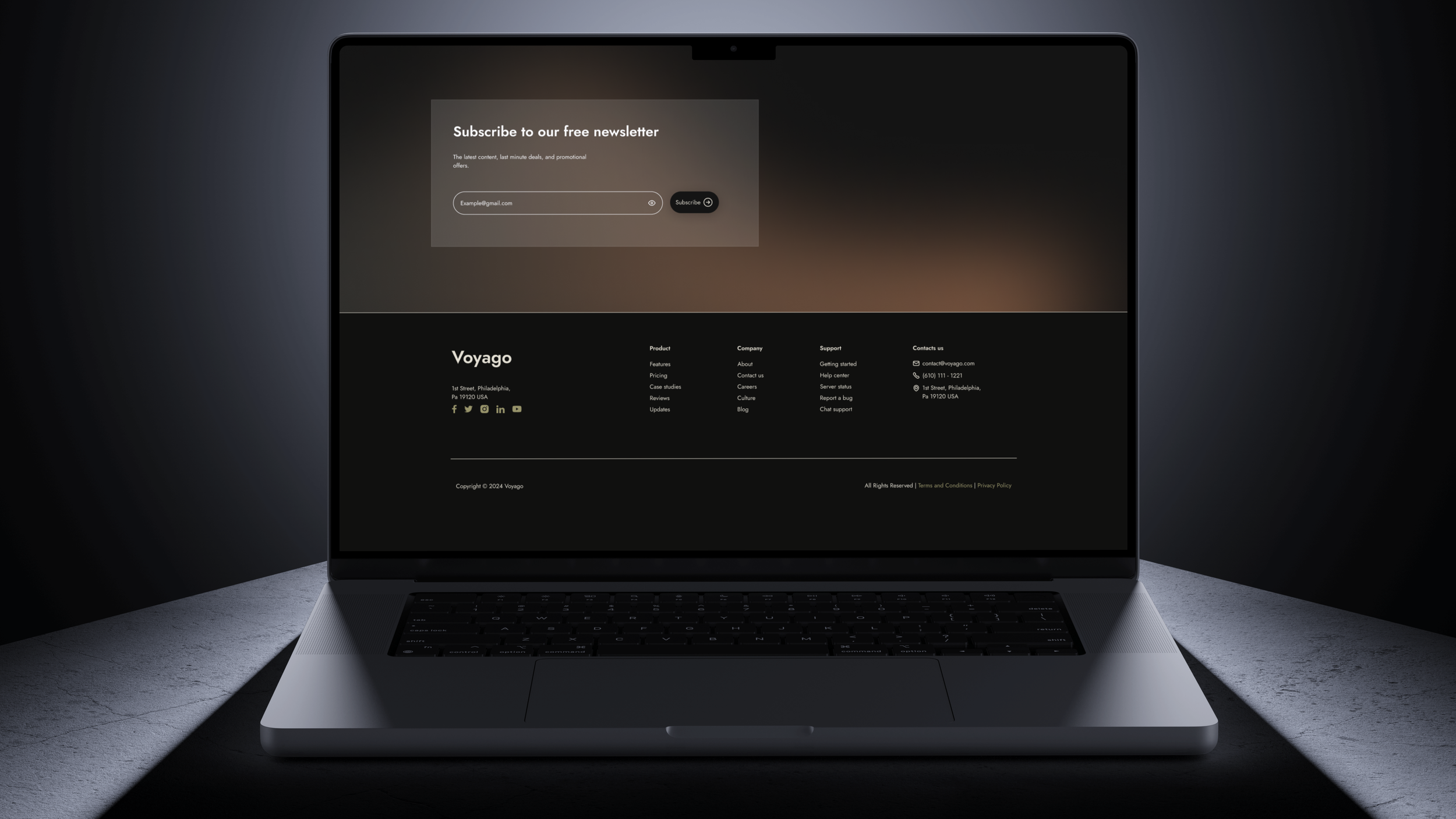
I chose a dark palette because many people prefer dark mode on phones or computers, as research shows it may reduce eye strain and increase focus. I kept the palette neutral to avoid overwhelming or distracting users, while incorporating accents of olive—trendy among my target audience—and occasional tan for a touch of excitement.
Additionally, I created tints and shades of each color for accessibility and defined secondary colors for forms.

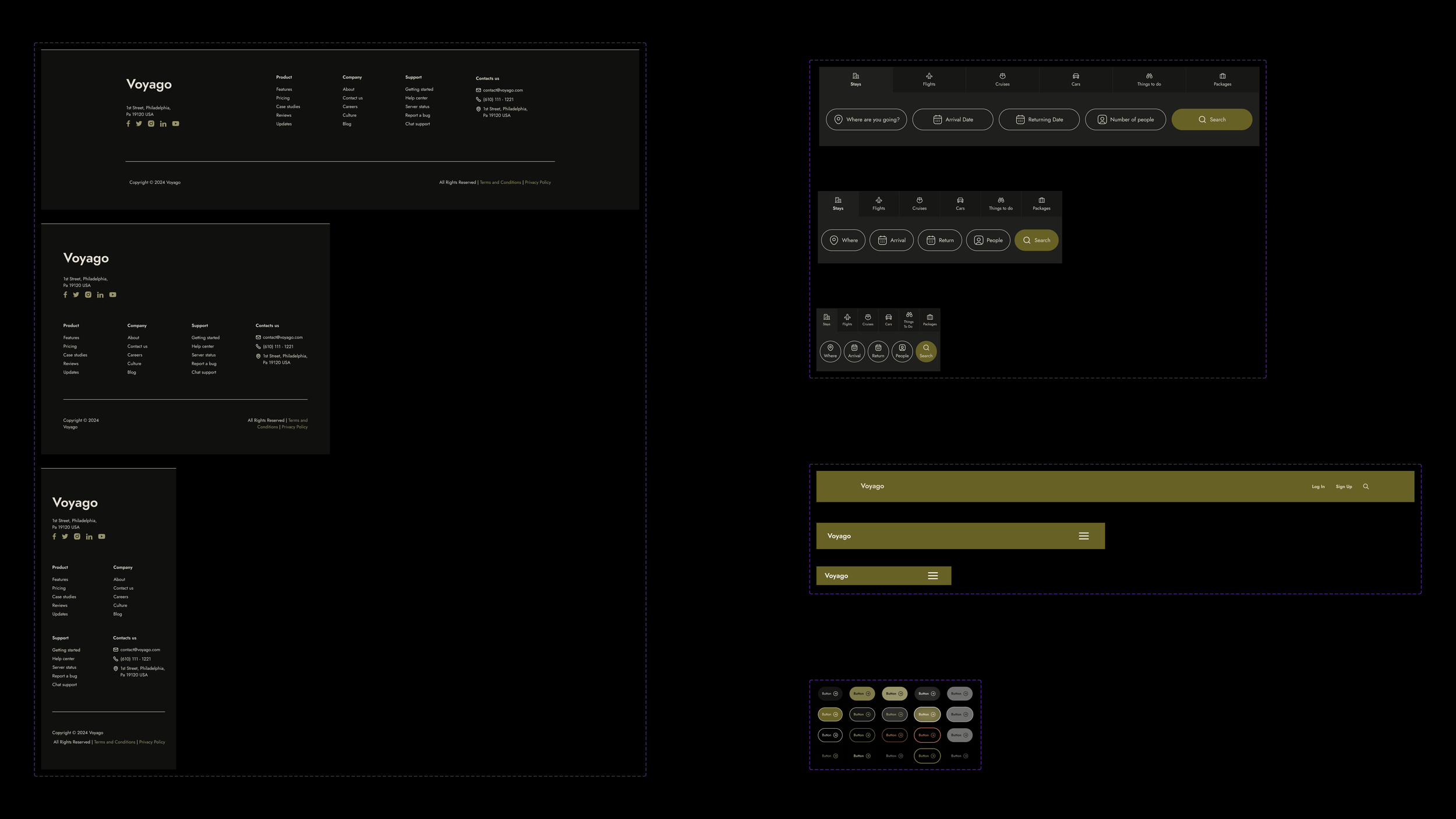
Components
Since the goal of this project was to adapt screens for different devices, I decided it would be useful to create some basic components before building out the digital wireframes for specific device types. I designed buttons, a navigation bar, and a footer.
This approach proved very helpful, and I applied the same method later in the process for other elements, such as radio buttons, checkboxes, and input boxes.
File Setup
My next step was to organize my Figma file by keeping components separate from their instances in the wireframes, preventing accidental modifications to the main component. By setting up local text and color styles, changes to the original components automatically updated all instances, making it easier to adjust colors and text sizes across the project later on.
Breakpoints
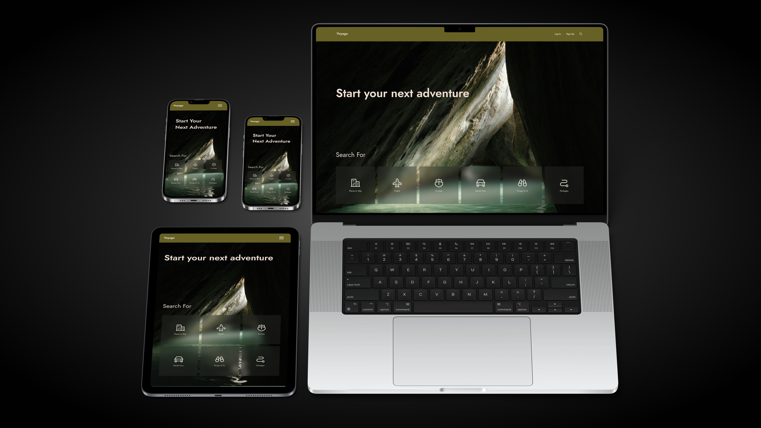
Mobile
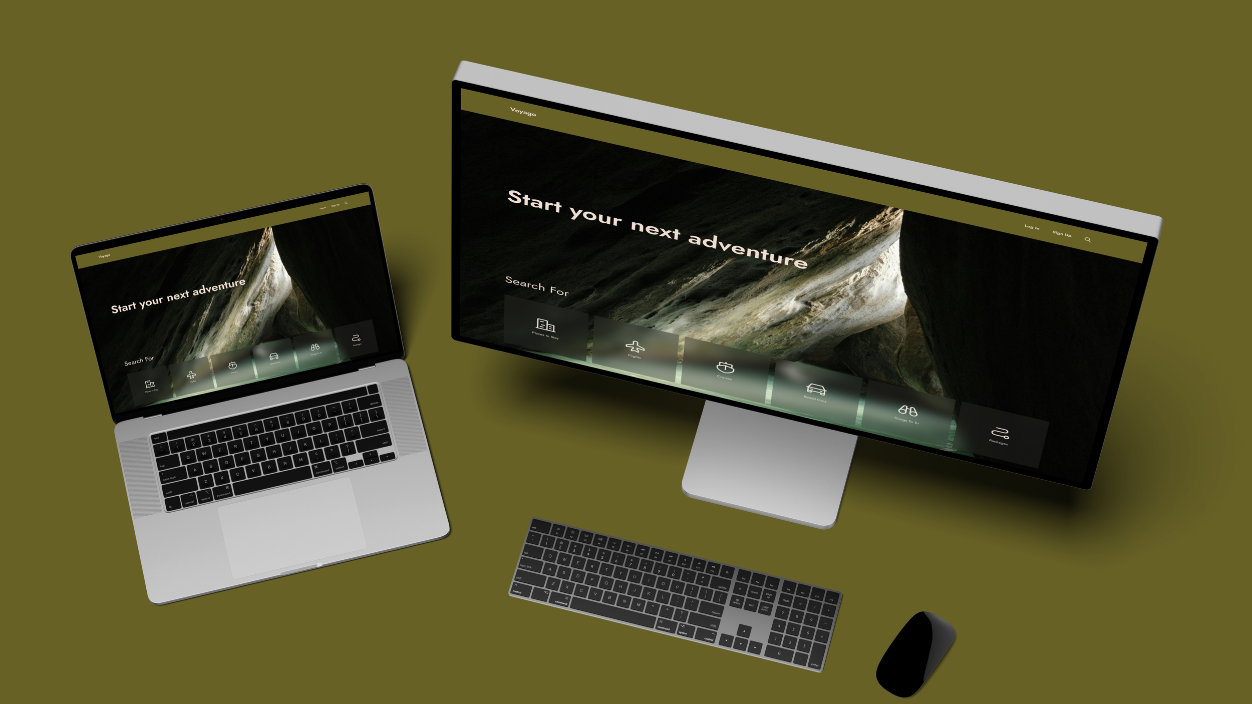
I started with mobile, given that most users primarily access sites on their phones and often encounter responsive design issues there. I used a 390-pixel width frame, based on the iPhone 11, one of the most popular smartphones, to ensure compatibility with a wide range of devices. This approach helped me address screen size issues that would affect the largest number of users.

Tablet
Next, I designed for tablets with a width of 770 pixels. I switched to a larger text style and used auto layout to adjust component widths. To ensure no formatting changes were overlooked, I manually resized cards and images to fit the new height.
Desktop
Desktop was the final screen size I designed for, using a 1728-pixel width, which is larger than my usual. This choice pushed me out of my comfort zone and allowed me to consider a wider range of screen widths. I encountered several challenges; despite being very comfortable designing for desktop, scaling up the mobile wireframe felt awkward, and finding the right spacing for elements on the desktop wireframe took considerable time.
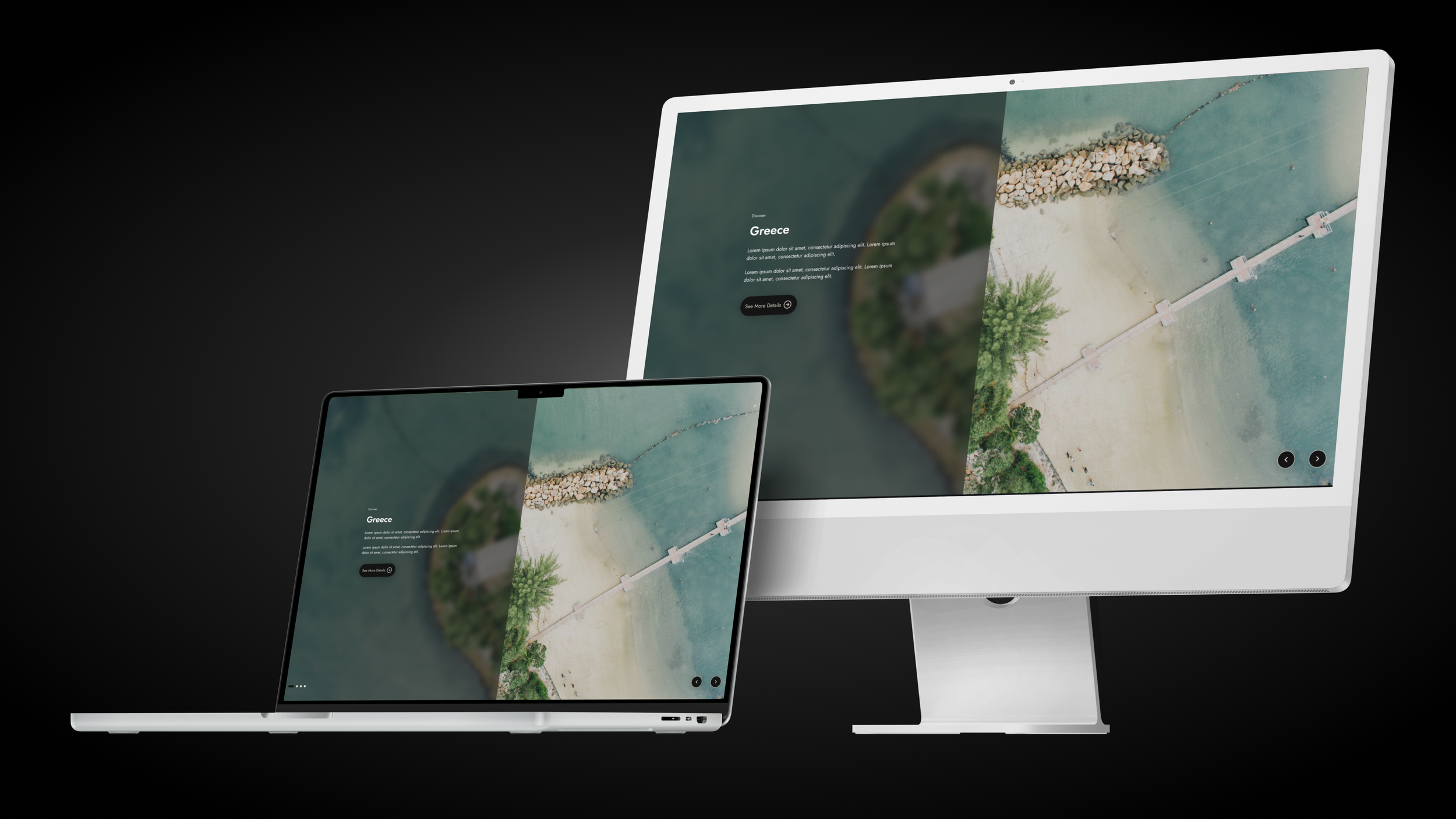
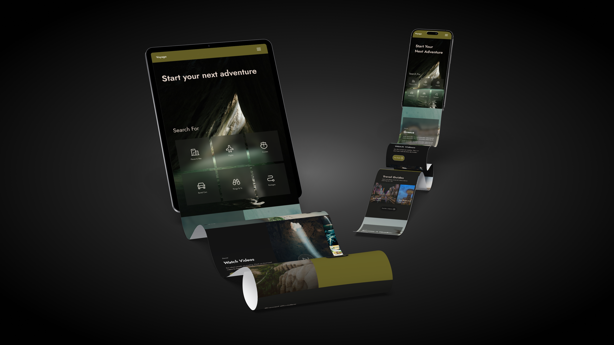
Pages
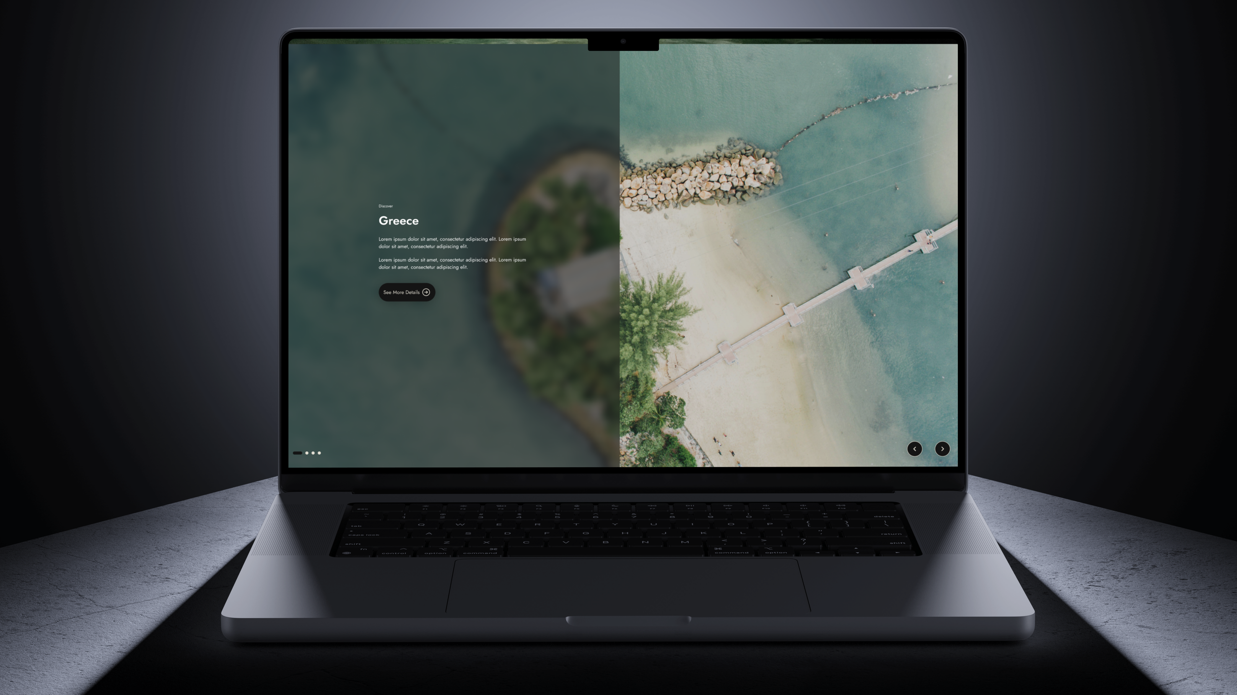
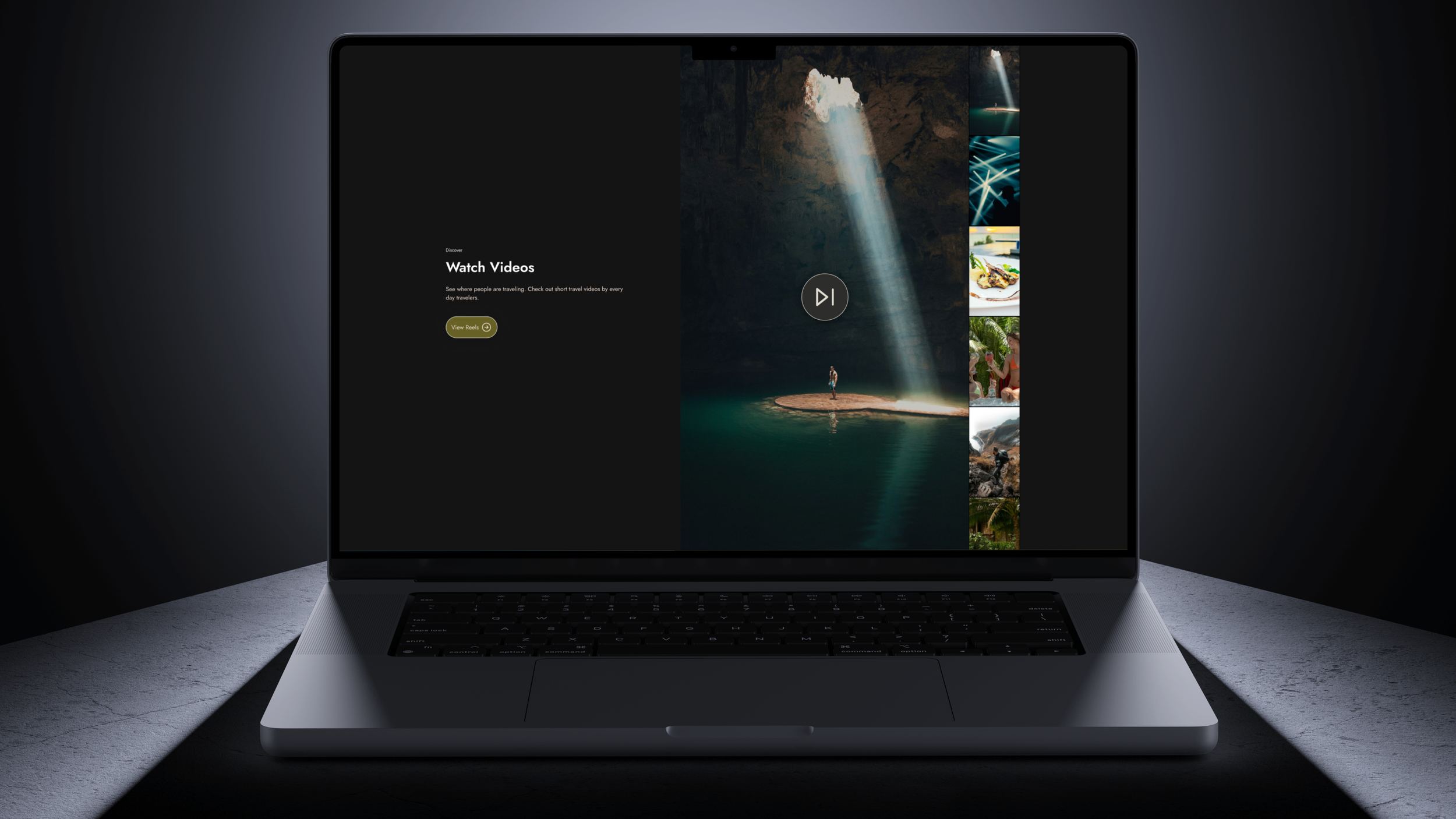
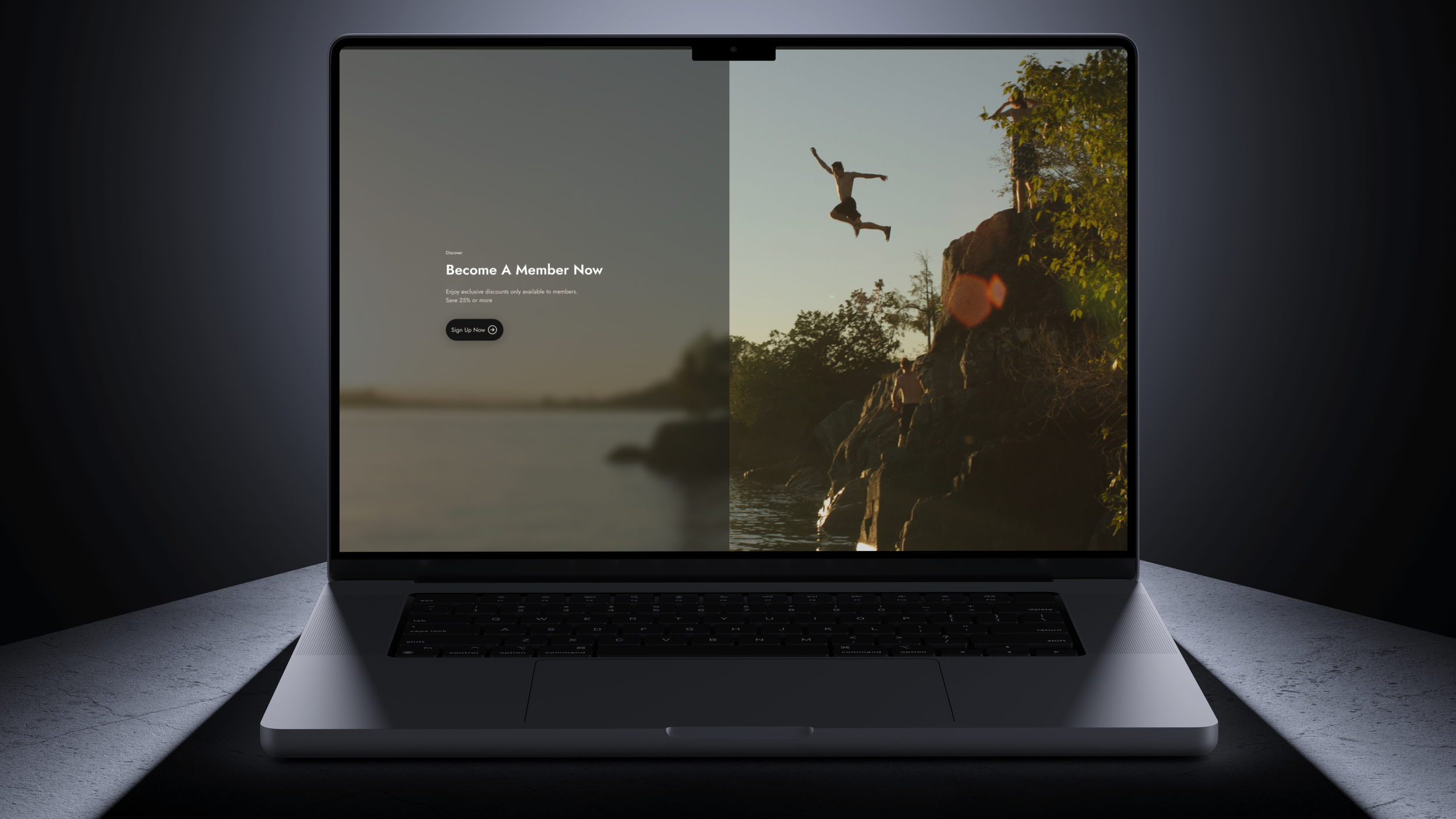
I designed each page to cover all aspects of the travel booking experience, from inspiration to checkout. Focusing on just one page wouldn't address the unique challenges of responsiveness that arise at different stages of the process.
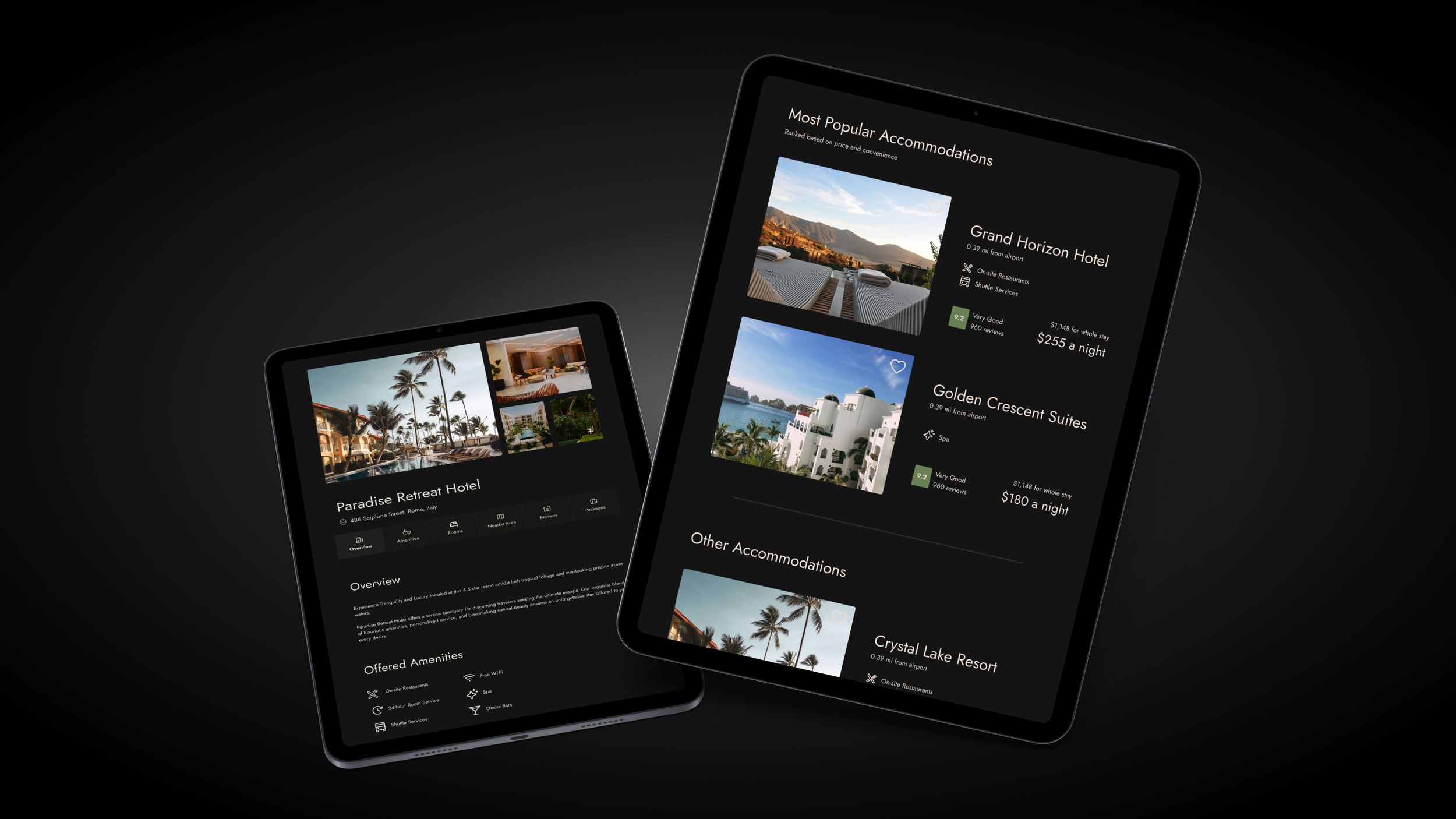
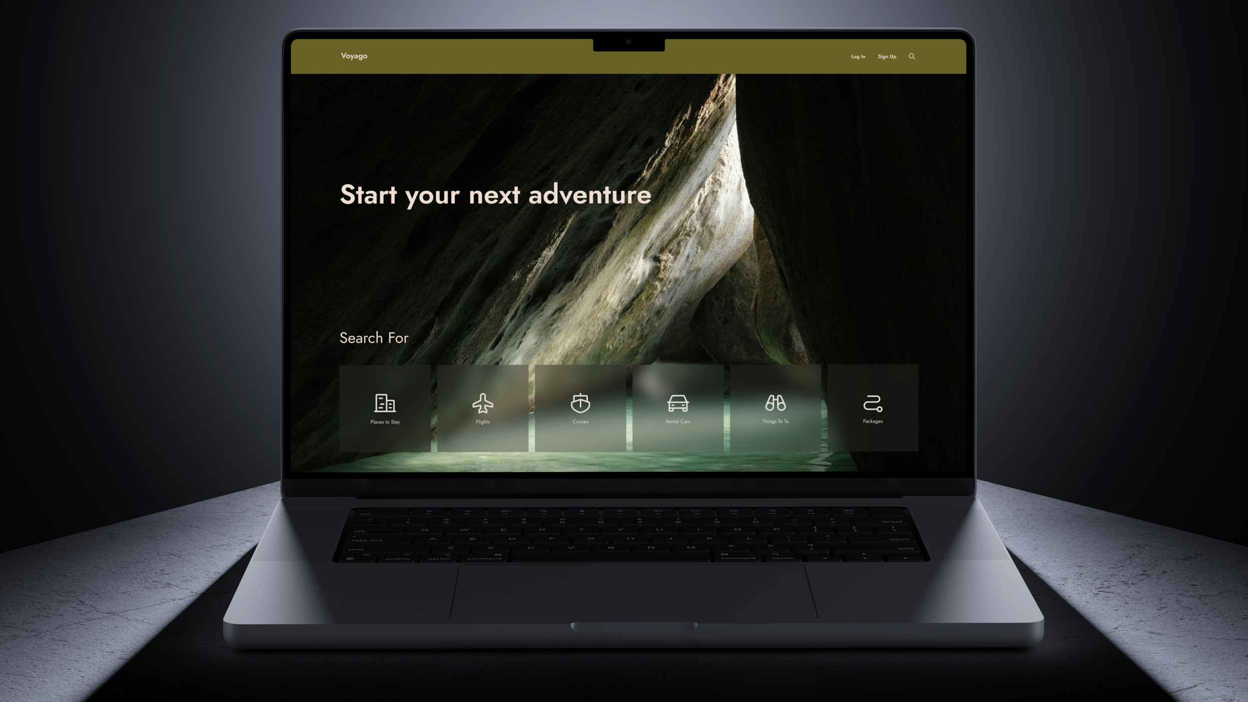
Home Page
Information architecture was my primary focus when designing the pages. For the homepage, I studied the content hierarchy on the Expedia app. My research revealed that users highly valued the Expedia app for its comfort and effectiveness in comparing flight and accommodation options on mobile.
Recognizing that my design needed to work on both desktop and mobile, I combined elements from the app with features from the Expedia website to create a cohesive experience.

Conclusion
This project forced me to take a much more structured approach and focus on the minute details on a page. The individual components and spacing came before the overall design of the project. As a result, much of the initial UI was changed much later in the process once the spacing was defined and I could spend more time on aesthetics. Thankfully this was a relatively quick process because the file setup made it easy for design changes to be updated everywhere.
Overall this project tested my patience as a designer. I wanted to immediately jump right into the fun part of UX design, but instead, I had to consider many details I had been able to previously overlooked in my collegiate work. In the past, my design files on Figma would be disorganized and aesthetics would be prioritized over functionality, however, this project made me consider the organization and structure needed for a professional UX design project to be a success.