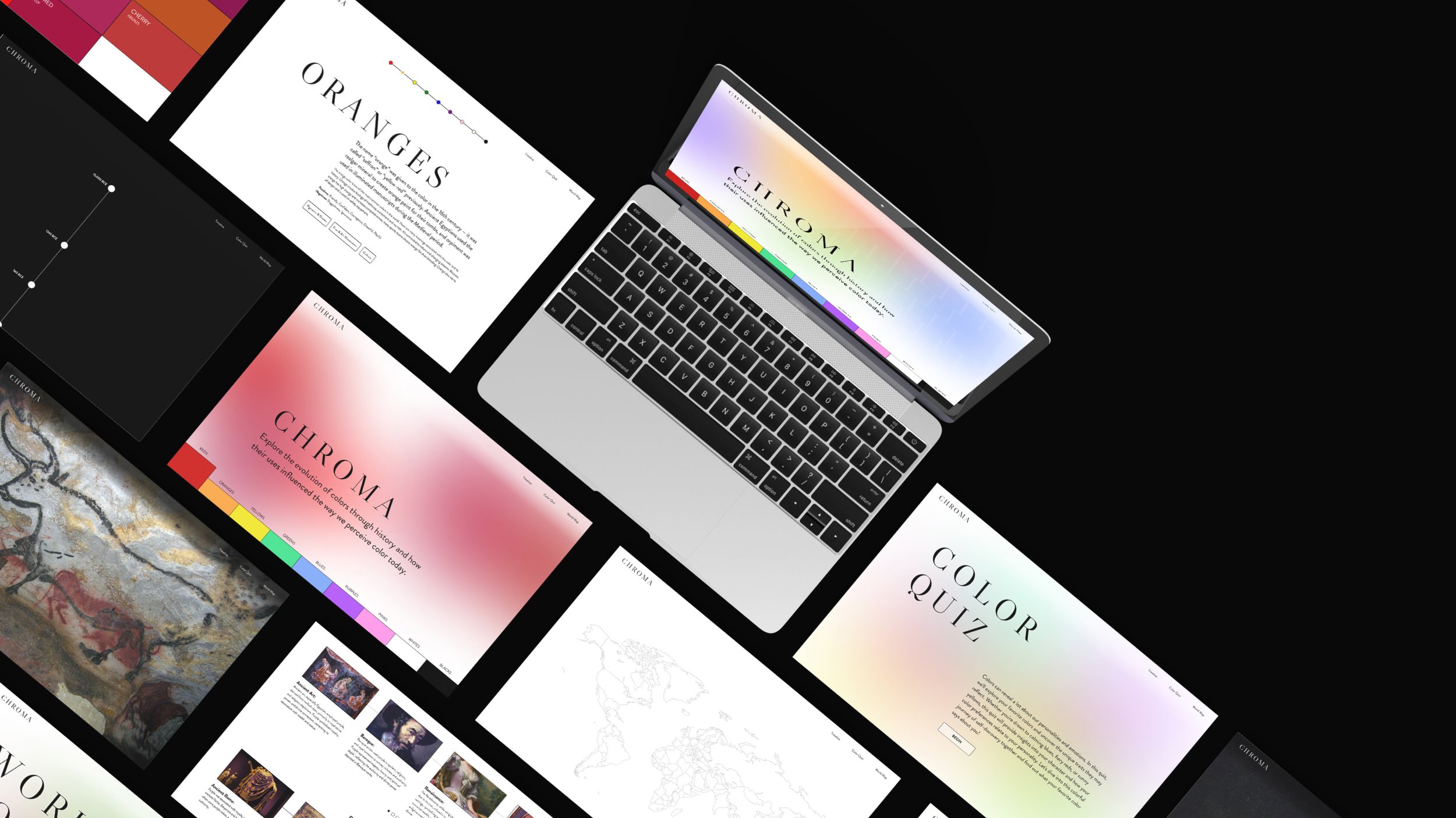
Chroma Website
A UI design project for a desktop website. The content is centered around the theme of color: what it symbolizes, how people perceive it, and the history of humans using color.
Instructor: Matthew McGlynn
Project Year: 2023
**I’ve been running into issues with the link working in Chrome. Please be patient while I try to fix in. In the meantime, feel free to use safari or another browser when trying to open the Figma prototype. Thank you!!
This issue does not impact any other part of the casestudy.
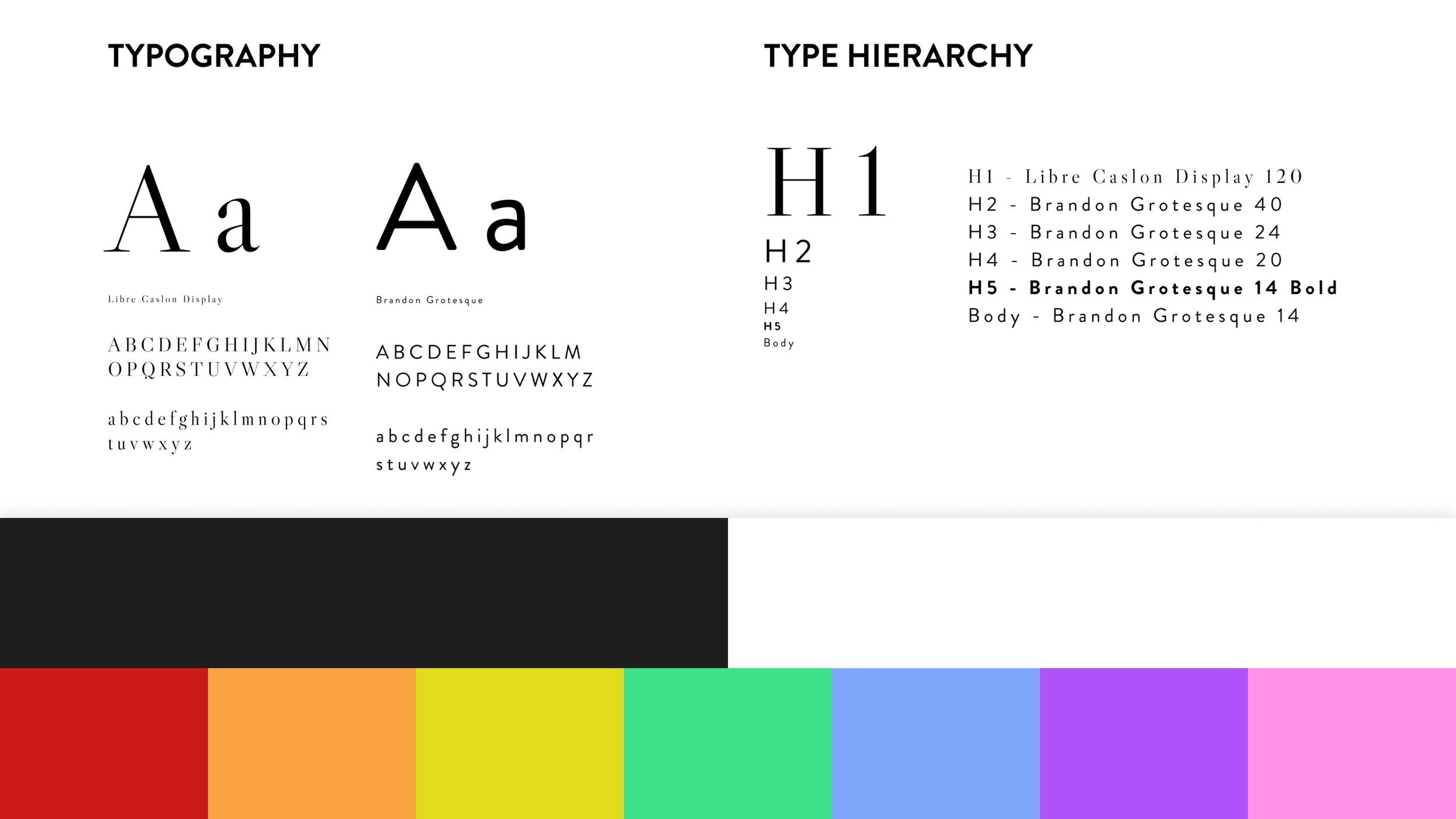
For the style, I aimed for a modern look, balancing vibrant colors with black and white for visual interest. I chose a rainbow color palette and used the fonts Brandon Grotesque and Libre Caslon Display for typography.
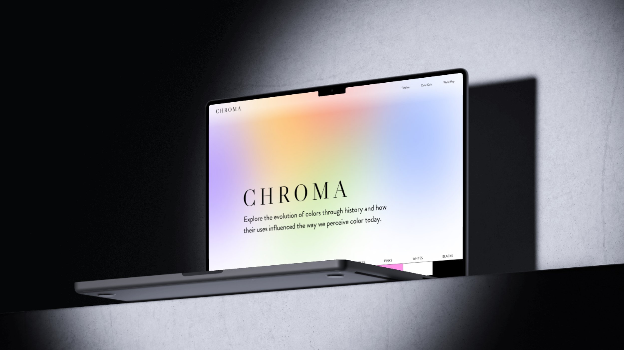
Home Page
When first starting the project, I hoped to create a timeline that visually represents the gradual increase in our access to color throughout history and its impact on color psychology.
I believed it would be valuable for artists to understand historical color usage and find inspiration for palettes that convey similar themes. As a result, early homepage designs resembled the current timeline section, which I will discuss later in this case study.
When I conducted research using a survey, it revealed that artists often build palettes around a single color which conflicted with my assumptions on what users wanted.
I scrapped the original site map and instead wove the color pages into the homepage itself to reflect this new starting point and highlight the content that would be the most helpful.

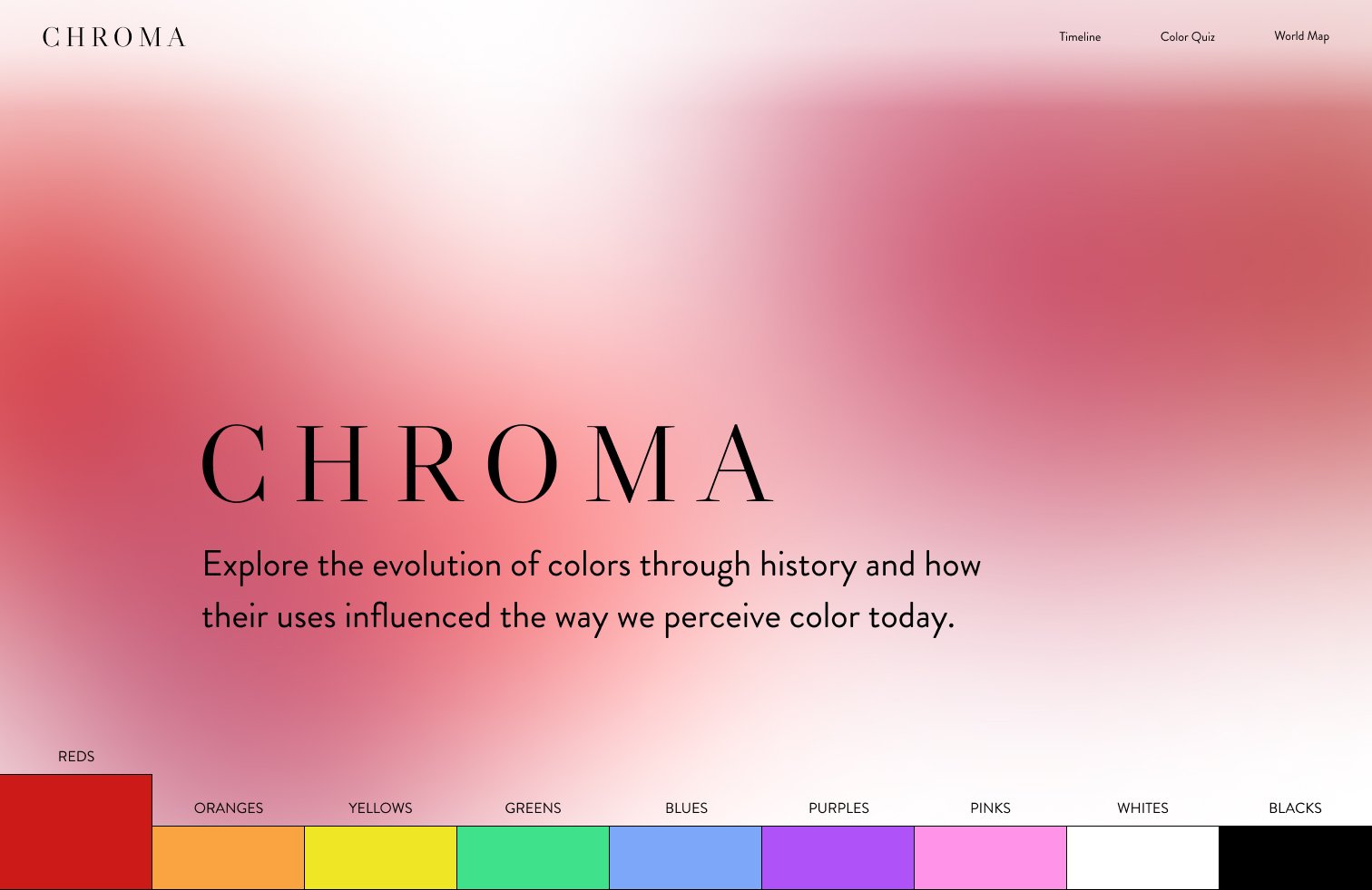

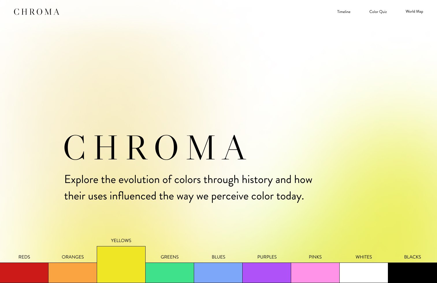

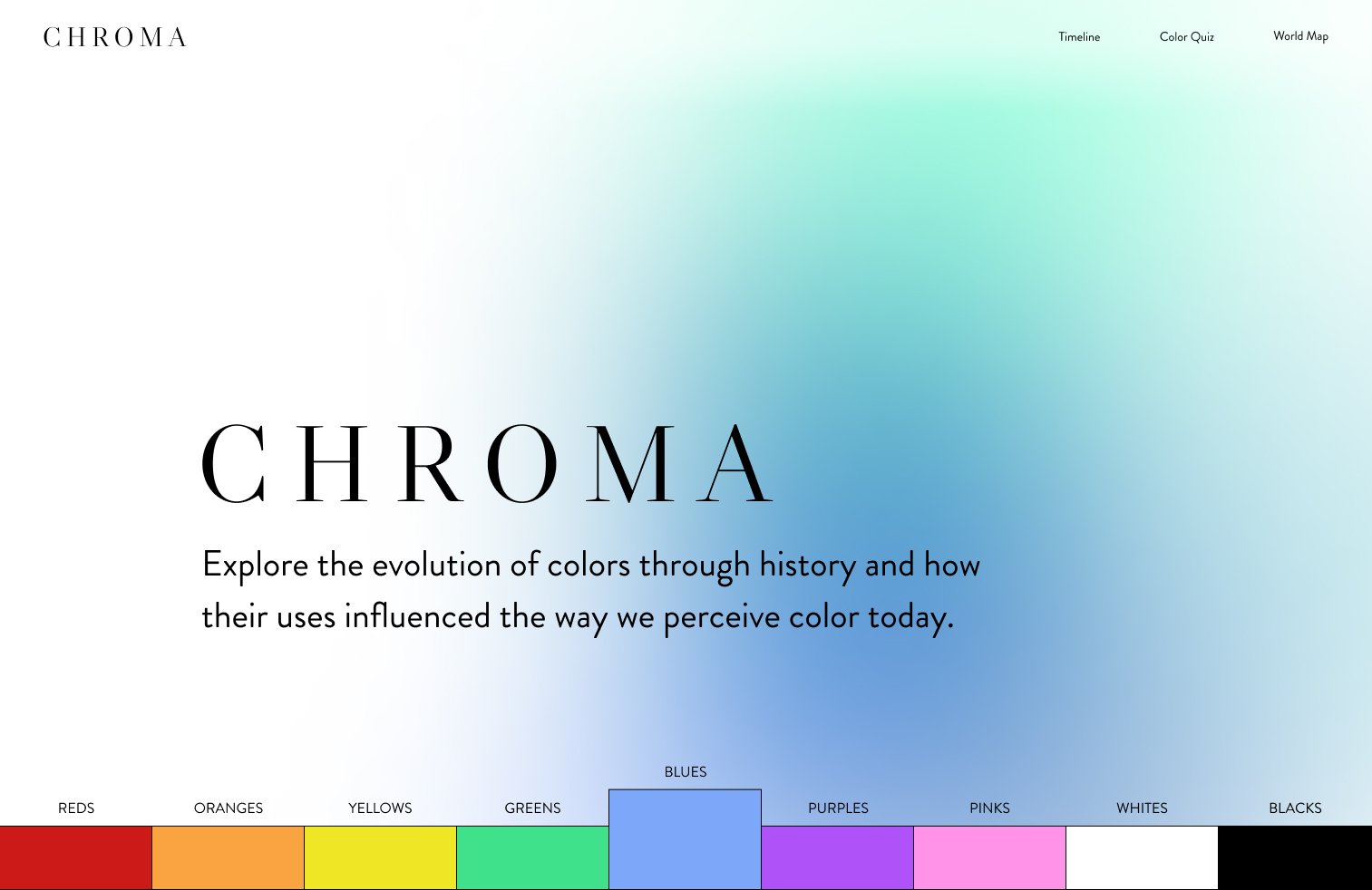
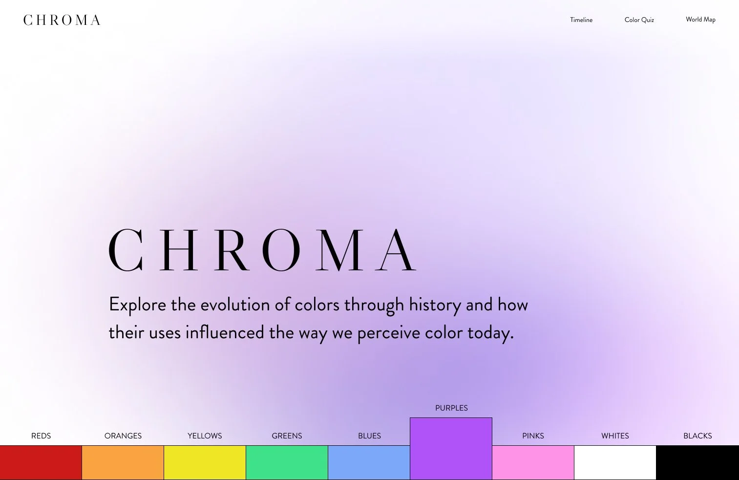
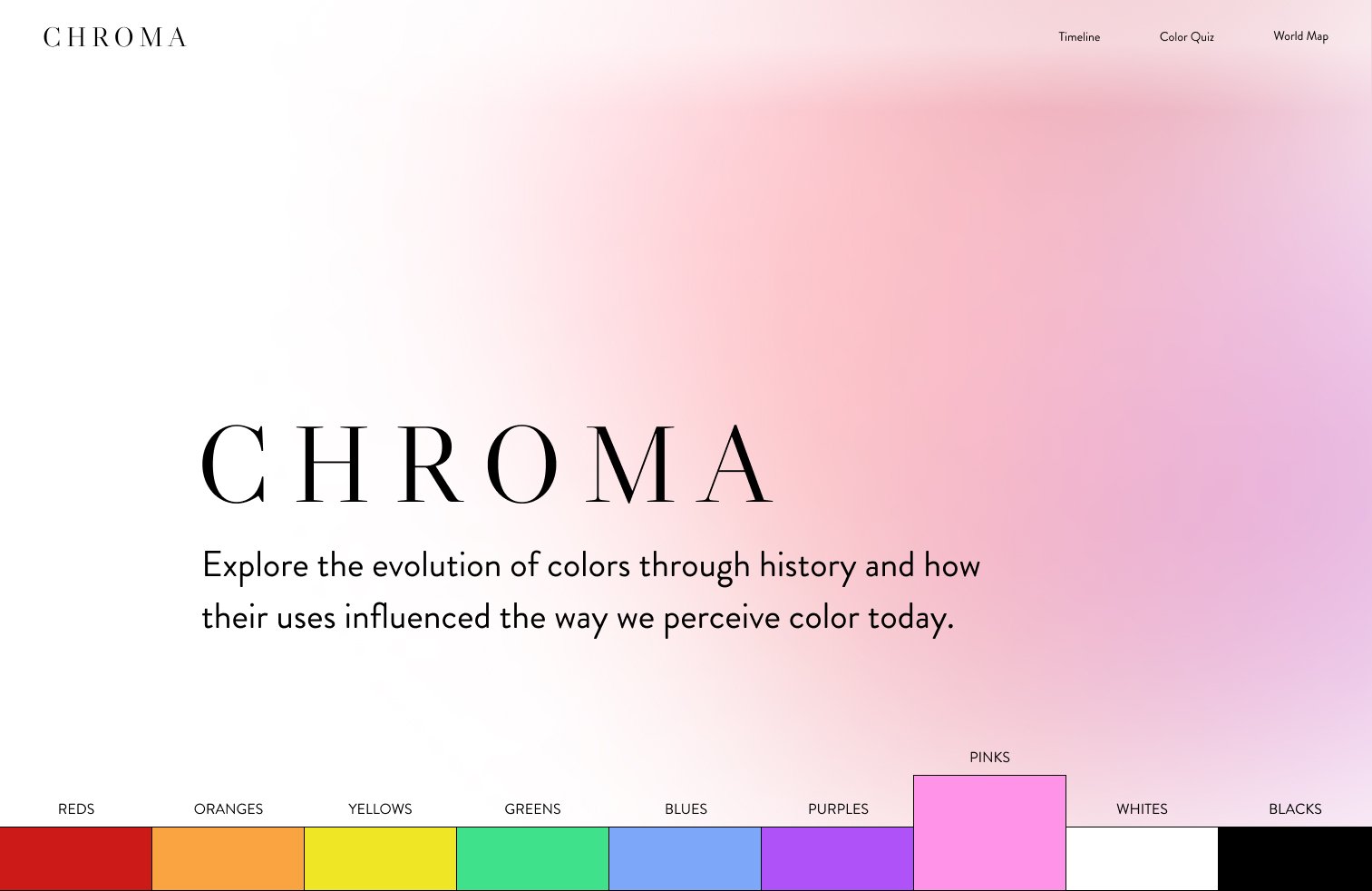
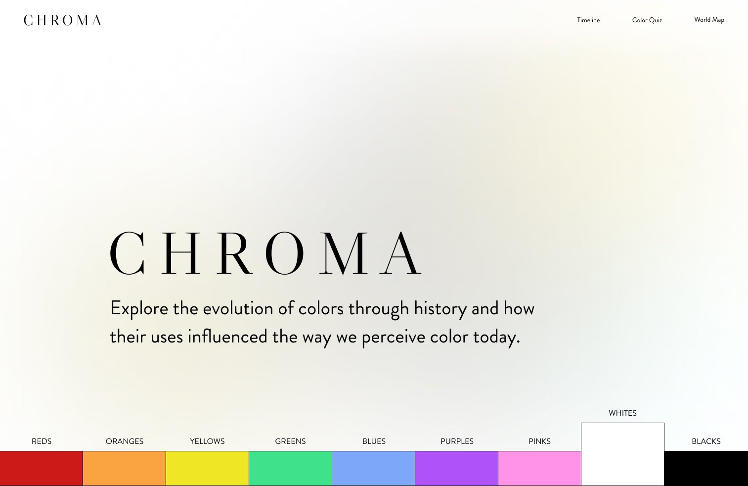

I continued to emphasize the bottom navigation with hover states that would change the default look of the background.
Content Summary
Beyond the homepage, the site is divided into four main sections: the color pages (tied to the homepage), a timeline, a world map, and a quiz. Each of the other three sections has its own introductory page before leading into the main content, mirroring the user experience on the homepage.
These sections collectively explain the evolution of color psychology and why we associate certain colors with specific emotions and concepts.

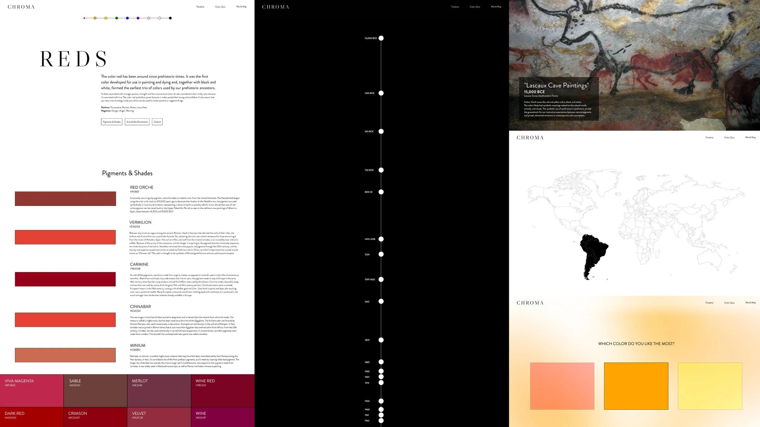
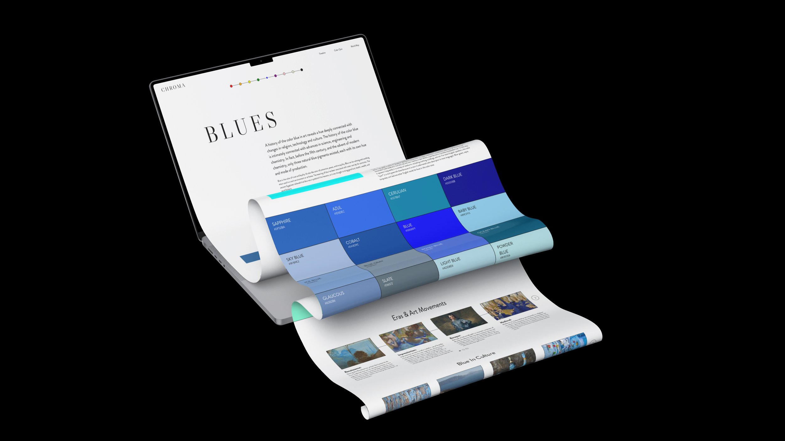
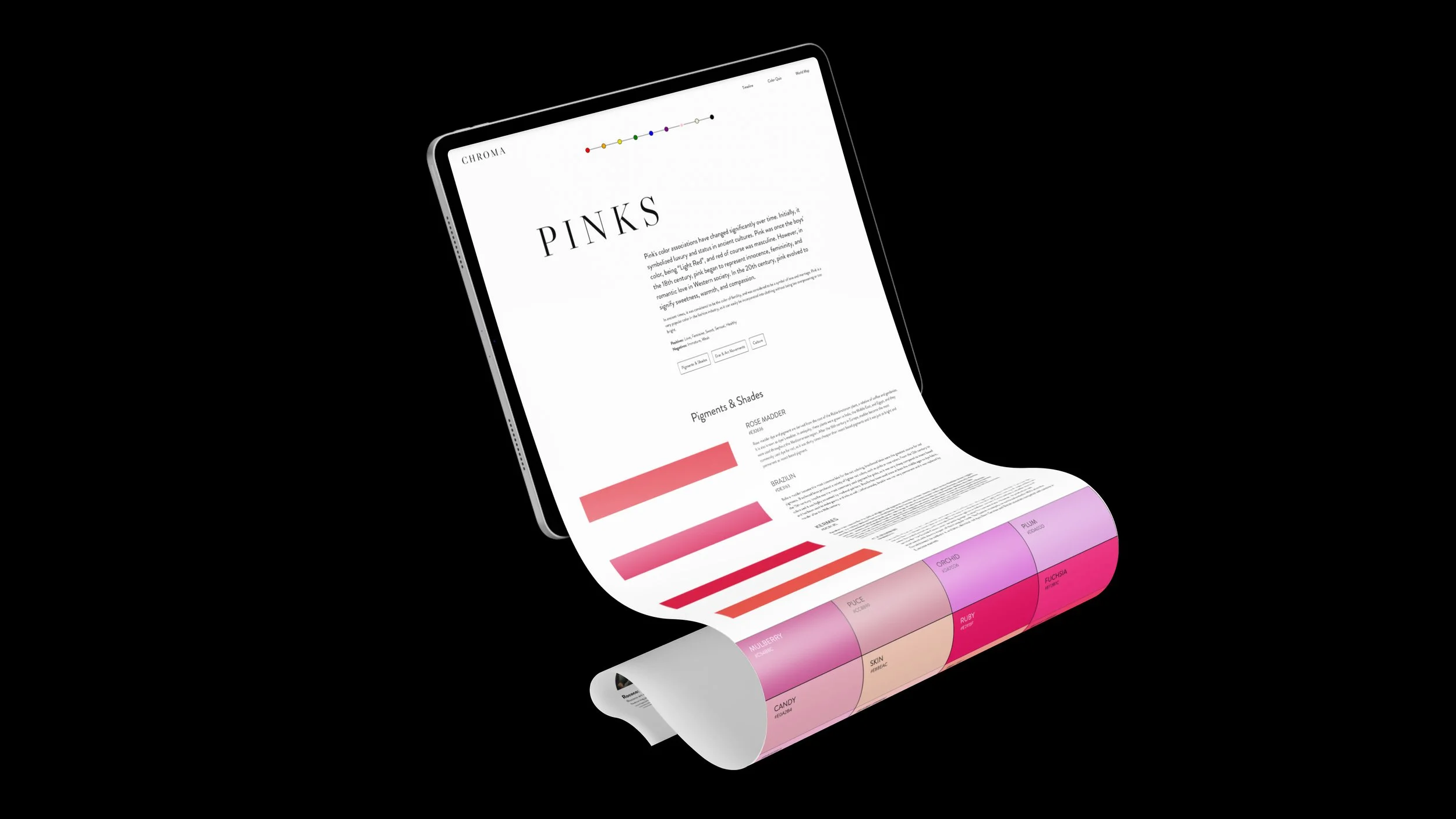
Color Pages
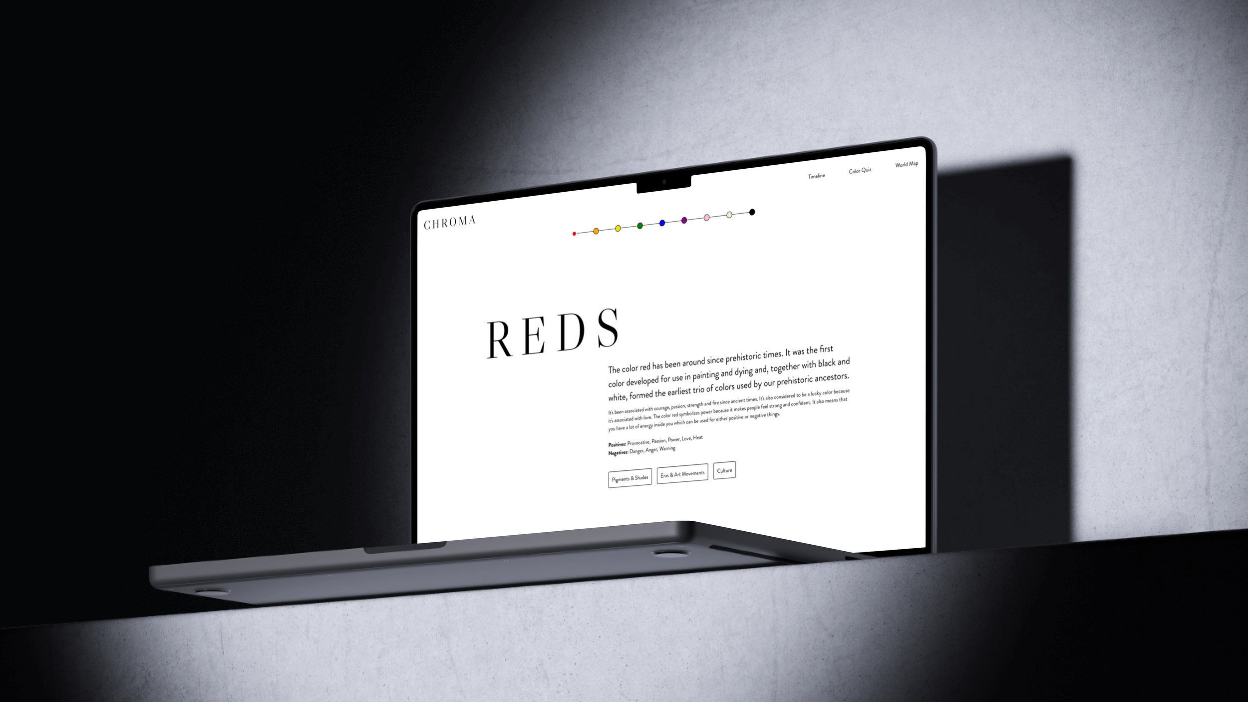
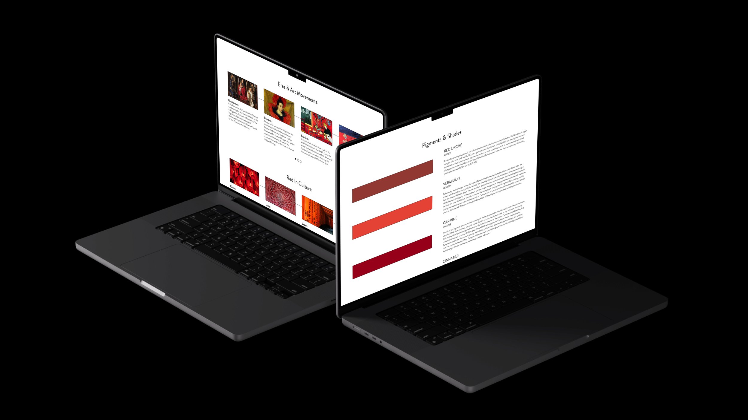
These pages provide an overview of how each color has been used and the symbolism that has emerged from it. Each page begins with a summary covering the basics, with buttons to navigate to specific sections further down the page.
The content includes historically significant pigments, common swatches seen in media today, and an introduction to how the color was used in art and cultures.
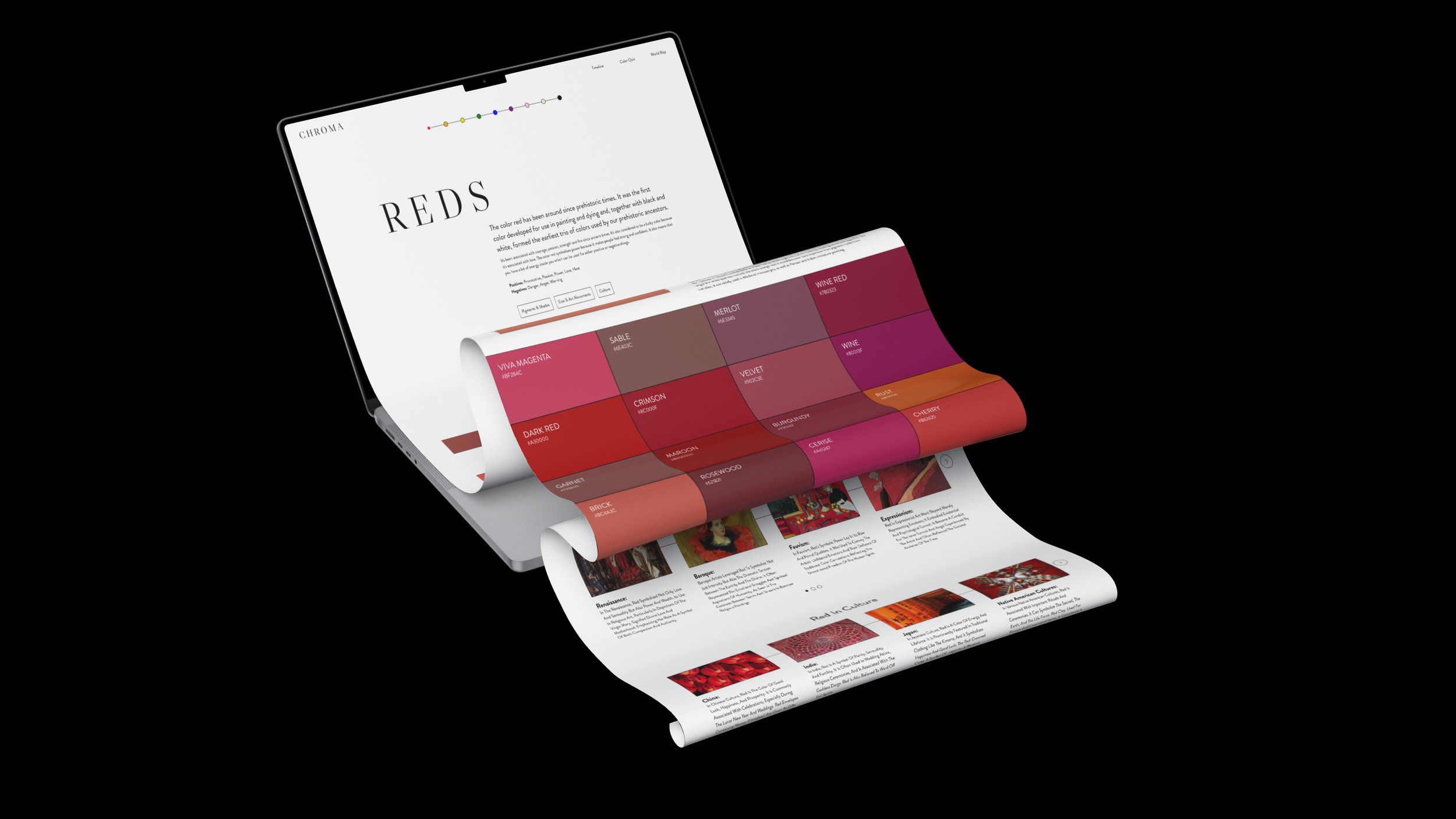

The color swatches were designed to add interactive elements to the page. With so much informational content, I wanted to ensure the user experience remained engaging and dynamic, avoiding a stale feel after the fun and vibrant homepage.
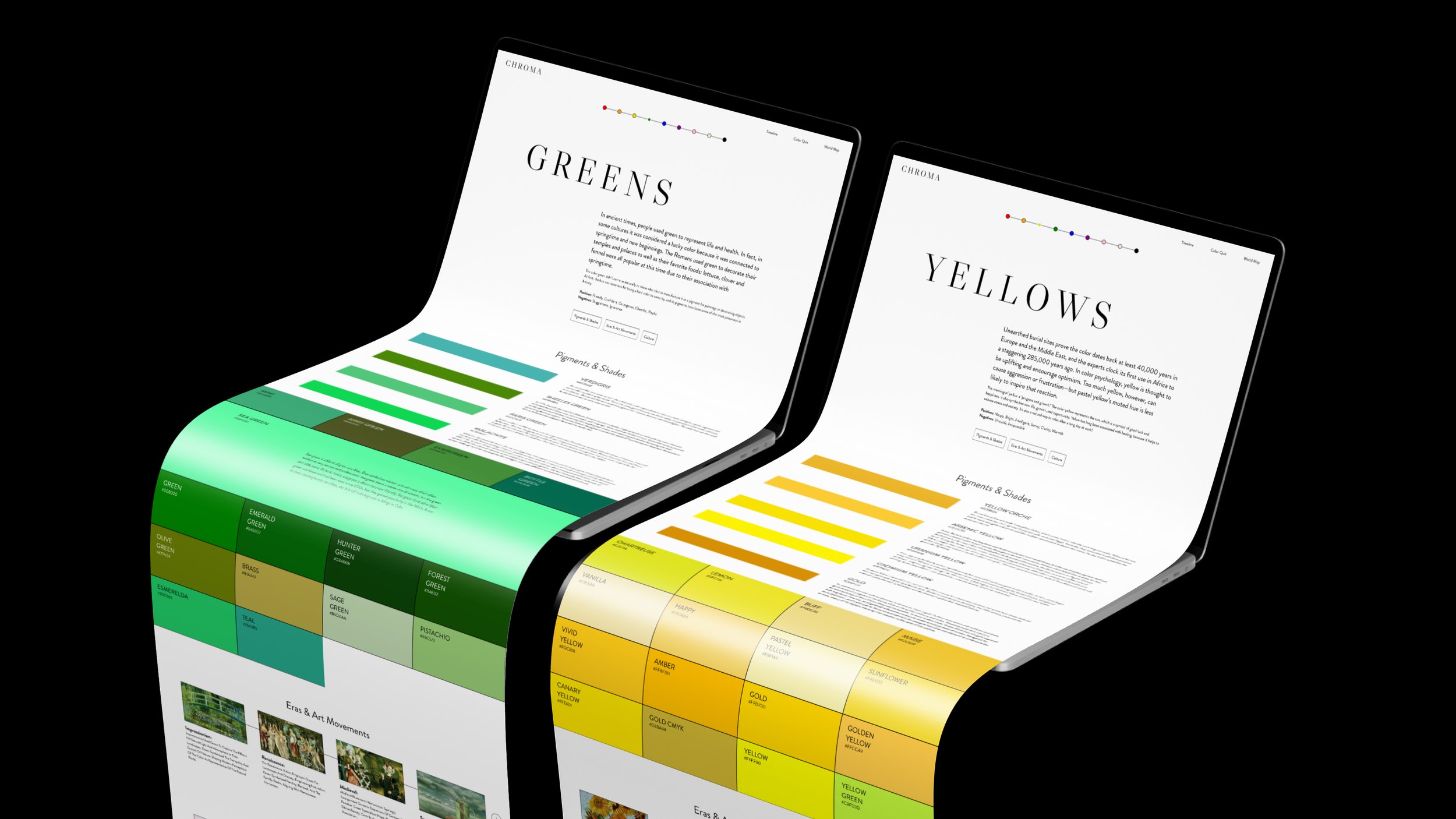
The carousels provided another way to present information in an engaging and interactive manner.
If I could continue to develop this page, I would love to add buttons linking to the timeline and map sections of the site, as these carousels hint at the content found in those areas.


Navigational elements were added to facilitate movement between pages.
A secondary navigation bar, below the main one at the top, allowed users to bounce between different color pages without returning to the homepage. Additionally, buttons to navigate to the previous and next pages were added at the bottom of each page.
World Map

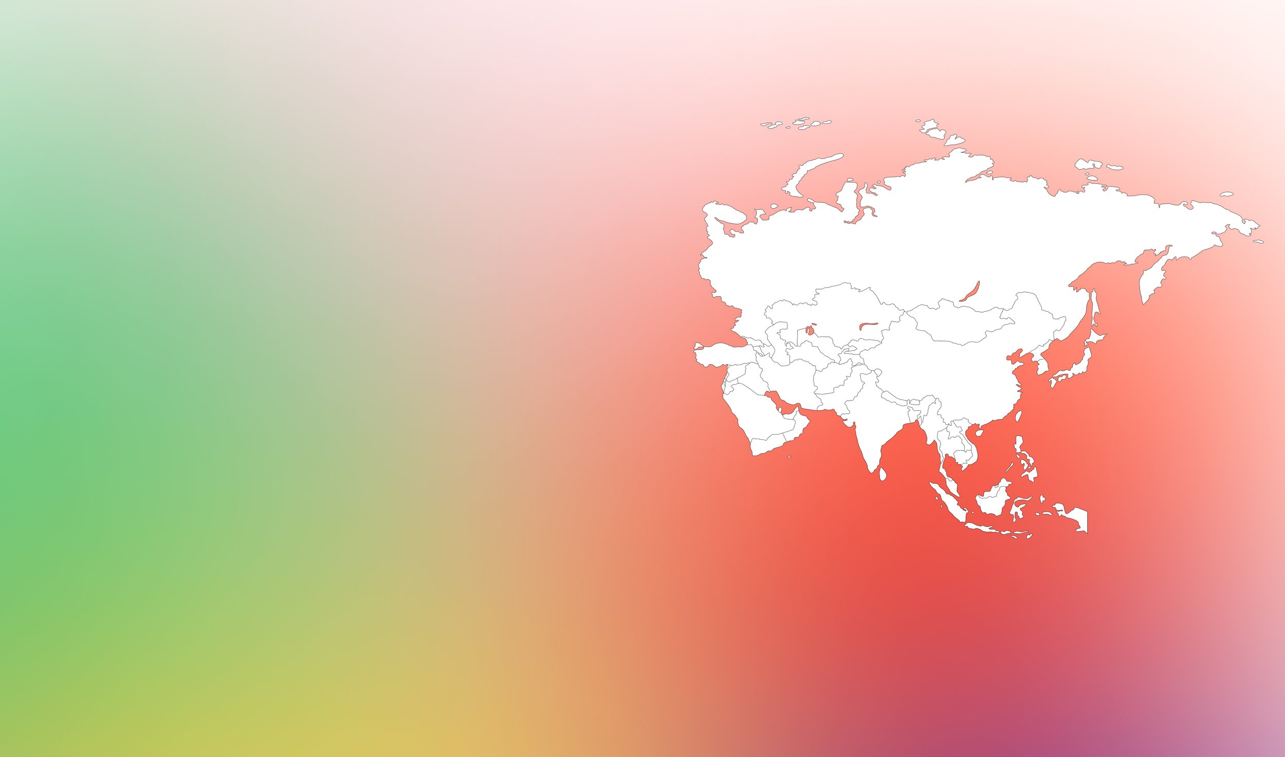
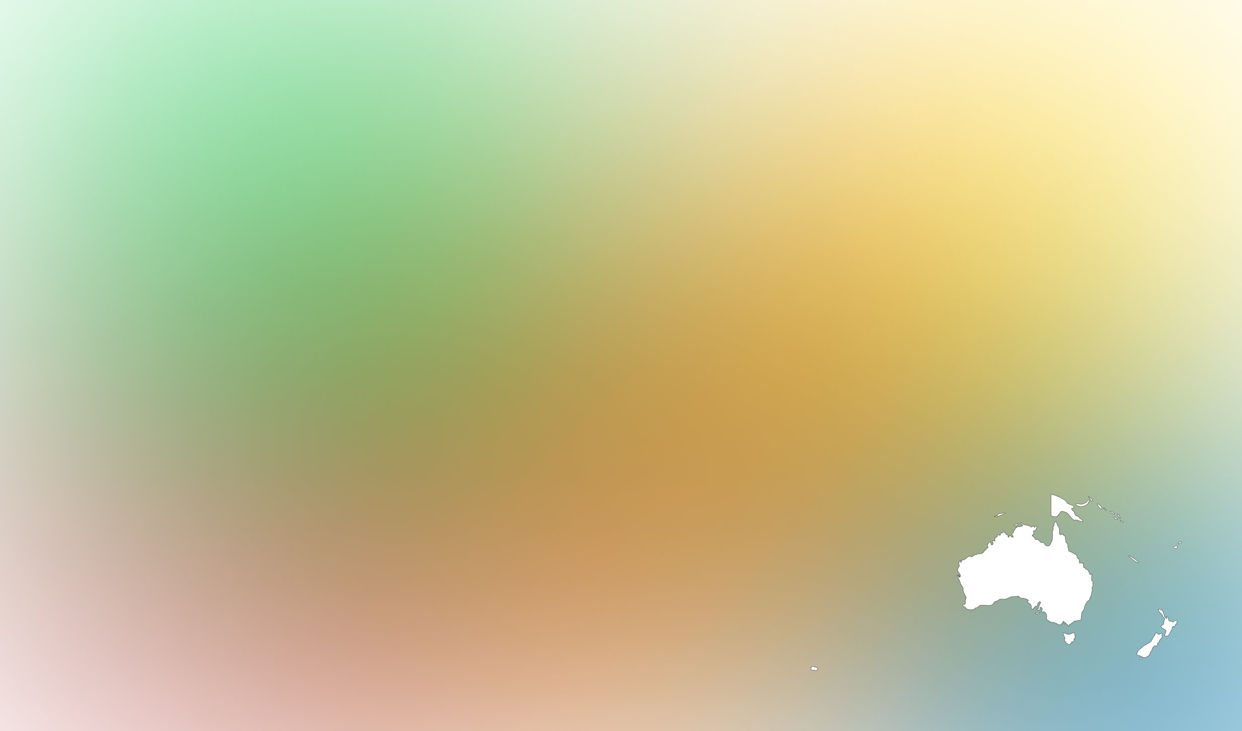
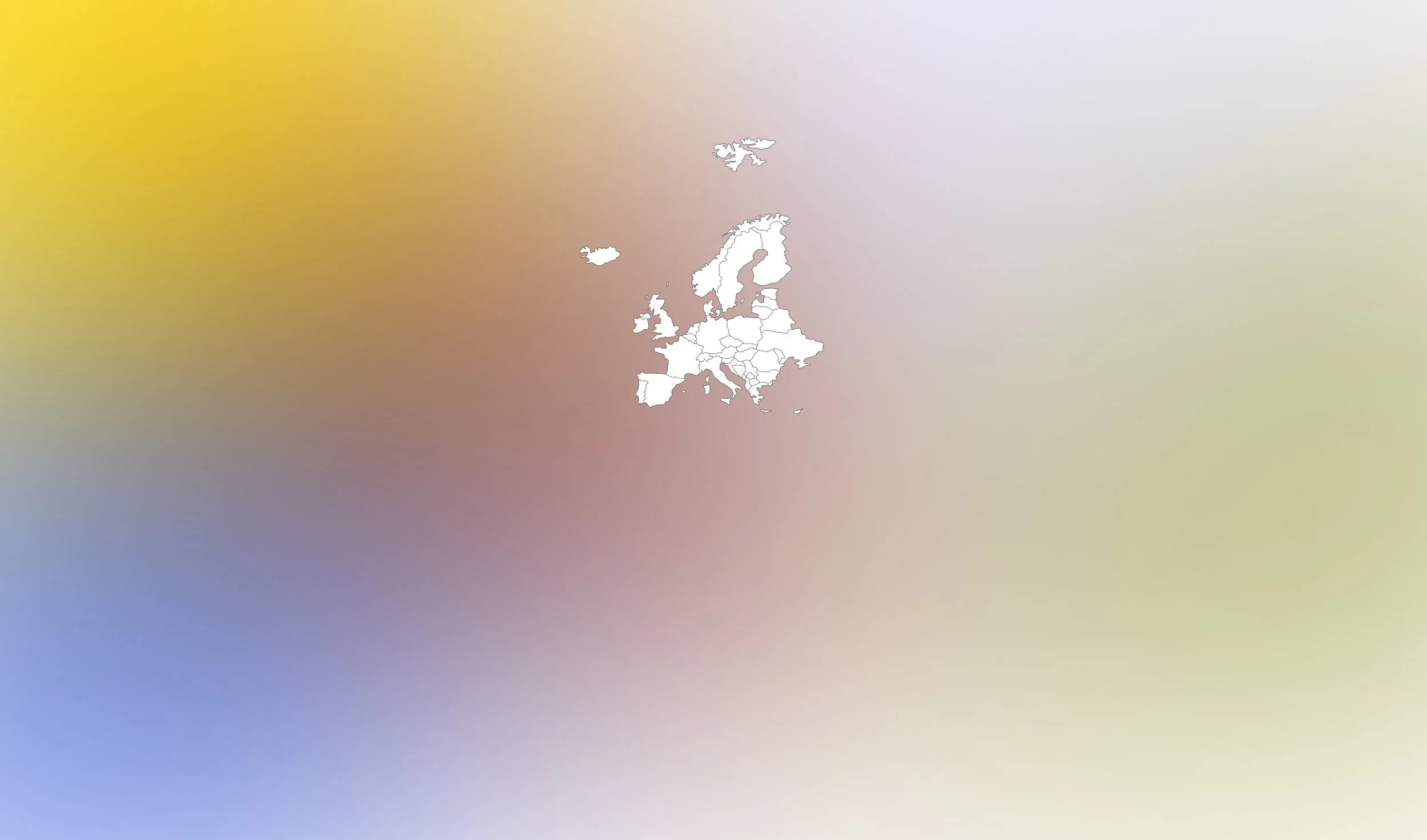
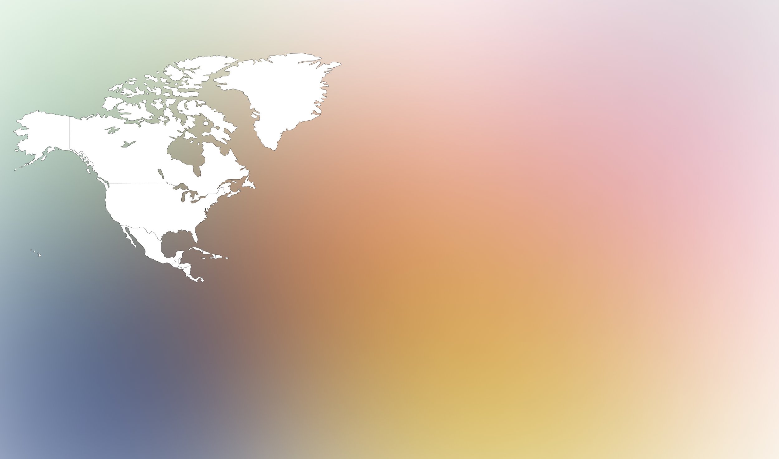

The map section highlights how the symbolism of colors change around the world.
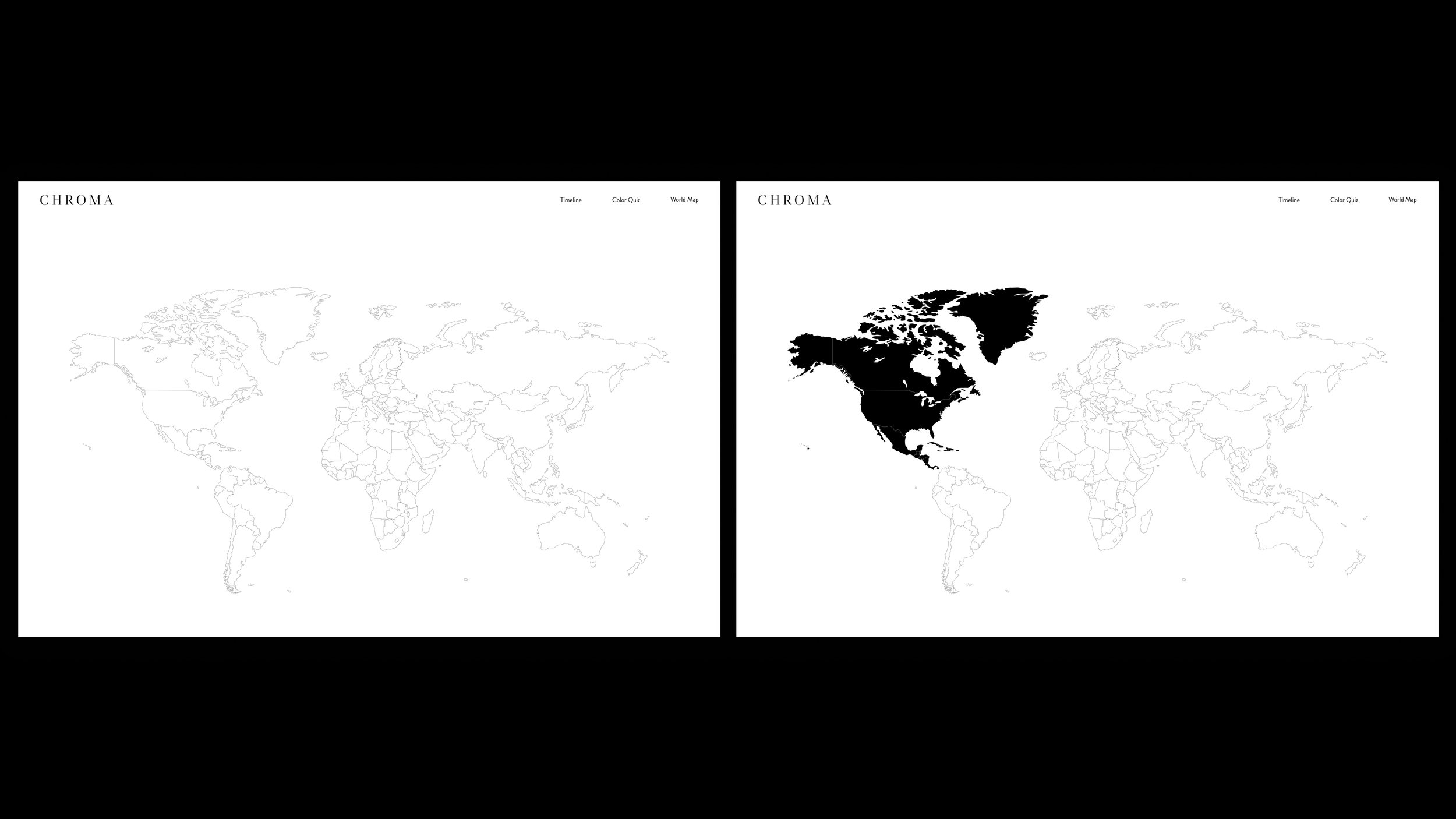
It begins with a simple world map. As users move their mouse, hover states are triggered, guiding them to clickable elements and showing how the map is divided.
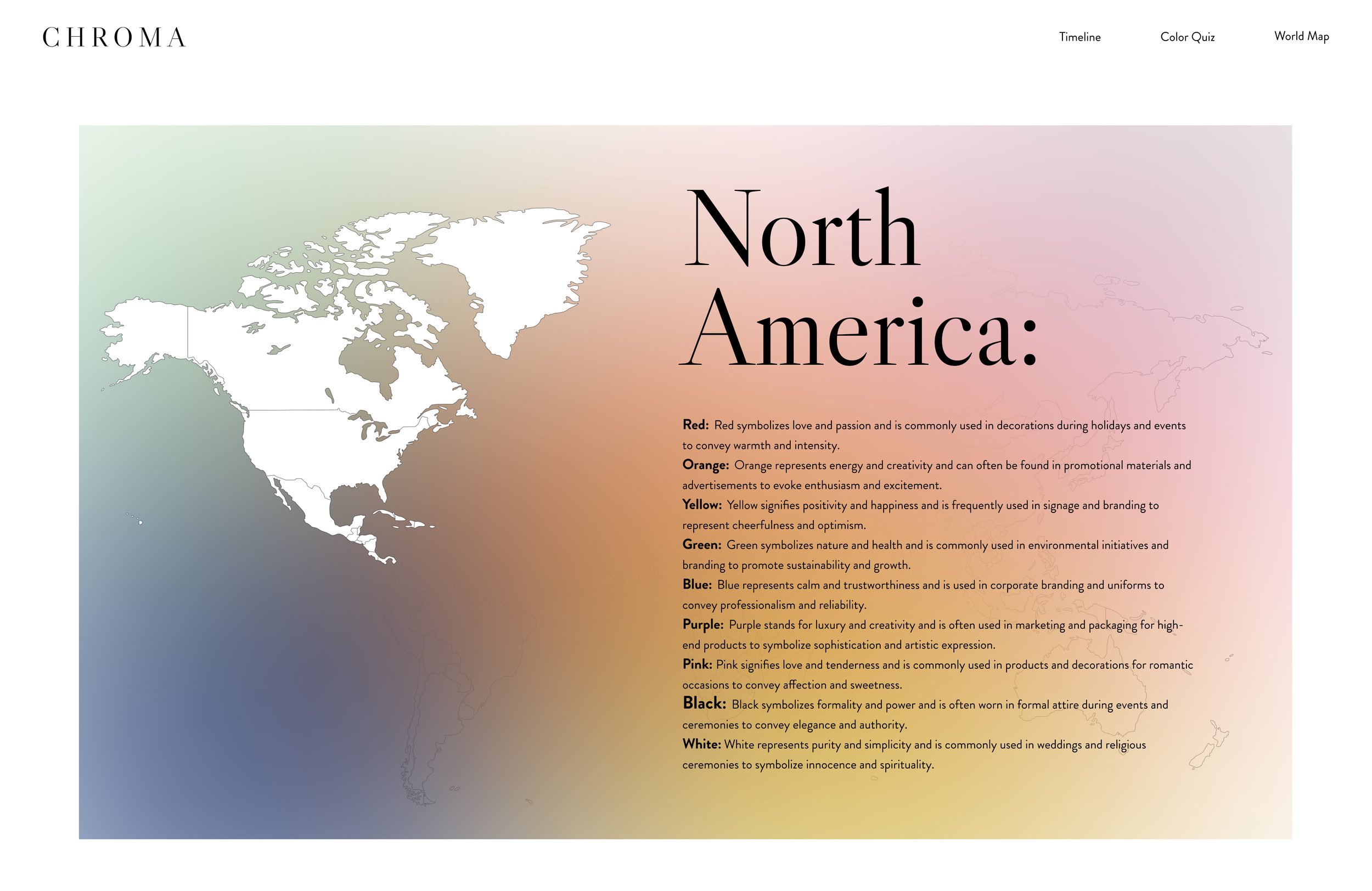
When each continent is clicked, overlays open to reveal the text content. To focus on the selected continent and block out the rest of the map, I used color gradients from the homepage.elected continent, i brought in the color gradients from the home page.


Timeline

The timeline section visually shows how people have gradually changed the way we use colors in art as our access to colors evolved. Knowing this website was created for designers in mind I wanted visual examples showing how art reflected the limited shades/pigments available at a time.
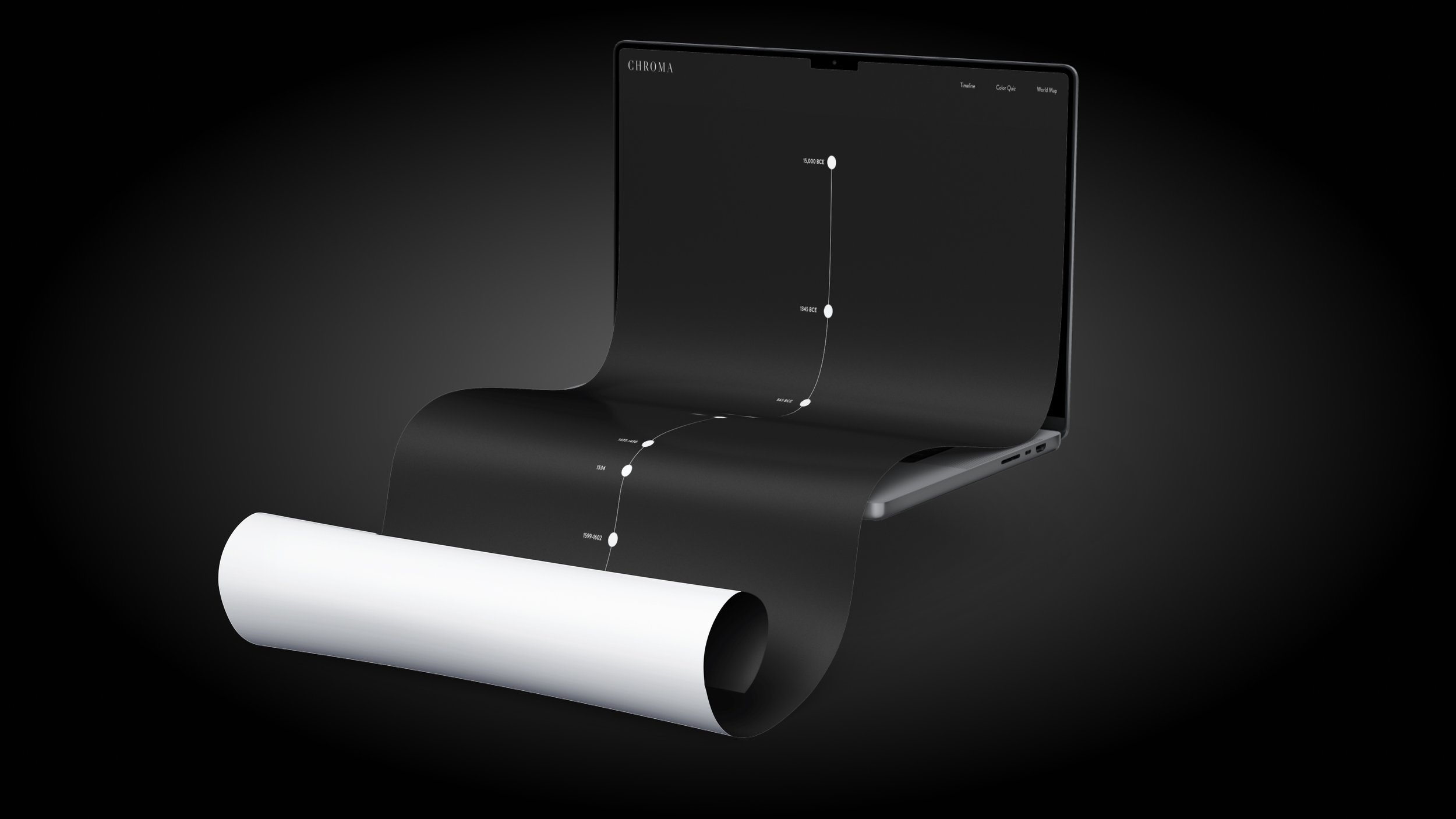
For this portion of the project, I inverted the use of B&W in the background and text to create contrast.
The actual content of the timeline starts during prehistoric times and continues until modern day.


When selecting images for the timeline, I focused on major art movements and historical periods. I avoided using works from the same time period or artist.
This approach created a well-rounded timeline with a minimal list of works, crucial for staying within the project's time frame.
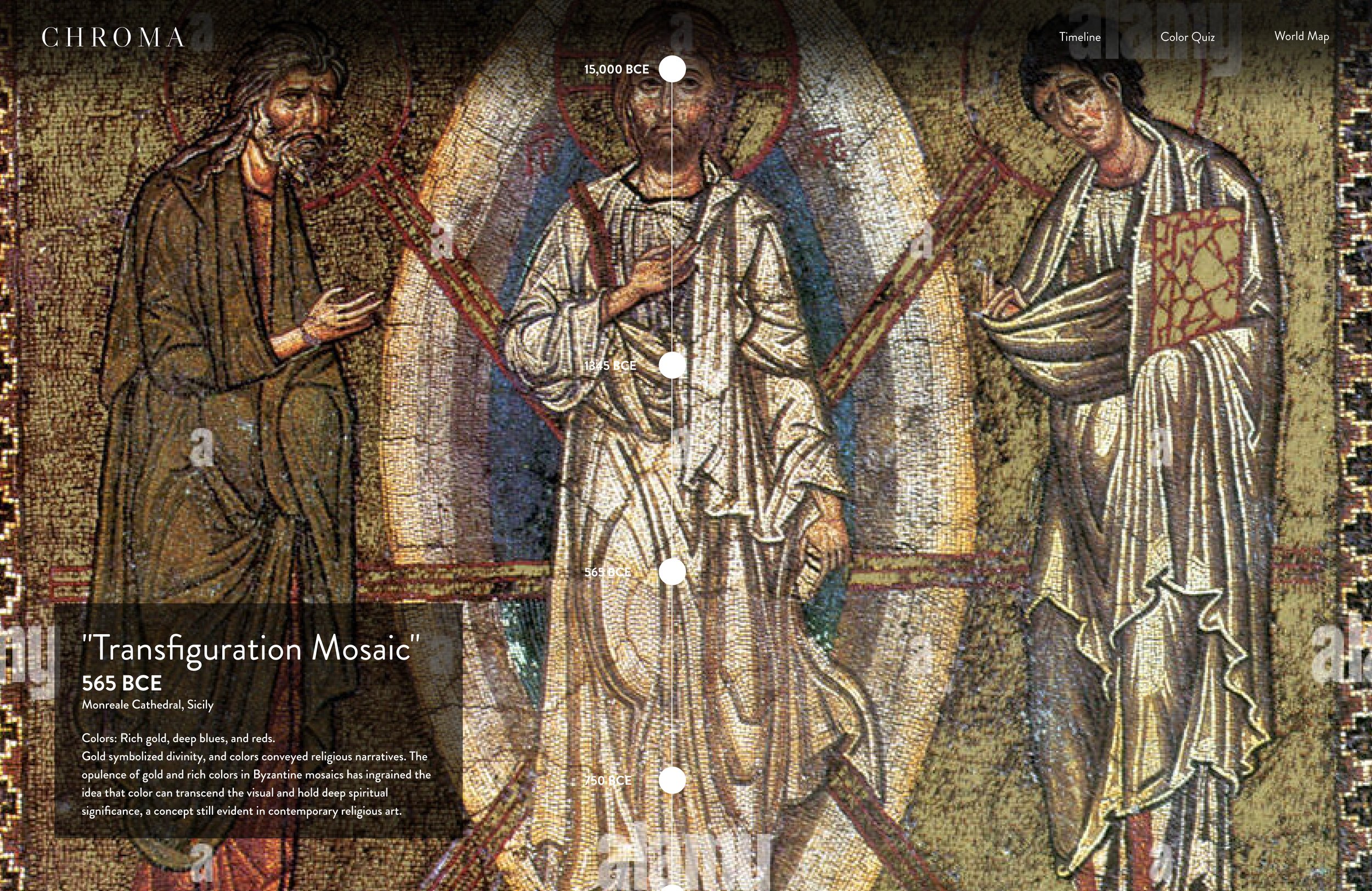
The text layout on this page was designed for clarity and to complement the artwork. Each section features a title, creation details, and historical context, including the significance of colors and pigments.
I added the black, partially transparent background to ensure readability without obscuring the artwork.

The design accommodates varying title and text lengths, maintaining balance and enhancing the viewer's experience. When a card has a longer title or more body text, the box will resize to fit the content, while keeping the spacing from the bottom and left of the page uniform.
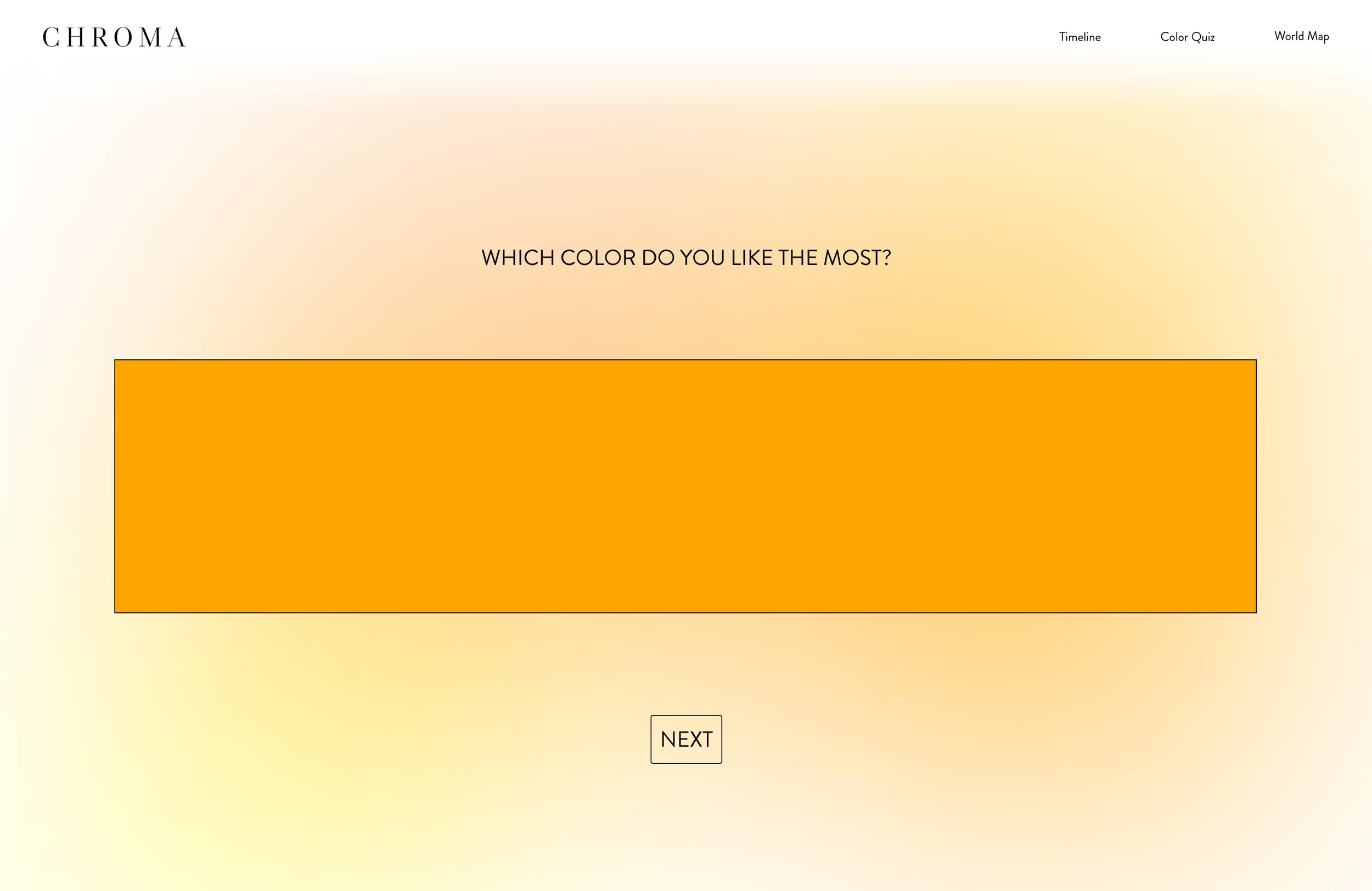
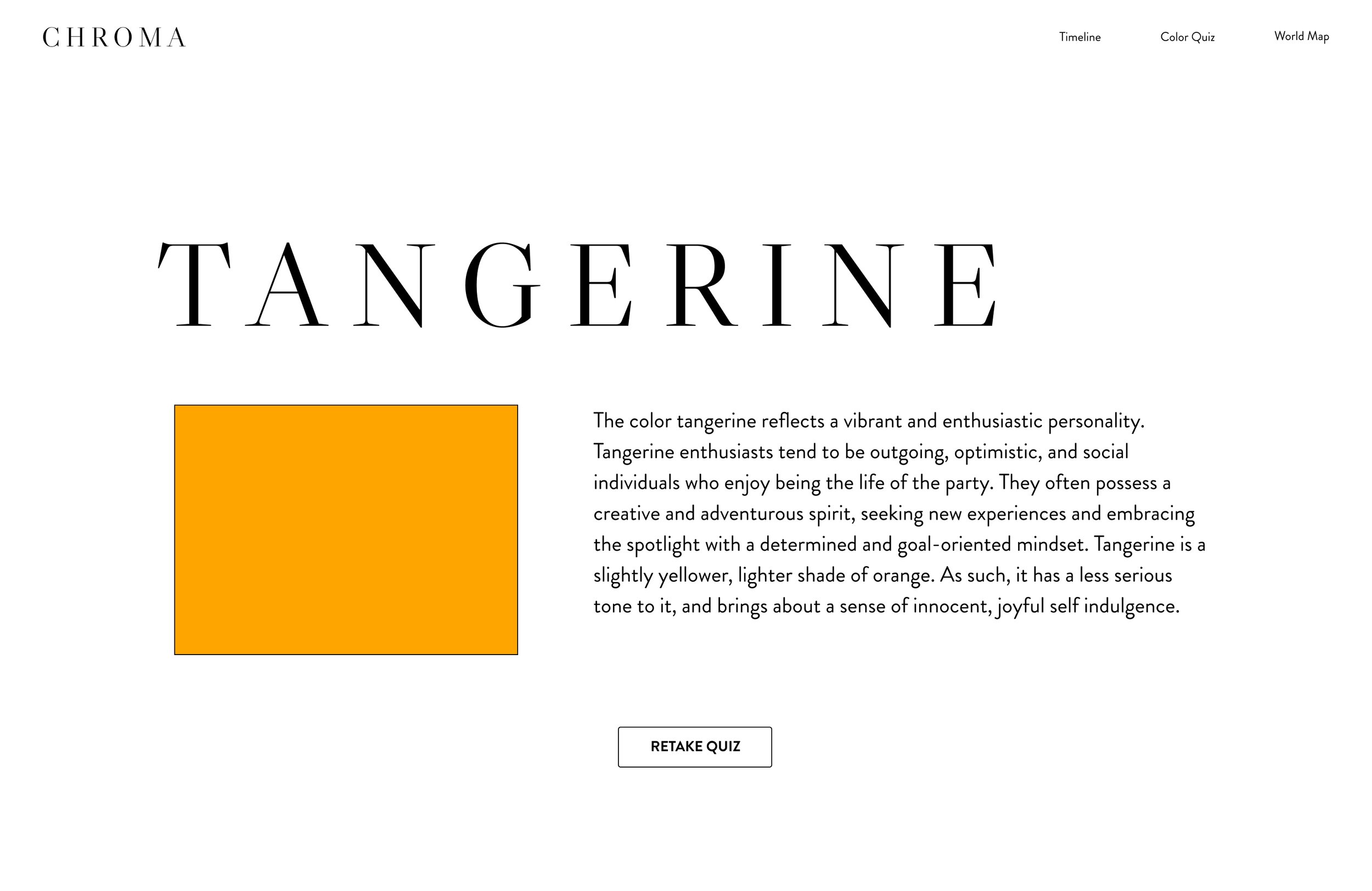
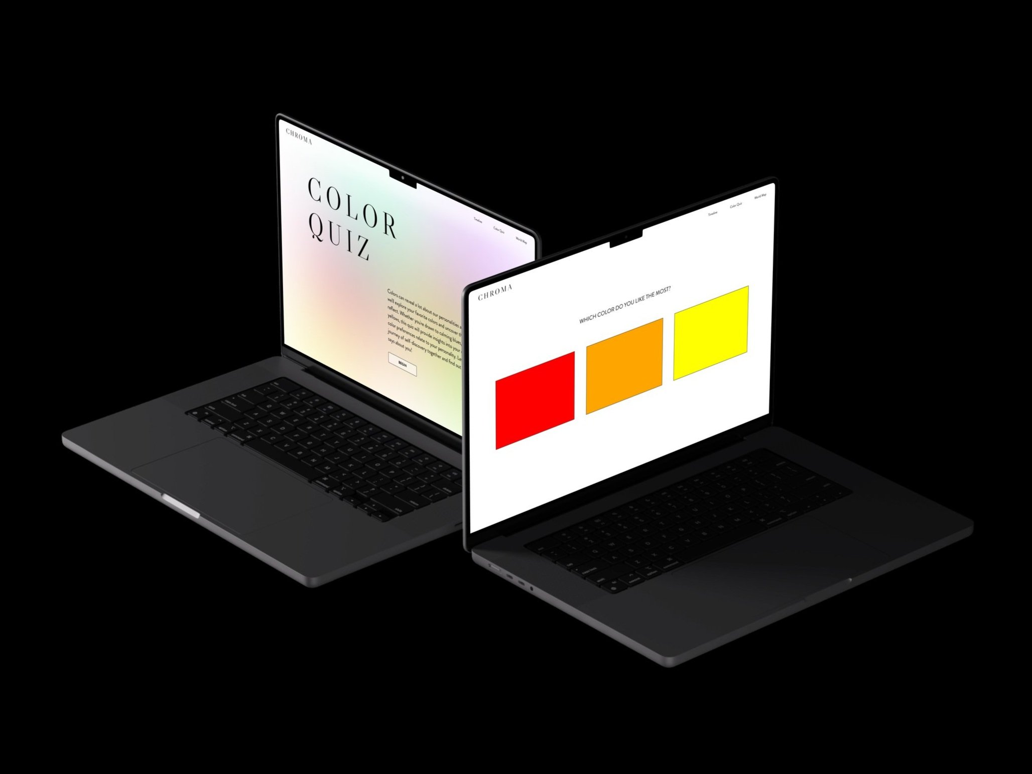
Quiz
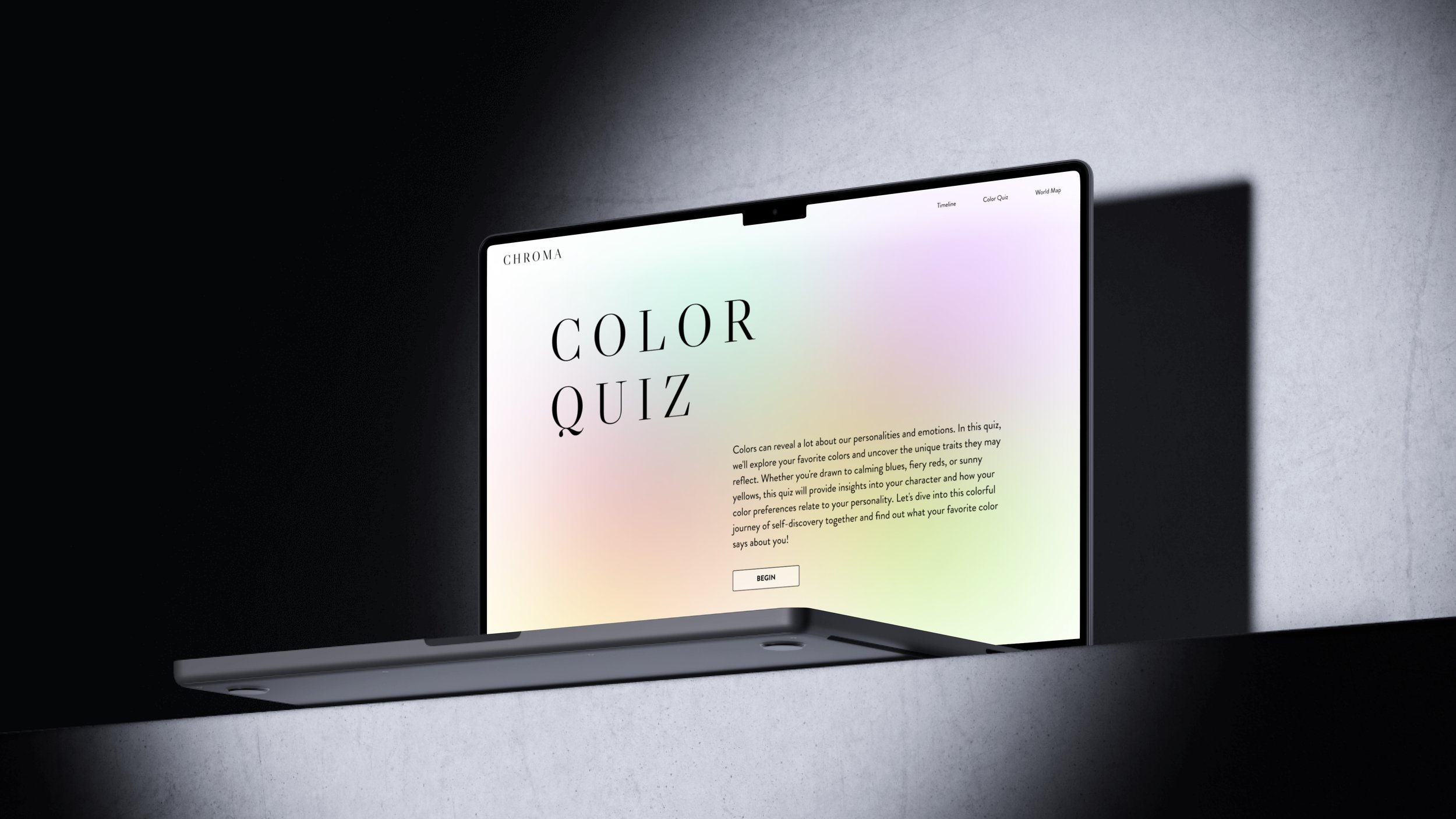

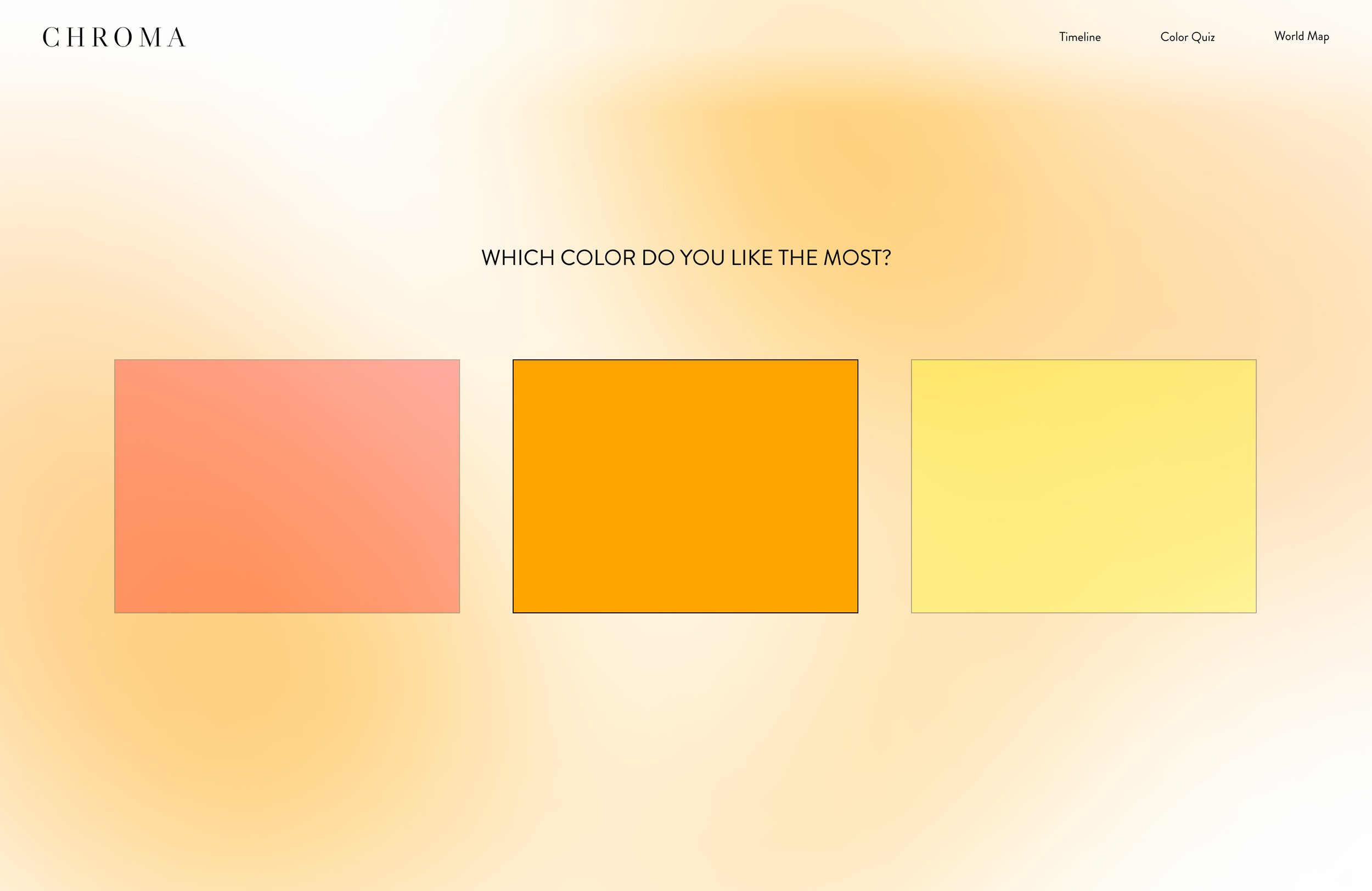
The quiz section is exactly as it sounds like. It has a very basic quiz that asks you to choose your favorite color out of the three shown at a time, and at the end, tells people what their favorite color says about them.
Originally this section was not a part of the project and the only purpose it had was to be something fun and interactive.
Prototyping
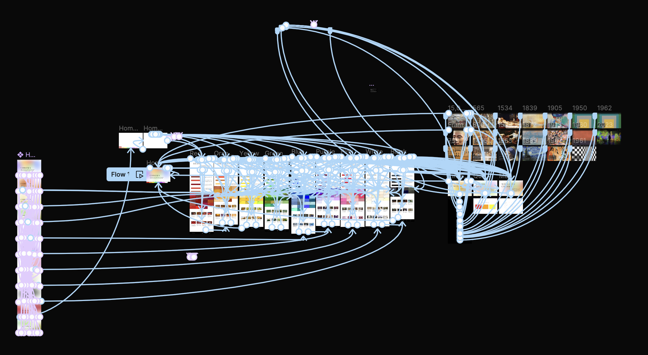

A significant aspect of this project is the extensive prototyping that was done. You can interact with it as if it were a real website. As the project progressed, the file became slower, so I eventually moved as many component sets as possible to a different page to improve loading times.
Conclusion
Throughout this project, I was extremely exploratory with how I used Figma, testing the limits of what I was familiar with and what I knew the program was capable of. By the end of this project, I was confident in my ability to prototype most concepts in Figma.
Oftentimes, I would even stress out some of my closest peers as they watched me break the website several times, worried that I wouldn't be able to fix it, just because I wanted to try something new. (sorry Caroline, I still do this)
Designing something for myself was a massive highlight, allowing me to unleash creativity in style and content. I explored ways to enhance website interactivity, finding joy in making them more engaging and playing with animation.
If I could revisit one aspect, it would be the text content. While it reflects real research, as the deadline drew nearer, design took priority, and I relied on AI to fill gaps. This significantly streamlined the process, and I walked away with the unexpected benefit of learning how to best work with AI.
However, I would love to continue my research, as color psychology fascinates me, and have this project reflect the level of research still happening behind the scenes and fact-check the information already there.
Overall, this experience has enriched my skills as a designer, emphasizing the importance of creativity, efficiency, and personalization in every project.